Wow Wow Wubbzy Logo
“Wow Wow Wubbzy” is a lively cartoon series designed for preschoolers, originating from the imaginative mind of Bob Boyle. This charming show debuted in 2006 on the children’s network Nick Jr., introducing young viewers to the enchanting world of Wuzzleburg. Here, the playful Wubbzy experiences heartwarming adventures alongside companions Widget and Walden. The animation bursts with vivid colors, capturing the eyes and hearts of its audience. Each episode is a tapestry of friendship and learning, woven with the threads of humor and song, presenting lessons on cooperation and empathy. As a staple of early childhood programming, it has etched a place in family viewing routines, blending storytelling with subtle educational messages, nurturing the minds of its viewers with gentle narratives of camaraderie and community.
Meaning and history
“Wow Wow Wubbzy” is an animated series for young children, featuring the delightful and curious yellow character Wubbzy. In the vibrant world of Wuzzleburg, Wubbzy embarks on various adventures, showcasing his playful nature and unique, bendy tail. The show highlights his interactions with his best friends: Widget, a pink, mechanically-inclined creature who loves to invent and fix things, and Walden, a thoughtful, purple intellectual with a passion for books and learning.
The narrative of “Wow Wow Wubbzy” revolves around simple yet engaging stories that teach important life lessons. Each episode presents Wubbzy facing a problem or a challenge, often stemming from his playful actions or curiosity. With the help of Widget’s inventive gadgets and Walden’s wisdom, Wubbzy navigates through these adventures, learning valuable lessons about friendship, teamwork, and problem-solving.
The show is renowned for its vibrant animation style, characterized by bright colors and whimsical designs. The world of Wuzzleburg is a place of imagination and fun, filled with other quirky characters, each contributing to the lively and diverse community. The episodes are interspersed with catchy songs that reinforce the show’s themes and messages, making them memorable for young viewers.
Themes like the importance of honesty, the value of cooperation, and the joy of helping others are recurrent throughout the series. Wubbzy’s adventures also emphasize embracing individual differences, encouraging viewers to appreciate diversity in others and themselves.
“Wow Wow Wubbzy” successfully blends entertainment with educational content, making it a cherished show among its target audience. Its appeal lies in the combination of amusing stories, relatable characters, and positive moral messages, which resonate with both children and their parents. The series stands as a vibrant example of children’s programming that entertains while imparting valuable life lessons.
What is Wow Wow Wubbzy?
“Wow Wow Wubbzy” is an animated television series aimed at preschoolers, centering around Wubbzy, a fun-loving and playful yellow creature with a twisty tail. Set in the whimsical world of Wuzzleburg, the show follows Wubbzy’s adventures with friends Widget and Walden, blending vibrant storytelling with themes of friendship, curiosity, and problem-solving.
2003
The logo showcases a playful and whimsical design, featuring three cartoon characters named Flopsy, Mopsy, and Ted. Flopsy appears to be a rabbit-like figure with a prominent front tooth and a slightly askew posture, suggesting a quirky and lighthearted nature. Mopsy, central in the lineup, is a smaller creature with an endearing smile, radiating innocence and joy. Ted, on the right, has a cheerful demeanor with eyes closed in delight and antenna-like appendages, hinting at a possibly otherworldly origin. The title “The Tail of Flopsy, Mopsy, and Ted” is written in a playful, childlike font that seems to dance above the characters, emphasizing the fun and adventure likely found within their story. The words “Story by: Viviana Ogawa” and “Pictures by: Bob Boyle” are neatly penned below, giving credit to the creators in a simple, understated manner that balances the overall exuberance of the logo.
2005
This sketch portrays a creative and playful logo, where the names “Flopsy,” “Mopsy,” and “Ted” are whimsically integrated with the characters themselves. Flopsy is depicted as a tall, rabbit-like figure standing on a pedestal, holding a paint roller, implying a role in creating the logo. Mopsy’s name is cleverly dispersed among a series of abstract shapes resembling wooden signs, possibly a nod to an adventure or construction theme within their story. Ted is shown at the bottom, a small, round creature strumming a guitar, adding a musical element to the mix. The artwork has a hand-drawn, personalized feel, suggesting a story that’s both intimate and imaginative. The varied typography mirrors the unique characteristics of each figure, contributing to a sense of playfulness and individuality.
2005 (prototype)
The logo is a vibrant and cartoonish portrayal of the characters “Wubby, Widget, and Walden.” In vivid hues, Wubby appears as a yellow character cheerfully peering from behind the first letter. Widget is a pink rabbit, perched atop a ladder and wielding a hammer. Walden, at the bottom right, bespectacled figure engrossed in playing the guitar. The characters’ names are etched in a playful, block-style font that intertwines with the characters, reflecting a tangible connection between the names and their personalities. The backdrop is a soft, gradient green, giving a sense of a lively, yet soothing adventure space, with a quirky cactus adding a touch of whimsy. “Created by: Bob Boyle” is neatly inscribed below, attributing the imaginative world to its creator. The overall composition is light-hearted and appealing, indicative of a creative and engaging narrative.
2005 (prototype)
The logo features the title “Wow! Wow! Wubbzy!” in a playful, bubble-like typeface that captures the show’s exuberance. The first “Wow!” is in a gentle lilac, the second “Wow!” in a soft pink, and “Wubbzy” in a lively lime green, symbolizing a vibrant and youthful energy. Each letter is outlined in a deeper shade, giving a popping 3D effect that suggests movement and fun. The exclamation points add to the excitement, mirroring the show’s dynamic and cheerful spirit. The green letters of “Wubbzy” are the largest, emphasizing the central character’s name and hinting at his prominence in the adventures. The overall look of the logo is simple yet effective, radiating a sense of joy and inviting potential viewers into Wubbzy’s animated world.
2005 (pilot)
The “Wow! Wow! Wubbzy!” logo is a playful fusion of bright colors and animated charm. It features the show’s title in bold, chunky letters with a 3D effect; “Wow! Wow!” is presented in gradient lime green, while “Wubbzy” stands out in a sky blue, all against a soft pink backdrop that exudes a friendly and inviting vibe. Adjacent to the text is the main character, Wubbzy, a small, yellow, animated creature with a springy tail, waving happily. His simplistic yet endearing design, with a single hair tuft and tiny limbs, captures the innocent and joyful essence of the show. The exclamation points after each “Wow!” emphasize the excitement and lively nature of Wubbzy’s world. This logo encapsulates the spirit of fun and discovery that defines the series, appealing directly to its young audience.
2005, 2006 – 2010
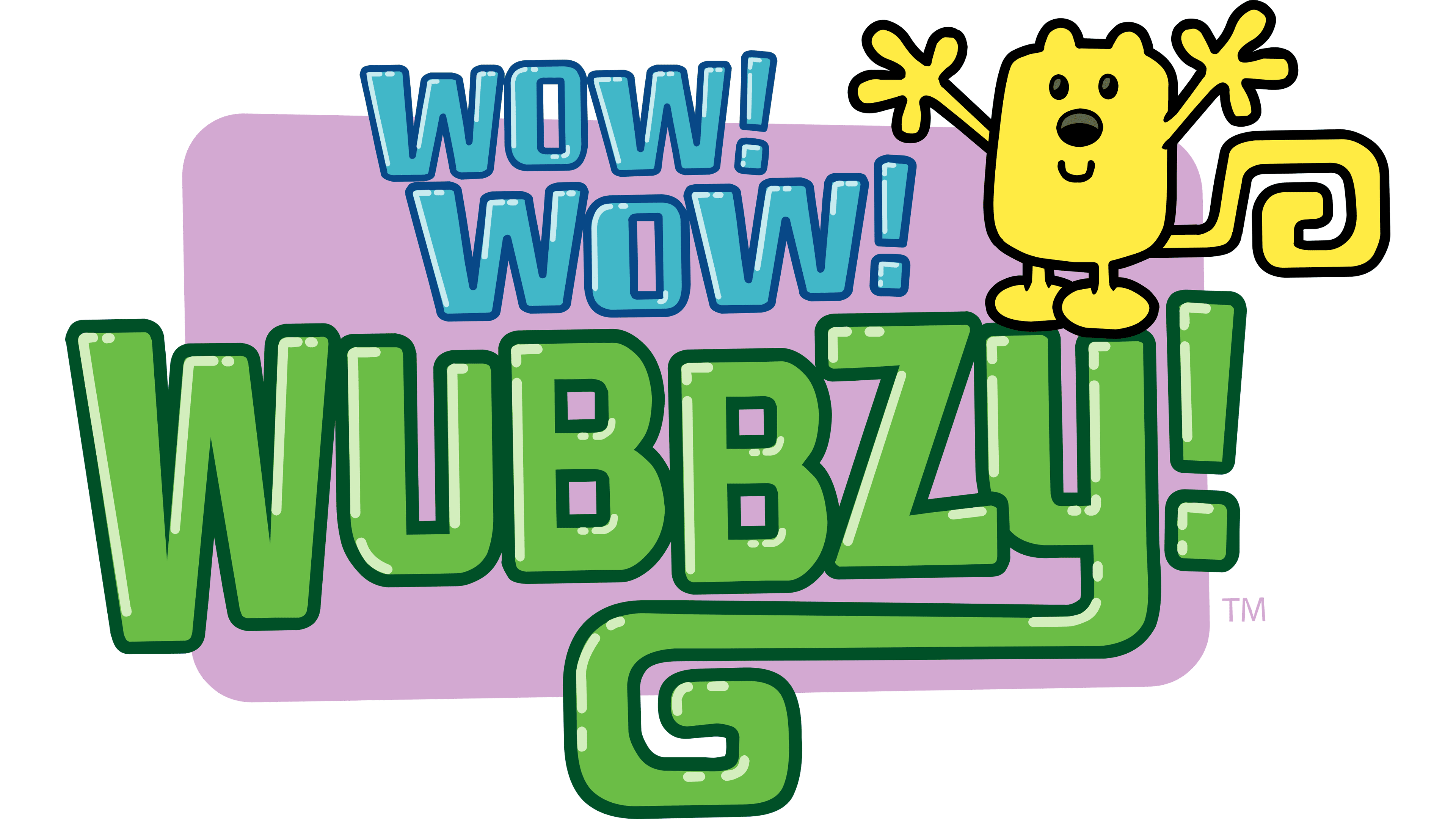
The logo for “Wow! Wow! Wubbzy!” is a vibrant display of character and color. The words “Wow! Wow! Wubbzy!” are written in a bold, bubbly font that leaps forward with a 3D shading effect. “Wow! Wow!” is rendered in a cool, icy blue, while “Wubbzy!” is a vivid, grassy green, suggesting a world that’s full of life and energy. The character Wubbzy is perched playfully atop the last letter, his bright yellow body, wavy tail, and open arms welcoming viewers into his animated universe. His cheerful expression and the logo’s bright colors capture the infectious enthusiasm of the series. The backdrop, a soft pink rectangle with rounded corners, adds a gentle contrast to the energetic text and character, making the logo pop. This design promises a joyful and dynamic experience for its young audience.


