Adidas Logo
Adidas has been one of the major producers of sneakers in Europe even before the brand itself was organized in 1949. Before then, it was part of the larger manufacturing effort that was called ‘Gebrüder Dassler’ – the only worthwhile sports shoe maker of its time. The same company also birthed Puma, another top German producer.
Meaning and History
Adidas was launched by an entrepreneur called Adolf ‘Adi’ Dassler. The company name is basically a mix of his nickname and last name. The name is notably styled as ‘adidas’, which could be just an artistic choice, although the founder was adamant not to use the family name (which he did), and it could be a way of confusing people.
1924 – 1931
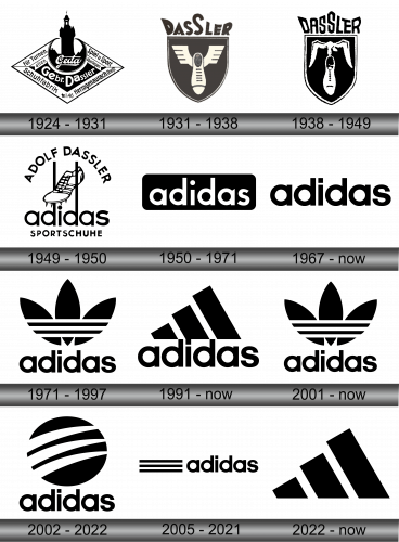
An earlier Adidas logo from 1924 features a black diamond-shaped emblem with white lettering. The words “Gebrüder Dassler Schuhfabrik” encircle a central tower, indicating the brand’s origin in shoe manufacturing. The top and bottom banners contain the phrases “Für Turnen, allen Schuhfabrik” and “Spiel u. Sport überlegen,” which translate to “For gymnastics, shoe factory to all” and “Superior in game and sport.” The design embodies a vintage aesthetic and emphasizes the company’s longstanding association with athletic footwear.
1931 – 1938
The Adidas logo is a 1931 version, which is a shield-shaped badge. It features the word “Dassler” at the top in a stylized font, underlined by a winged shoe, symbolizing the Greek messenger god Hermes and indicating speed and agility. This black and white emblem reflects the brand’s focus on producing specialized sports shoes and its commitment to enhancing athletic performance. The winged shoe within the shield becomes a precursor to the more simplified branding Adidas is recognized for today.
1938 – 1949
The predecessor of Adidas, the ‘Dassler’ company used this logo for almost the entirety of the company’s history – at least until the big rift between the brothers.
It featured an iconic Dassler sneaker being carried by the read of a sole in the beak of a bird (probably a seagull). This image was white and put against a black shield shape with a double white and black outline.
Above the icon there was also a text part – the company name written in uneven letters. Because there were 7 letters, they decided to put the second ‘S’ in the center and specifically highlight it by extending its length.
1949 – 1950
Adidas’ first logo was rather complex. The usual text design was already present, but it was also surrounded by several elements. Beneath it was the writing that said ‘sport shoes’ and above – ‘Adolf Dassler’.
Between the upper text and the brand name, there was a company symbol – an iconic Dassler sneaker with two vertical lines on each side.
Everything in this logotype was black or white.
1950 – 1971
Not long thereafter, Dassler got rid of the excessive imagery and only left a brand name. This time, it was white but put inside a black plaque for prominence. In all fairness, the text looked pleasant enough to be the center of attention, so it was a right decision.
The letters looked a lot sharper and elongated than they do now, however.
1967 – today
In terms of text design, this is the latest edition. They basically removed the plaque, made the text black again and slightly changed the letters style. They are now more tightly grouped together, and most sharp corners were removed in favor of the usual straight-forward endings.
1971 – today
With a brief pause, this design was used since 1971 for a very long time. It’s one of the iconic Adidas symbols – three black leaves with three horizontal lines across the part where they are attached to one another.
It could be used independently, but often in conjunction with the text.
1991 – today
That’s another chief emblem – three tilted lines. They are supposed to symbolize ‘reaching for the peak’, or achieving your goals, spoken plainly. Just like the leaves emblem, it’s often used alongside the text.
2002 – 2022
That’s another, lesser-known Adidas logo – a globe with three claw-like white lines. Just like the other two, it’s mostly accompanies by the brand name.
2005 – 2021
Unlike the three minor logos, this one is primary. It’s used both to signify the brand itself and on many products that don’t belong to broad collections. It’s just a black company name with three long lines right to the left of it. Just the same, the imagery is often used independently.
2022 – today
The Adidas logo features three black parallel stripes of varying lengths, positioned at an angle to suggest a mountain. The smallest stripe is on the left, and they increase in size progressively towards the right. The design is simple yet iconic, rendered in stark black against a white background, symbolizing the challenges and peaks that athletes aspire to conquer. This emblem is synonymous with the brand’s commitment to performance and its heritage in sportswear.
Emblem and Symbol
The three minor symbols are actually used to mark different collections – ‘Originals’, ‘Performance’ and ‘Style’, even though they were primary logos once upon the time. Adidas likes to recycle their logos this way, because it makes buying the collections you like in particular a lot either.


