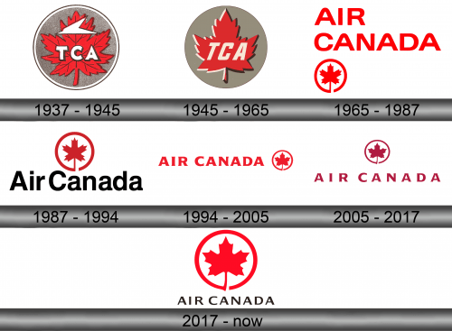
Air Canada Logo
Air Canada is a national airline of Canada, in addition to being the country’s most product carrier. It has a large fleet and actually operates across the world thanks to that. Most of the provided destinations are located either in Europe or in Americas, with Canada, strangely, not even being the biggest customer in terms of travel routes.
Meaning and History
Air Canada was created by the government on the eve of commercial flying in 1937. Back then it was called Trans-Canada Airlines, which reflected the fact that it was first and foremost a means to travel across the country. By 1965, they’ve become a private company, as well as changed their name to Air Canada.
Who owns Air Canada?
It’s owned freely by shareholders. However, prior to being privatized, it was a fully state-owned entity.
1937 – 1945
The central part of the first logo was a red maple leaf with a lot of darker veins, put in the middle of a grey circle. In front of the lead, they’ve placed a white acronym that spelled ‘TCA’ (Trans-Canada Airline), and in its upper part was a sort of white arrowhead that was supposed to represent a plane.
1945 – 1965
By 1945, they decided to simplify things. They removed most details from the leaf, made the coloring not as saturated and outlined it twice in white (on the left side) and black (on the right side). The arrowhead shape was removed, but the acronym stayed – in a slightly different style, with bigger, tilted letters.
1965 – 1987
In 1965, they adopted ‘Air Canada’ as their official name, and that meant a new logo. The original was just the airline name in all capital, colored in red. It was the plainest sans-serif font with no visual oddities. Below and on the left, they’ve also put a little emblem of a red maple leaf surrounded by a ring of the same color.
1987 – 1994
Later, they decided to keep the lead, but make it a central element of the new logo. The text changed little: they colored it black, spiced it up with lowercase characters and moved it directly below the emblem.
What is Air Canada?
It’s a flag carrier for Canada. They provide flights all over the country (which is critical) and beyond.
1994 – 2005
By 1994, however, they moved it to the left of the emblem and changed the style. The color was returned to red, but the new font was sharper, less uniform and with a touch of serif. It was more pleasant, too.
2005 – 2017
In 2005, they used all the same stuff, but made the letters slightly thinner than before, and that’s about it.
2017 – today
In 2017, the parts exchanged places. Additionally, the previous red text turned black, while the emblem was made just slightly paler.
Emblem and Symbol
Where does Air Canada fly?
Primarily, they fly across Canada. However, there are also major travel routes to Europe and USA.
In addition to using the logo as it is on their planes, the Canadians also love to decorate the tails of their vessels with various types of maple leaves. They often put just the usual emblem from the logos, but spice it up with the black background. Often still, they take just the leaf, make it bigger, more sprawling and give it a bit of shading.

