Mexicana de Aviación Logo
Mexicana was Mexico’s oldest airline before they went bankrupt in 2010. It was for the longest time this country’s most reliable airline company – they linked various cities inside Mexico and contributed to the travel between their homeland, USA, Canada and several more American nations.
Meaning and History
Mexicana was founded in 1921, which puts them amongst the earliest national airlines in history. If they didn’t go down in 2010, they would likely be one of the oldest flight providers Latin America has to offer. Their full name read ‘Compania Mexicana de Aviacion’, or ‘Mexican Airline Company’.
1940 – 1968
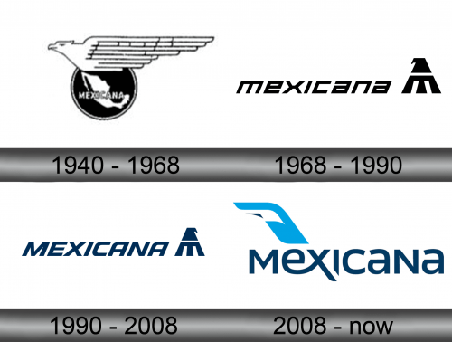
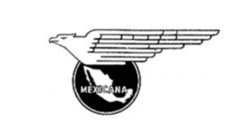
The first logotype was introduced in 1940 when branding became of essence. It shows a black circle with the white silhouette of Mexico depicted on it. Further above the map, you can notice the word ‘Mexicana’ written in white and outlined in black. The circle itself is doubly outlined in white and black.
The other detail is the golden eagle – the Mexico’s national bird – sprawled over the top of the circle emblem. It actually looks more like a wing with a proportionally small bird head of its left. It’s also completely monochrome.
1968 – 1990
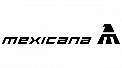
By 1968, they still insisted on using both the eagle and the ‘Mexicana’ inscription. The former was now a black silhouette of a head plus some upper body with folded wings (all styled with minimalism). The latter is now a central piece written in square, blocky letters, all black and lowercase.
1990 – 2008
In 1990, they somewhat changed the design. Primarily, they opted for the dark blue coloring this time and turned the lowercase letters into uppercase without changing their size. The minor nuances include a now-mirrored eagle and the thin underline below the logo.
2008 – today
The 2008 logo depicts a much more stylistic company name. They aren’t tilted anymore, and the appearance is much softer and fluid. They are also neatly positioned with continuation in mind. For instance, one of the ‘X’ lines directly continues follows down the same trajectory as the right side of the emblem.
The emblem, for its part, is a turquoise vertical stabilizer with some white and dark blue inlays.
Emblem and Symbol
The 2008 emblem is not just a stabilizer, it’s also a bird. The small dark shape is a beak, the white part is the body, and the rest are the wings. Notably, it’s flying at an angle, but if you consider that all the company logotypes had an eagle somewhere, it makes sense. Yes, it doesn’t strike you as an eagle at first, but the company is gone anyway.


