AirAsia Logo
AirAsia is one of the largest Asian airlines and a big fan of the Airbus A320. Every day it flies to about one hundred destinations and over twenty countries of the world, which makes it a leader among its competitors. AirAsia managed to make a cheap, but pleasant and high-quality service. All additional options are offered for a fee, but they are not always needed. If necessary, you can pay extra for luggage, food, and even for the red carpet. It has been named the best low-cost airline in the world eleven times, most recently in 2019.
Meaning and History
AirAsia was founded by Fernandez in Malaysia in 1993, but the first flights took place only in 1996. In 2001, the airline had huge debts and was bought out by Time Warner, whose CEO was Tony Fernandez at that time. All AirAsia’s debts were taken care of and it turned into a profitable carrier. AirAsia was so successful that it was able to leave behind a significant competitor, Malaysia Airlines. It is now Asia’s largest low-cost airline. As of 2020, AirAsia.com had 14 million active users and the app has been downloaded over 14 million times, according to the company. Over 60% of AirAsia’s seats are sold directly through their platforms.
What is AirAsia?
AirAsia is a huge corporation whose aircraft can be found in every Asian airport. It operates regular domestic and international flights. The ban on flights due to the COVID-19 pandemic motivated the airline to transform its website and app into travel & lifestyle platforms. This allowed individuals not only to buy and store tickets there but also order the delivery of food, and goods, as well as communicate with other travelers.
1996 – 2002
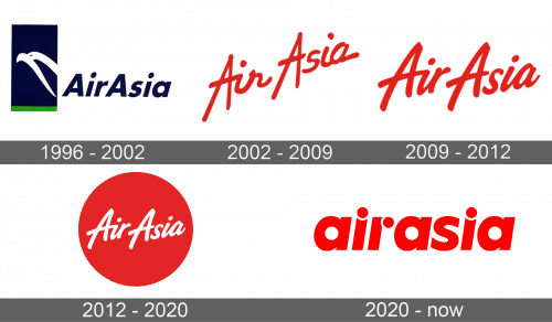
The name of the company is done in dark blue with the first letter being capitalized. To the left, the logo had a vertical blue rectangle with a thin green line at the bottom, which looked like the night sky and green grass. A couple of smooth white lines on the blue background resembled a bird flying in the sky, which symbolized the AirAsia aircraft.
2002 – 2009
The logo had a completely different look and feel. There was no more emblem next to the name. AirAsia was printed in bold red color that immediately caught attention. All the letters were cursive, except for As which had straight lines and were extending below and above all the other letters. The lines had varying thickness, which made it seem that the wordmark was handwritten. The words were written on a diagonal, which made an association with the airplane taking off and going up in the sky.
2009 – 2012
The logo was kept minimal and featured only the name of the airline. A different cursive font has been used and the letters looked bolder. The airline kept the idea of the name being written on a diagonal, but it was not as steep. The company kept the bold traditional color which is used to denote courage, bravery, and loyalty.
2012 – 2020
A circle was added as a background for the wordmark. It was the same red color as the logos the airline had for the past ten years. A white was used for the name to create a nice contrast. Otherwise, the font and style of the wordmark were kept unchanged.
2020 – Today
The new logo kept its original concept, and only a few minor elements were changed. The logo represents a brand’s name written in bold red letters on a white background. If earlier only the first letters “A” were in capital letters and stood out significantly, now they all have the same height and type of font. The whole phrase had a very uniform look.
Font and color
During its history brand changed its logo five times. The last rebranding happened recently in 2020. With an exception of the first emblem used for six years, red and white were the signature colors of the airline. Initially, the company used a cursive, handwritten style of font. The latest logo, though, featured rounded, thick letters. The first letters were no longer capitalized.


