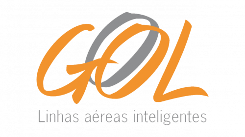
GOL Linhas Aereas Logo
GOL Linhas Aereas is an important Brazilian airline. They mostly operate inside the country, but also venture abroad – primarily, into other Latin American countries. The flights they provide are mostly low-cost, which earned them success and recognition in their home country.
Meaning and History
The company was started in 2000 as a low-cost airline that would conduct flights across Latin America. The full name adopted back then means ‘GOL Intelligent Airlines’, with ‘GOL’ being nothing more than a reimagined word ‘goal’ – displaying the company’s determination and hard work.
2000 – 2015
The first logo was s bunch of orange capital letters that made up ‘GOL’, accompanied by the words ‘Linhas aereas intelligentes’ in grey right below. The styles they chose for each of the elements differed from one another.
The letters above were cursive and seemed painted on, and as if hand-written. In addition to the three thin orange letters, they also copied the ‘O’ and put this copy in grey right behind the main emblem. This design choice stayed even into the next iteration.
The letters below, however, were plain and slim. They weren’t at all a center of attention, they were simply meant to display the company’s full name.
2015 – today
Most ideas remained after they settled on a new logo in 2015. This time, the orange letters were plain and bold, which they chose for more comprehensiveness. The grey ‘copy’ was this time intertwined with its original instead of staying in the rear.
The lower part was also slightly changed. Primarily, they made them orange this time, but other changes include also a softer font and generally bigger size.
Emblem and Symbol
Unlike many other airlines, GOL doesn’t have a distinctive emblem they could put onto the tails of their planes. Instead, they paint the stabilizers and the rear parts of their vessels orange, grey and white in various schemes. Mostly, they lock the two into a shape that resembles the Yin Yang with a white seed between them.


