Aquafina Logo
Aquafina is a popular brand of fresh bottled water. It’s mostly sold in America, to great success. It’s positively the biggest-sold brand of pure bottled water in this country. The brand belongs to Pepsi Co, and these bottles actually amount to a good portion of their yearly income.
Meaning and History
The brand was established in 1994 as the move by Pepsi meant to expand into the niche of purified water. ‘Aqua’ obviously means ‘water’, which was the clear choice for the branding (a lot of rival brands use it this one for their own names), although it’s not as clear what ‘fina’ is supposed to represent.
1994 – 2004
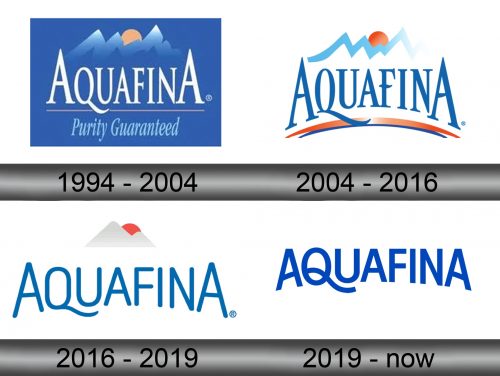
The initial logo depicted the brand’s name in tall white letters; the font is rich with serifs. It was then placed against a blue rectangle with a lot of other visual elements on it. Above, several mountain peaks were drawn in front of a setting sun. Below, they’ve written ‘Purity Guaranteed’ in a similar font, yet tilted to the right and pale blue.
2004 – 2016
The remodeling that followed in 2004 didn’t change much. They got rid of the blue background, painted the letters white, somewhat tweaked with the mountains and some orange & blue curvature below the main writing part.
2016 – 2019
In 2016, they simplified the thing further still. They shortened the mountains to just 2 peaks and a uniformly orange sun behind. The letters lost their strict serif font in favor of a softer, more fluid and with fewer nuance.
2019 – Now
A 2019 redesign basically took the writing from the previous stage and added some changes. The blue became darker, the font became rather sharper, and the letters in general got bolder. Moreover, there were some illustrative alterations, like on the letter ‘Q’.
Emblem and Symbol
Many labels actually still feature different color palettes for these logotypes, seeing how the bottles are mostly blue, which means blue background, white letters and more smaller details, in spite of the official changes. The cans are mostly white, which enables them to just keep to their actual designs.
