Powerade Logo
Powerade is one of the two main sports drink brands in America (alongside Gatorade). It’s owned by Coca-Coca Company, and they’ve distributed it across the world, although, frankly, no one drinks it in such massive quantities as Americans do. It’s almost ingrained in their culture.
Meaning and History
Powerade appeared in 1988 as an alternative to Pepsi’s Gatorade. The name is simply a mix of the word ‘power’ (referring to the energizing quality of the drink) and, likely, the last part of ‘Gatorade’. They did want it to sell on part with Gatorade, so why not it call it an eerily similar name?
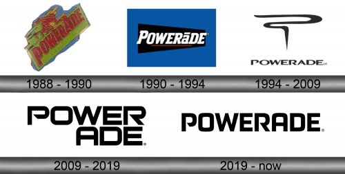
1988 – 1990
The initial 1988 logo was modeled after the labeled they made for the drink back then. The label looked like a lime green rectangle with a red drink name on it. Interestingly, it was mostly lowercase letters, except for the ‘a’ in the ‘ade’ part. That one was capital – probably to market it as an alternative to Gatorade.
In that same place, they also wrote the brand’s motto as a ‘high energy thirst quencher’ – in dark orange. That same color is also used as an outline for the name, as well as other elements around.
They also put a red silhouette of a running person up above the main lime plaque. Some color was also spared to distinguish the ‘trail’ this person left behind themselves – they mostly colored this space in lime, yellow and red.
1990 – 1994
The second logo was much more concise – a blue rectangle with a turned-over black trapezoid inside it. They then put the white drink name inside that black shape, slightly underlined it in red and sent it to print.
The name was this time written in a different, athletic serif font. It’s also used by many sports clubs – blocky letters with square tips and other bulky features.
1994 – 2009
In 1994, they decided to simplify the logo even further by simply using the name and the stylized letter ‘P’ above it. The script of the name was now more futuristic, wide and imposing than before. They painted it black, and did the same with the emblem. The latter was simply a single stroke of black that vaguely resembles the ‘P’.
2009 – 2019
They largely reused the written part from the previous logo, except they changed the type to an even more futuristic, robotic script. It was pretty similar, except the letters were now uniformly thick and more geometrical.
2019 – today
It’s largely the same thing, except they made the letters bigger, added saturation to the coloring and moved the ‘ade’ part to the second line below.
Emblem and Symbol
Most of the emblems aren’t seen in their black variations most of the time, actually. The ones you see on the bottles are usually white, because the labels themselves have a black background. As such, the black variations are basically reserved for corporal use and marketing.


