Bavaria Logo
Bavaria is a popular brand of lager beer from Netherlands. It’s one of the most popular European beers, and the brewery that makes these is doing it since at least 17th century. The brewery that makes these, and also several other brands of beer, is called Swinkels Family Brewers. They are the 2nd largest beer brand in the Netherlands.
Meaning and History
The brewery has been consistently operating since at least late 17th century. However, the name ‘Bavaria’ was adopted by the brewery and one of their brands only in 1923, when they started making pale lager – colloquially known as ‘Bavarian’ back then. Over time, the name stuck to their chief product.
1923 – 2009
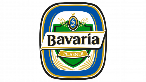
The first logo was a rounded vertical rectangle with a layer of hold and blue inside, followed by a large white space. In its middle, they put a green shield with the white ribbon that said ‘Bavaria’ in black bold serif. They also made sure to point out below that the beer is pilsener (or pils) – a type of pale lager.
The other important element includes an oval with a big golden ‘S’ in it (for ‘Swinkels), which they put onto the top of the shield. The choice of colors here and throughout the logo is inspired by the colors of Lieshout (the home village of the brewery) and Bavaria. Thus, there is a lot of blue, yellow and white.
2009 – today
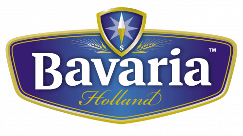
In 2009, they decided to re-imagine the logo and make it simpler. They instead adopted a sort of wide blue shield with the golden edges. They reused the ‘Bavaria’ word from before but painted it white this time. This time, however, they also added the ‘Lieshout Holland’ inscription just below, which just pinpoints where they live, basically.
There are also additional nuances, such as the shield up above with the letter ‘S’ and the compass on it, the wheat ears below and the inception year in the very bottom.
Emblem and Symbol
The emblem used by the brewery now has nothing to do with ‘Bavaria’ or its variations. It’s now called ‘Royal Swinkels Family Brewers’, and it was reflected on the official logo of the brewery. This bunch of words would usually be colored yellow and put next to a Swinkels crest (featuring a crown, hop and the letter ‘S’).

