Campari Logo
Campari is a brand of Italian bitter liquor. It’s mostly consumed as a sort of dessert drink, although it varies from country to country. Generally, the formula, presentation and flavoring change depending on the country where the liquor is sold, although it’s usually red and bitter.
Meaning and History
Like most Italian brands, this one is named after the family name of the founder – Gaspare Campari. The drink was first sold in Novara in 1860, and even more than 150 years later, it’s still popular dessert drink across Europe. The iconic red color has been used ever since the inception.
1888 – 1905
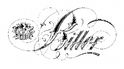
The first logo adopted in 1888 featured the word ‘Bitter’ written in a very sophisticated cursive script, in monochrome letters. They’ve written that instead of the brand name, because bitters (bitter herbal drinks) started growing in popularity by the end of the 19th century, and it was a sure way to make sales.
1905 – 1912
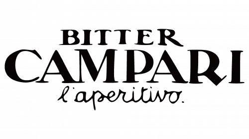
In 1905, they decided to put the company name on the label by writing ‘Campari’ in big black serif letters, with the smaller ‘Bitter’ written on top of it, although in the same style. Below, they’ve put the word ‘l’aperitivo’ – means ‘aperitif’ in Italian. The script here was instead cursive and slimmer.
1912 – 1920
The 1912 attempt was one of the labels from olden days. It looks like a brochure explaining everything about the drink. The paper had the greenish tint (because the drink was supposed to be made of herbs), and there was a lot of writing on it. The central piece was the brand name as seen on the 1888 logo.
The other written elements include the description for the drink, as well as their personal print mark.
1920 – 1921
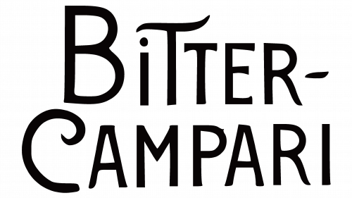
The 1920 logo consisted of just written parts again, and it now said ‘Bitter-Campari’ (with a dash) in quirky, uneven letters. They are much thinner than those used in the 1905 logo, but they make up for it in weird twirls.
1921 – 1922
They mostly reused the 1905 emblem for this one, except they removed the ‘aperitif’ part and made the remaining words bolder.
1922 – 1923
They did the same thing again, but aligned the text by the right side and changed the type to a much thinner cursive font instead.
1923 – 1927
For this one, they decided to reuse the ‘Campari’ part from the 1921 logo, but make the letters yet bolder. Something about the font changed – for instance, the ‘A’s became shorter, but it’s not substantial.
1927 – 1928
In 1927, they changed the font again. This time, the letters became a more pronounced serif script, with much thinner lines and somewhat taller letters.
1928 – 1931
For this one, they basically took the old bold script, but made it even thicker and fatter. In the same bold style, they also added the small wards ‘cordial’ and ‘liquor’ along the edges of the main word.
1931 – 1935
In 1931, they decided to use the old structure of ‘bitter’, ‘Campari’ and ‘l’aperitivo’ written one below the other. Each word has its distinct style: the first is an old Campari font, the second is written diagonally in a thick oily cursive, and the last one is a thin small typographic script.
1935 – 1936
In 1935, the designers opted to use the ‘cordial’ design again, although the words are rearranged this time. The positioning changed slightly, and the style was significantly reworked. The letters were now more blocky, yet still bold and thick. The distinctive part was the gradual change of the character size throughout the word.
Basically, they made the slides out of these words.
1936 – 1987
It’s the same concept as the one before, but they rearranged the words even more. They are now positioned rather plain. The main word was now a peculiar serif font. The other two (situated below this time) were thin cursive.
1987 – 1991
By 1987, they decided to introduce the first properly colored emblem, which was simply the drink name written in blue letters. Script-wise, it was a bold slab serif – words had big rectangular tips. They were also all capital and rather tall.
1991 – today
That logo was largely carried on into the 21st century, except the word was now white with some yellowish tint, while the blue was reserved for a rectangle that served as a background plaque.
Emblem and Symbol
The emblem is not always used with the colors given to it officially. For instance, the letters are often used separately from their blue plaque (in relation to the 1991 logo). On the decorative boxes used to store the bottles, the word itself is used in white across the red space that occupies most of the box’s exterior.


