Canada Dry Logo
Canada Dry is a major producer of various soft drinks located in Canada. At the moment, they are owned by Dr. Pepper, although they were present at the American market ever since the inception of the brand. They are famous for their ginger ale, although there are also numerous other products they are responsible for.
Meaning and History
Canada Dry first appeared in 1904. At first, they simply sold sodas, although just several years later their celebrated ginger ale soft drink entered the market and made them rather successful both in USA and in Canada. It’s called ‘Dry’ in reference to the dry alcoholic drinks.
1904 – 1975
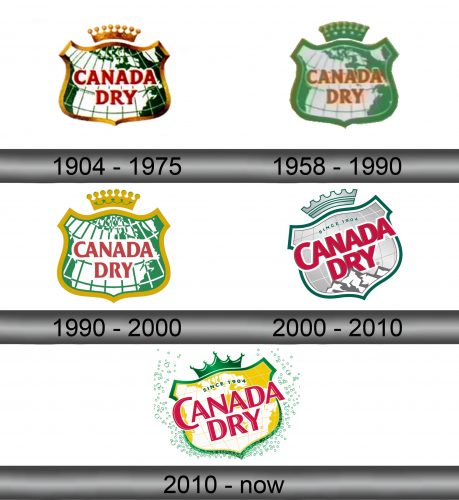
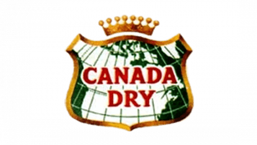
The first ever logo they had featured a wide golden shield with the map of Canada (and some parts of USA) drawn in white over the green background. There also nested the words ‘Canada Dry’ in big red letters right in the middle of the logo. The style was a slight serif.
The final touch was the crown floating over the shield and colored the same shade of yellow, although with some green inlays.
1958 – 1990
The logo they adopted in 1958 was largely the same, except they supplanted the yellow on the edges and in the crown with the green almost the exact type as the background behind the map.
1990 – 2000
The 1990 emblem was a reused initial logo, but with a few additions.
Firstly, they added a green outline around the golden edge. Secondly, they reworked the crown to be more bulky and prominent, gave it a green outline as well and then put it closer onto the shield. Lastly, they added the black word ‘Gottlieb’s’ in a cursive writing right above the main inscription in the middle.
2000 – 2010
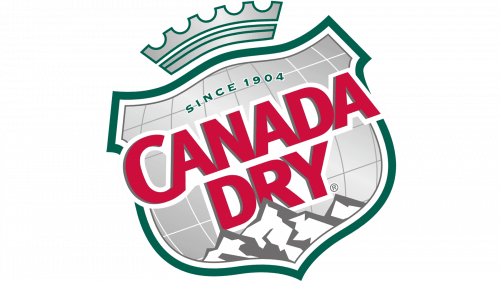
2000 saw more change than the rest of the previous logos combined. It was now a green shield with a silver space inside. The map was gone; all that was left is a white grid for latitudes and longitudes. In the map’s stead, they just put a white-grey mountain in the bottom of the emblem proper.
Simultaneously, the ‘Canada Dry’ part grew in size and now went beyond its boundaries. You could now see the thick white outline they gave the letters (the red & white combination are the Canadian national colors). Lastly, they wrote ‘since 1904’ in green right above the name.
The crown also changed to a more rectangular version, and was also repainted silver this time. That, and everything else, was rotated counter-clockwise.
2010 – today
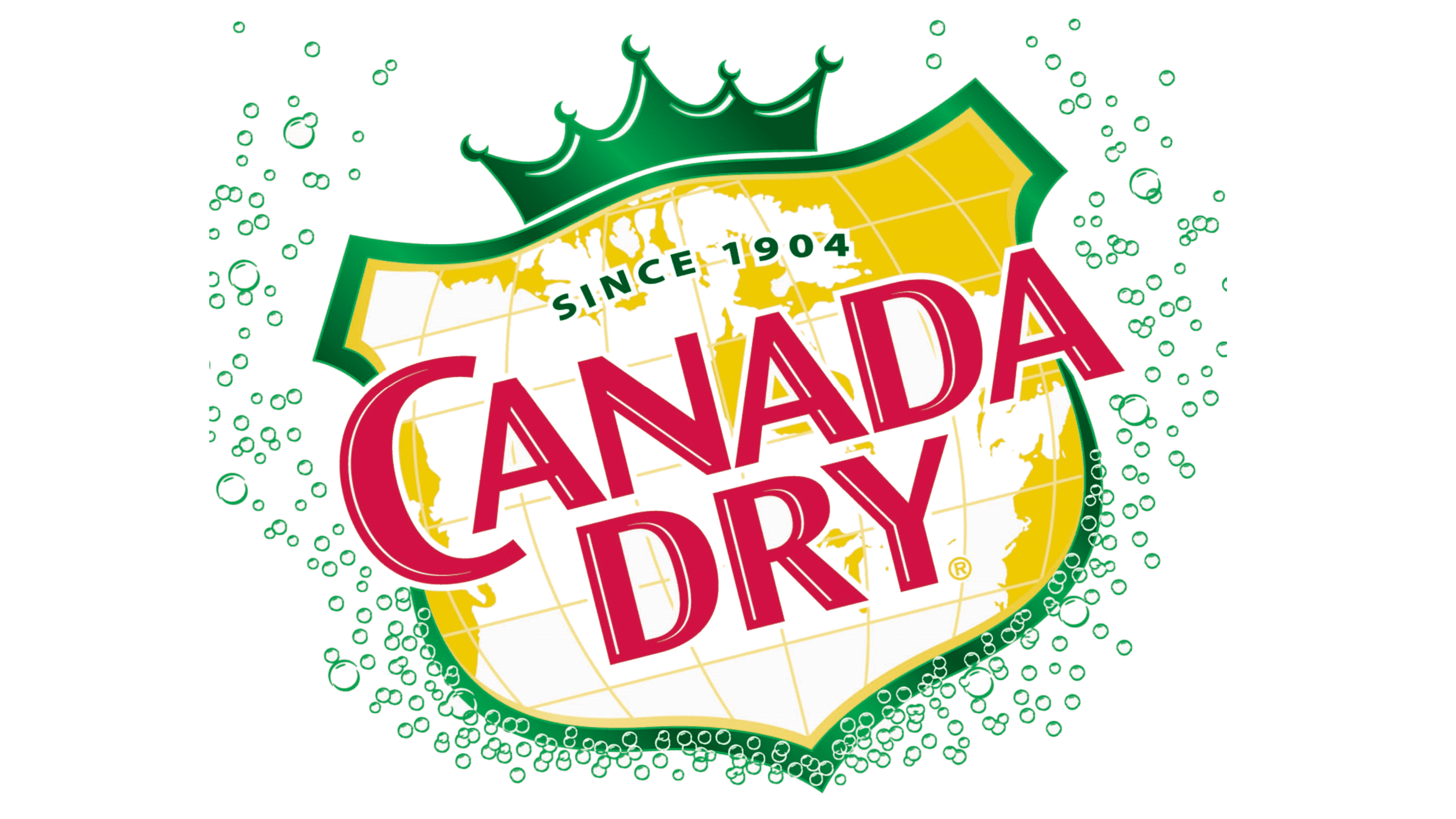
Most things remained as they were, except they returned the map and gave it a yellow background instead. The name’s font changed to a slimmer, more uneven script. The crown became just a green 5-tip silhouette. Lastly, there are usually miniscule green bubbles all around this new logo.
Emblem and Symbol
The logo is used as it is across all of their drinks – including every ginger ale variation. There isn’t a lot of difference between them, except the bubbles coloring – these are usually white or green, but can be other colors depending on the background they are set in. Other than that, there is nothing special.
