Carling Logo
Carling brewery is a major beer brand in Canada. Despite being located since time immemorial in Ontario, their products are actually incredibly popular in United Kingdom. Statistics show that Carling is one of the most popular beer brands in this country.
Meaning and History
The brewery was started in the city of London (no joke) in Ontario, Canada in the year 1840. The founder was called Thomas Carling, hence the name. For the longest time, it was actually called ‘Carling’s’, but somewhere in the 90s, they introduced their first real logo, and after that the name ‘Carling’ stuck.
1990 – 2011
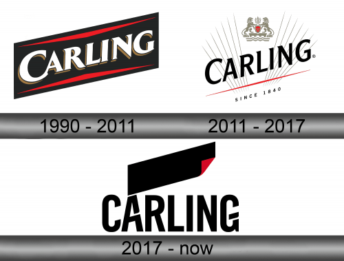
The first Carling logo displayed the company name written in big white letters with a touch of 3D – the sides were visible and colored orange. As you understand, the word was turned to the right side a bit, which also prompted them to skew it, so that the right tip was much higher than the left one.
The letter was put on the black plaque (that was likewise skewed counter-clockwise), and they ultimately sandwiched the word between two red lines (although they were more like very wide and short triangles).
2011 – 2017
In 2011, they rearranged the logo. The black plaque was removed, and the writing was left to float in the air, now colored black and with no volume this time. The lower ‘triangle’ was squished so it now looked positively like a line. The upper counterpart was dispensed with.
They also put several secondary details: such as the ‘since 1840’ writing below, grey rays emanating from the red line and Carling coat of arms above.
2017 – today
The biggest change followed in 2017. It was no longer skewed – the company name was still black, but now completely horizontal and with a different typeface. Everything else was gone, although they did add a black ‘label’ symbol – a rectangle with one corner coiled up to reveal a red underside.
Emblem and Symbol
The lion is usually closely associated with the brand. The coat of arms (presumably, Carling’s own symbol) is, after all, two lions supporting a red shield with no defined imagery. This coat of arms is usually portrayed as silver, and a silver lion eventually become somewhat of a recurring image for Carling.
