Central Perk Logo
Central Perk is the name, known to people from all over the globe, as it was the main meeting spot for the characters of the legendary Friends tv series. Central Perk is the coffee shop, which has finally brought to life in 2014.
Meaning and history
The famous Central Perk coffee shop, where the “Friends” so beloved by TV viewers from all over the globe met for 10 years. There is a play on words in the name of the coffee shop.
Central Perk is consonant with one of the landmarks of New York: Central Park. In turn, the perk can be translated as “privilege” or, simply put, “chip”.
It’s also “earnings” or “tips,” which isn’t surprising, since one of the characters, Rachel, has been a waitress there for a while, while the other, Phoebe, moonlights as a songstress.
Also, the perk is consonant with the English percolate, which means “to make coffee.” This is also where the expression to perk up is “to perk up.”
In the first season of “Friends,” the view outside the coffee shop window is only a painted setting. The “street” outside the window was made only in subsequent seasons when important events for the script began to take place there.
To celebrate the 20th anniversary of the first episode of the super-popular television series Friends, a temporary Central Perk Cafe opened in New York City, a replica of the one where Monica, Chandler, Ross, Phoebe, Joey, and Rachel spent so much time.
By the way, the famous orange couch for the coffee shop was found in the basement of the film studio. And the paintings on the walls of the cafe were created by the artist Burton Morris. Every three episodes the painting in the background was changed.
What is Central Perk?
Central Perk is the name of, probably, one of the world’s most famous cafes, as it was the cafe, where Monica, Chandler, Ross, Phoebe, Joey, and Rachel from the iconic Friends tv show have spent a lot of time.
In terms of visual identity, Central Perk has been very solid and constant, with its logo appearing in the first season of the tv show and never changing. The badge of the coffee shop has become as iconic as the logo of The Friends.
1994 – 2004
![]()
The Central Perk logo is executed in a very traditional American diner manner. The lettering, set in the center on two banners one above another, is enclosed between two white (or sometimes orange) cups of coffee with white steam coming up out of them. The top banner, set in a cream shade, is arched and boasts a red “Central” wordmark set in a geometric sans-serif font. As for the “Perk”, it is written on a green horizontal banner, and executed in an extra-bold designer font. With two white dots on the sides of the words
Font and color
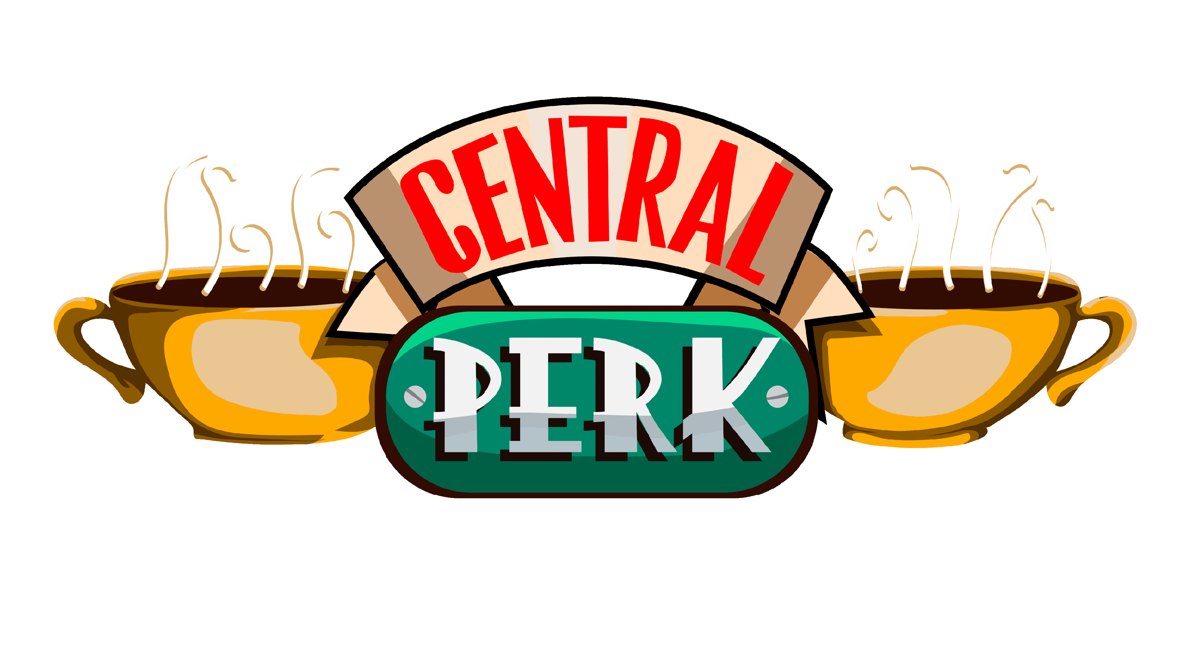
The “Central” part of the lettering on the primary Central Perk logo is set in a simple geometric handwritten font with square shapes of the characters. As for the “Perk” part, it uses a more Art-Decoish typeface, which looks somewhat similar to such fonts as Song And Dance JNL, or Changing Times JNL with significant modifications of the characters’ contours.
As for the color palette of the Central Perk visual identity, it is based on a combination of green, white and red, with some cream or brownish additions. Green is a very energetic color, which also symbolized balance and growth, while white is all about loyalty, and red here is for passion.