Clif Bar Logo
Clif Bar is a California-based American company that produces energy bars and drinks meant for athletic consumption. Their main product is naturally the Clif Bar itself – a nutritious bar originally made from nuts and protein additives. Now, there are many variations that include chocolate, caramel and other ingredients.
Meaning and History
The brand was created in 1992 by a former mountain hiker in California, United States. The very first product (that actually became a foundation of the brand itself) is a Clif Bar. That’s also how the brand got its name, because back then there was just this one type of bar. And ‘Clif’ obviously refers to cliffs – as in cliff-climbing.
1992 – today
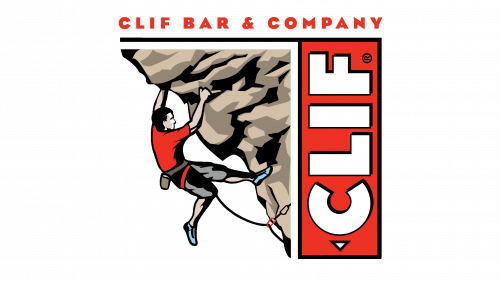
The initial logo featured a simplistic depiction of a man climbing the steep mountain cliff. There are many nuances, but it still looks like something out of a comic book. The main colors here are red, grey and pale brown. To the right, they’ve put a vertical red rectangle that had the word ‘Clif’ written over it.
They obviously mean for it to represent a bar, but in this location it also symbolizes vertical movement – the letters themselves are rotated counter-clockwise. And as for how they look – they also are slightly cartoonish: white with drawn black shading.
The black outline on the rectangle extends horizontally from its top. So, it actually encases the alpinist and the cliff. Over this extension, they’ve put the full name of the company: ‘Clif Bar & Company’ – in the same style as the other letters, but red.
Emblem and Symbol
The other emblem they use – primarily for labels and packages – is the same red rectangle with the word ‘Clif’ on it, except with a horizontally-placed word ‘Bar’ in the bottom. The style is the same, but the letters are much smaller than in the main word. Actually, they rotate the packages, so sometimes it’s the ‘Clif’ that’s placed normally.


