Fanta Logo
Fanta is a brand of orange-flavored soda owned by the Coca Cola Company. Over time, many flavor variations have been introduced, and the concept of drink shifted to just being juice-based and carbonated. Currently, it’s one of the most popular soft drinks in the world.
Meaning and History

The soda originated in Nazi Germany in 1940. The German branch of Coca Cola couldn’t get their hands on the Cola syrup because of the American embargo, which meant they had to improvise with what they had – orange byproducts and other residue components. The name comes from the German word for imagination – ‘Fantasie’.
1940 – 1955
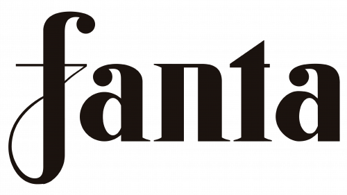
The first logo they introduced was just the brand name written in the Gothic-style serif letters. They were lowercase and completely black, which slightly goes against the original concept of a ‘bright, sweet soft drink’.
1962 – 1970

In 1962, they changed the environment to a brighter, blue rectangle with an arched top. The writing also shifted to a more blocky, yet uneven and slightly cartoonish look. The color, too, changed to white.
1970 – 1980

They played with the fonts again. The letters now became soft, but still somewhat childish. This time, however, they repainted them black and added three orange dots above the right line of ‘N’.
1980 – 1995

The 1980 logo uses most letters from the 1955 design, except for the ‘F’ – that one is taken from 1972 more-or-less. The color choice for this one was blue, and the orange dots up top were given more saturation and a brand new green leaf.
1995 – 1997

It’s the same design, but with a slightly paler shade of blue and a new approach to the ‘orange’ above. It’s now just two strokes of paint: a wide orange one and a narrow green one.
1997 – 2004

It’s the same painted ‘Fanta’, but rotated counter-clockwise by about 60 °C. The ‘orange’ part became a painted spiral behind the inscription, as well as a little green leaf (also painted on).
1997 – 2008

For 1997, they took the inscription design from before and styled it as a painted logo with sharper tips.
2000 – 2004
In 2000 Fanta introduced a new badge, based on the logo, created in 1997, but with more decorative details on the background. The lettering kept its style and colors, but got a white outline for each character, and the leaf was redrawn more vertically, and moved to above the space between the “T” and the “A”. As for the background, it got more solid orange parts, with gradient blurred swirl in the same palette.
2004 – 2008
It’s the same thing, but digitized and with more of everything on it. The orange behind in particular is now a square picture that looks much like juice.
2008 – 2010
 For the 2008 logo, they toned the perspective down and decreased the rotation. The letters changed design to a more bloated, inflated look, and the leaf became more nuanced and less of a single paint stroke.
2008 – 2016
This one is the 1997 logo without the orange background and with added perspective.
2010 – 2016
In 2010, they added the white outline to the letters and placed the big orange circle behind the main thing.
2016 – today
The new writing style they introduced in 2016 is rather inspired by the 1972 logo, but blockier and more like a comic book writing. This time, they colored the letters white and gave them a long purple underside (they look like 20th Century Fox logo here). The leaf was also given a brand new purple outline.
2017 – 2021
The redesign of 2017 has refined the previous badge, with the massive shadow of the logotype removed. The refreshed design featured a white outline logotype in the uppercase of a geometric sans-serif font, set against a light-orange roundel, and decorated by a green leaf in a blue outline, placed above the “N”,l and slanted to the left.
2023 – now
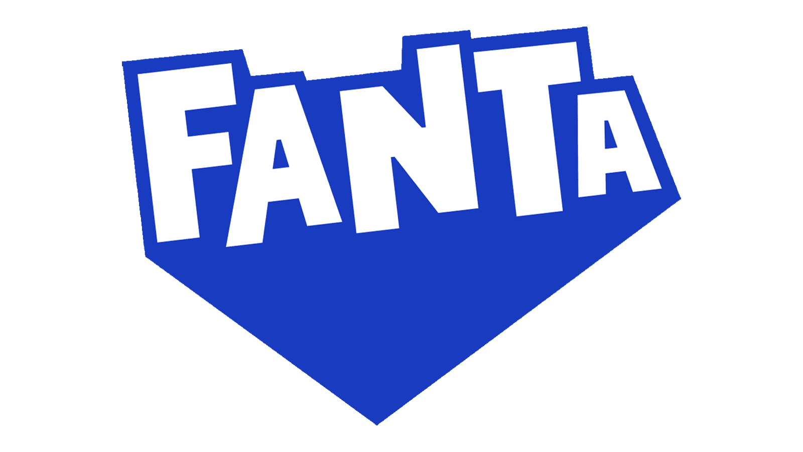
In 2023 Fanta introduced a modernized badge, executed in a very minimalistic style, but keeping the most recognizable element from several previous versions — the logotype. The new concept is based on a white uppercase inscription in the extra-bold geometric sans-serif font with jumping letters, heavily outlined in blue and white a solid blue shadow under the letters, making up a triangle pointing down. No other elements are there, and even the iconic green leaf was removed.
Emblem and Symbol
The logo is used almost unchanged the variations. However, the can emblems sometimes change the circle behind based of the flavor of the drink inside. For grape it’s purple, for cherry – red, and so forth. The newer 2016 logotypes don’t usually do that, but it was the common thing prior to that.
