Costa Coffee Logo
Costa Coffee is a chain of coffeehouses from Great Britain. At the moment, it’s second in size and profits only to Starbucks, although the rift is big enough still. Right now, they have branches on all habitable continents. What they sell is the usually assortment of coffee, tea and other drinks.
Meaning and History
The company was started in London in 1971 by two Italian brothers from the Costa family. As most Italian-run businesses, they decided to use their own family name in the making of the new brand. In 2019, they were bought by the Coca Cola Company, interestingly enough.
1971 – 1995
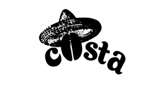
The initial logo featured a collection of lowercase letters that made up the word ‘Costa’. They were as if curved upwards and to the right. Neatly, the ‘o’ here is supplanted by an image of a coffee bean. The characters, the bean and the hay hat worn by the bean are completely black.
1995 – today
Since 1995, they instead used a dark red circle with lots of white additions. There were three coffee beans sectioned off in the middle by a thin white circle. Above this bit, they put the word ‘Costa’, and below was the word ‘Coffee’ – both written in a bold, soft typeface and curved to align with the circle’s own curvature.
The other visual elements include the words ‘since 1971’ written alongside the horizontal midline of the circle and the additional white circle around the written bits.
Emblem and Symbol
The other logo variations includes the same ‘Costa Coffee’ writing from the 1995 emblem, but written straight and in one line. The purple-red mix used in the circle is instead used for the rectangle that acts as the background. Actually, that’s just the most common variant. There are more positioning options.


