Disney Plus Logo
Disney+, aka Disney Plus – is a streaming service created by Disney to host the shows and movies created by the studios they own. It includes all the movies from the Star Wars universe, Pixar movies, Disney movies, and a lot of other content. Much of it is exclusive, and you’ll have to pay a small monthly subscription to enjoy it all.
Meaning and History
![]()
After Netflix turned out to be a popular and profitable venture, Disney decided to create its own library of cinematographic products. They removed all of the shows and movies they had on Netflix and instead put them all on Disney+. Officially, it launched back in 2019, but it hasn’t reached some countries yet.
2019
![]()
The original Disney + logo was introduced in 2019 and only stayed active for several months. It was a dark-blue iconic Disney signature, followed by the plus sign in the same color, and roofed by a thin arched line in gradients from light blue to the darkest tone on the right. The vertical bar of the plus is slightly arched to the right, supporting the main arched line and its shape.
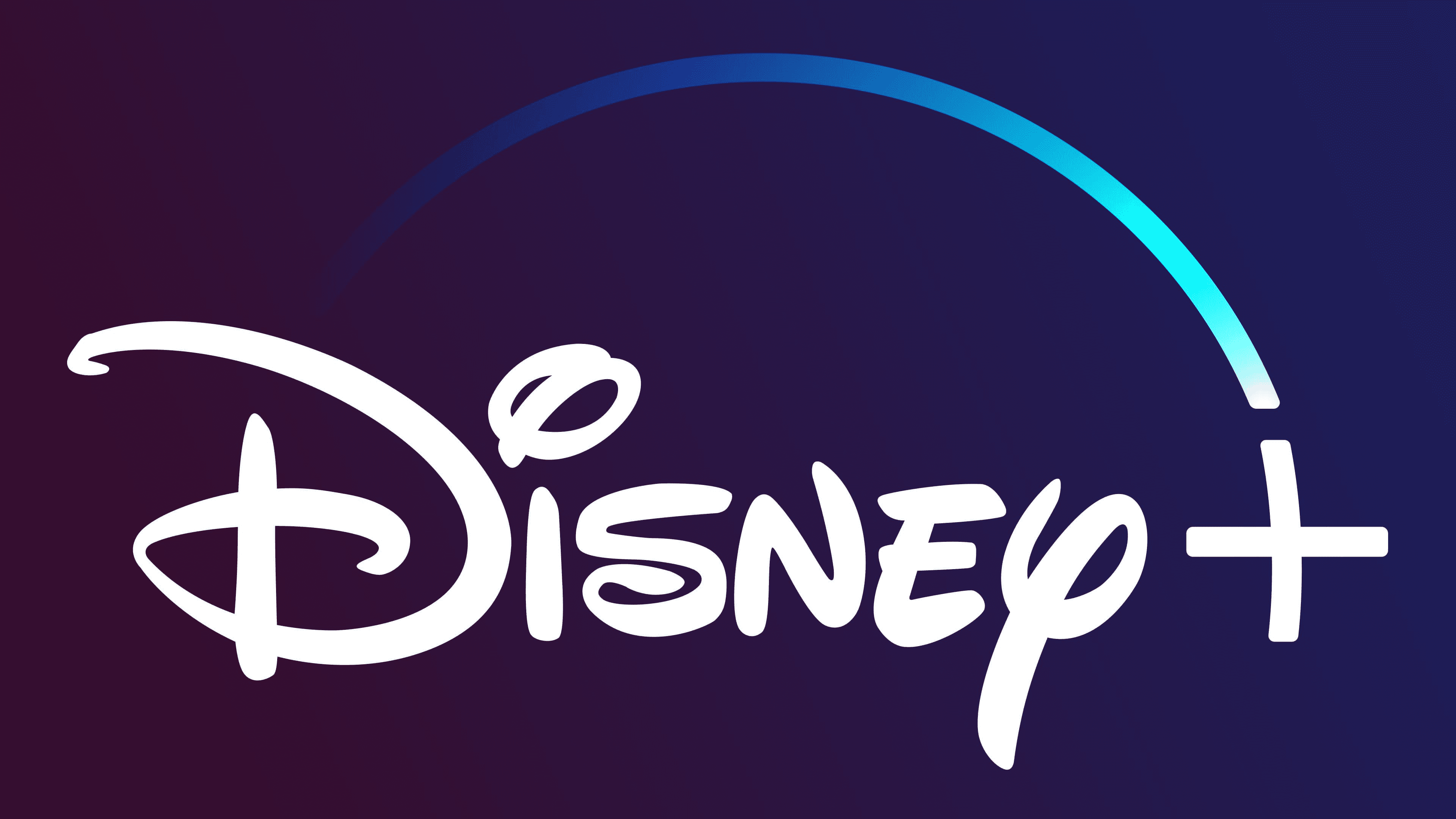
2019 – 2024
![]()
The Disney+ logo is obviously inspired by the Disney’s own logo. They basically took the standard design of the word ‘Disney’ off the official company logo and painted it dark blue. They included an arch-like line above the main logo. This is supposed to represent the falling star – a usual sight on Disney symbolic.
They added a gradient from paler blue to darker blue from left to right. The ‘+’ sign to the right of the writing was also colored dark blue. What’s more, they warped the vertical axel to look as if it continues the arch line, except they are severed.
2024 – Today
![]()
In 2024 the logo of the Disney Plus TV channel was slightly refined, and the only change, done to it, was about its color scheme. If the previous badge had the lettering with the plus-sign set in one shade, and the arched line was in bright gradients, the new concept simplifies the shades, drawing all three elements of the logo in one color, sea-green. It looks pretty unusual and makes the channel stand out in the list of its competitors.
Emblem and Symbol
The base coloring is blue with various hues to resemble the evening sky. This aesthetic has been used by Disney for a long time. However, the colors change a lot based on the current purpose. The interface of this service itself featured a white logotype, and it’s not uncommon to see it in black or other colors.


