Finlandia Logo
To achieve the heights of excellence, the Finish brand of vodka has overcome many obstacles. The external beauty of the bottle design and taste sophistication create an amazing harmony. What makes this vodka special is pure spring water and golden barley ripening in the cold north. When creating fruit varieties of the beverage, the manufacturer adds only natural extracts from berries and fruits, such as cranberries, raspberries, black currants, as well as lime, mango, grapefruit, and even coconut. Despite the international ownership, it’s still considered a Finnish-made vodka brand.
Meaning and History
![]()
The history of real Finnish vodka dates back to the end of the 19th century, and the trademark Finlandia was introduced in 1970. In the beginning, it was only small private production, but in 1920, it was bought by the state, which owned it until 2000. Success came gradually, but by 1993 Finlandia became one of the best-selling vodkas in the world. Since 2000, it has been owned by Finlandia Vodka Worldwide Ltd., which is a subsidiary of Brown-Forman, one of the largest spirits manufacturers in the world. The American company Brown-Forman lost $52 million on the depreciation of the Finlandia trademark, which left the Russian market due to the invasion of Ukraine in 2022 as it was one of its main markets. The trademark’s name, obviously, takes inspiration from a more Latinized version of the country’s English name.
What is Finlandia?
Finlandia is an iconic Finnish vodka made from local ingredients and with local technology. The brand is considered one of the higher-class vodkas, as are most vodka trademarks from this country, generally. It’s also famous for having numerous flavors in assortment – most notably, the berry ones.
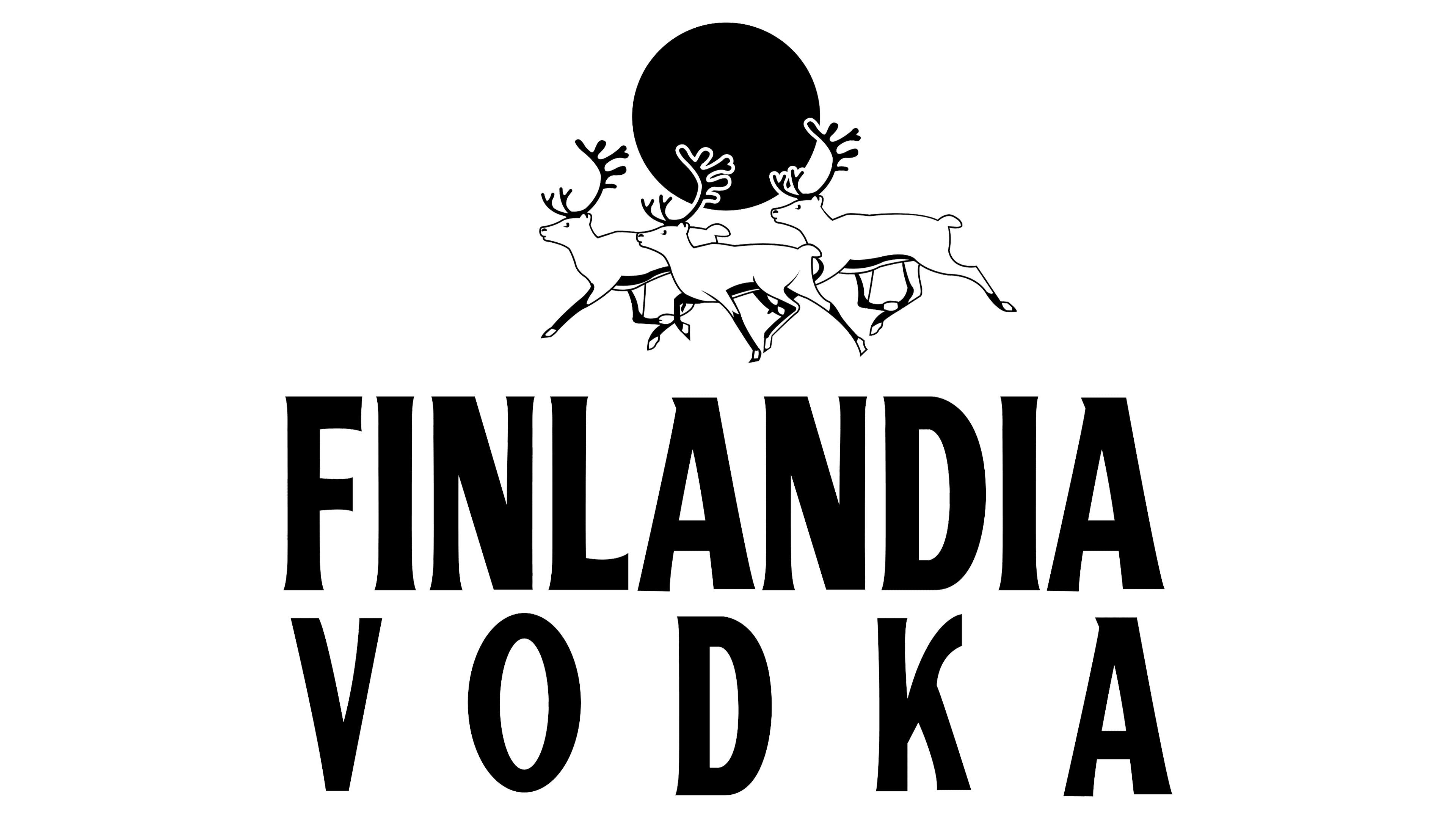
1970 – 1998
![]()
The central piece here is the name of the brand itself. This word is written in thin, tall, and geometric letters and occupies the central part of the logo. It is accompanied by the phrase “Vodka of Finland” written in all uppercase serif typeface directly below the main part. The other visual element commonly in use here is three reindeer galloping to the left in front of the red northern sun, which hangs low over the horizon. The color of choice is an off-white color, except for the sun and thin blue outline of the deer.
1998 – 2003
![]()
The logo was updated to reflect the colors of the country. The brand used dark blue for the name and changed the deer to white with blue, keeping the same shapes and font. In addition, it shortened the “Vodka of Finland” phrase to simply state “Vodka”. It was written using the same font as the main name only using smaller size letters and adding more spacing than what is used for the name.
2003 – 2011
![]()
The new color palette featured silver along with the red sun. The latter has changed to a half circle with a thin silver horizon line underneath it and deer being placed higher. Under the name, it stated “Vodka of Finland” again, but the font was delicate cursive writing with serifs and only the first letters being capitalized.
2011 – 2018
![]()
The company brought back the blue and used it for the company’s name as well as reindeer. The deer have not only changed their color but also turned around and were horn-fighting in front of the same round sun, except it’s higher up and smaller. The “Vodka of Finland” inscription was done using the same font as in the original one, except the letters were smaller and red to go with the red sun.
2018 – Today
![]()
The company updated its logo in 2018. It changed the dark blue color for a lighter shade of the same color. The sun, which was big again, has acquired a gradient that ranged from yellow to reddish-orange. The “Vodka of Finland” inscription was redone again. It was done using the same color and font as the name. To add more interest to the phrase, the company wrote
Font and Color
The dominant colors of the logo throughout the years were white, blue, and red. The first two colors are the colors of Finland, which shows that the brand wants to be closely associated with this country. These colors also symbolize ice, snow, and water, which are abundant in Finland. For several years, the company used silver, which can also be associated with sparkling snow and ice. The red color was used as a nice bright accent. The company has not changed the font used for the name of the company from its foundation. It is News Gothic Bold Condensed. For the inscription below, it used multiple fonts that closely resembled the one used for the main name.


