Google Duo Logo
Google Duo is a user-friendly video and voice calling application developed by Google. It’s known for its simplicity and reliability, functioning across various platforms including Android, iOS, and web browsers. Duo supports high-definition video calls, even on slower network connections, thanks to its efficient optimization. It features end-to-end encryption, ensuring privacy and security. Unique to Duo is the ‘Knock Knock’ function, allowing users to see live video of callers before answering. The app also offers features like group calls, video messages, and low-light mode. Its integration with other Google services enhances its utility, making it a popular choice for personal and casual communication.
Meaning and history
Google Duo, a notable venture in video communication technology, was unveiled by Google in 2016. Originating as part of Google’s broader initiative to revamp its messaging strategy, Duo was introduced alongside Allo, a messaging app. Unlike its sibling Allo, which was discontinued, Duo gained traction for its exclusive focus on video and voice calls.
Duo’s debut was marked by its simplicity and user-friendly interface, designed to work seamlessly across various platforms, including Android, iOS, and web browsers. It quickly distinguished itself with its high-definition video quality and low latency, which remained consistent even on slower networks due to its efficient optimization.
A standout feature at its launch was ‘Knock Knock’, allowing users to see a live video preview of the caller before answering, enhancing the call’s personal and engaging nature. This, along with its end-to-end encryption, positioned Duo as a secure and privacy-focused app, a critical factor in gaining user trust.
Over time, Google Duo evolved, introducing new features to enhance its usability. It expanded to support group calls, accommodating more participants, and introduced video messages for when contacts were unavailable, adding to its versatility. The low-light mode was another significant addition, improving video visibility in poorly lit environments.
Integration with other Google services like Google Assistant and linkage with a user’s Google account and phone number for easy contact syncing further increased its appeal. Despite the crowded market of video calling applications, Duo managed to carve out its niche, particularly appreciated for personal and casual communication.
Google Duo’s journey reflects Google’s adaptive approach in refining its communication tools, focusing on user needs and technological advancements. Its continued updates and features maintain its relevance in the dynamic landscape of digital communication.
What is Google Duo?
Google Duo is a video and voice calling app developed by Google, renowned for its simplicity and efficiency. It offers high-quality calls across various devices and platforms, highlighted by features like ‘Knock Knock’ previews and end-to-end encryption, ensuring both a user-friendly experience and heightened security.
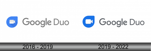
2016 – 2019
The logo presents a modernistic iconography, where a video camera symbol is encapsulated within a blue speech bubble, itself nested inside a shield-like shape. Adjacent to the icon, the Google Duo wordmark is typeset in Google’s proprietary font, featuring soft, rounded characters that convey a friendly and accessible demeanor. The color palette is minimalist, with the iconic Google blue providing a touch of both professionalism and playfulness, echoing the app’s balance between efficient communication and a warm user experience. The overall design encapsulates Google’s signature aesthetic of simplicity and functionality.
2019 – 2022
In this iteration of the Google Duo logo, the blue hue of the speech bubble has a more vibrant tone, and the camera icon within is stylized with a minimalist approach. The wordmark retains the familiar Google font but is grayer, creating a subtle contrast with the icon’s bold color. The spacing between the characters in “Google Duo” appears more balanced, providing a neat and organized look. The simplicity of the design reflects a modern aesthetic, resonating with the app’s streamlined functionality. This logo maintains Google’s branding consistency while emphasizing Duo’s identity as a straightforward, reliable communication tool.


