HBO Logo
When studying the American market for cable and satellite TV channels, one cannot help but pay attention to HBO. This is a company with a wide network of subsidiaries in dozens of countries around the world that broadcasts its own TV channels on cable and satellite. In addition to television broadcasting, HBO provides many secondary media services. Actually, HBO is not an independent standalone company, but just one division of another American media giant, Warner Media.
Meaning and History

The oldest paid TV channel, HBO, went on the air in 1972. The year before, Charles Dolan, the head of the first urban underground cable television system in the United States, came to the Time-Life Corporation with an idea for a new cable television channel. This idea was not approved by the public, but after an attractive offer, half changed their mind. About 10 years later, HBO became a television network. Home Box Office was a work-in-progress name, but due to a deadline, Time-Life decided to still go on the air and later change it to something else. However, this never happened. The only thing is that it was later shortened to HBO.
What is HBO?
Home Box Office is an American cable television channel that is part of the Time Warner media corporation. Over 40 million people watch HBO in the US alone. The company’s divisions are constantly represented in more than 50 countries of the world, and products are purchased by over one hundred fifty countries.
1972 – 1973
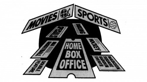
The very first logo for the Home Box Office company was created in 1972, and composed of a graphical representation of the brand name, executed in a black, gray, and white color palette. The concept was built around the image of a house silhouette, formed by several tickets, “flying” on a solid black background.
1973

The redesign of 1973 has simplified the HBO logo, drawing a white silhouette of a house on a striped black and white background, with the road to the door replaced by an enlarged ticket with the “Home Box Office” lettering inscribed on it in three levels. The badge was only active for several months.
1973 – 1975
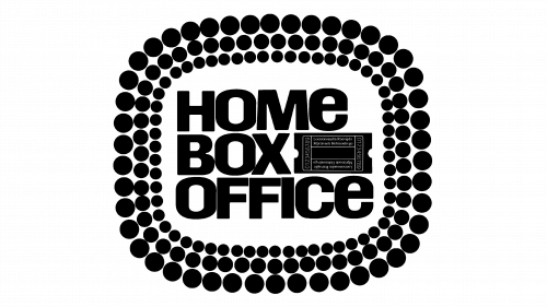
The name of the channel, written in three lines, became the center of a logo for a new channel. It was done using a black thick Westinghouse font. Next to the word “Box” a ticket stub black and white image was added. It filled the otherwise empty space and was in line with the last word. It was framed with three rows of marquee light, which was also done in black. Each row had a different size and the shape of the outline resembled a TV screen.
1975 – 1981
Although the original name was not changed, the logo has been updated. This time it was a very simple abbreviation of the name done in uppercase, thick letters. Letters “H” and “B” are set right next to each other with a very thin, straight white line. The letter “O” is bold thanks to a filled circle in the center with a thin white outline. It is slightly overlapping the previous letter.
1980 – Today
A modified version of the logo was presented in 1980. The wordmark was still black in color 5uand done using the same font. The only difference was that the letter “O” was standing alone and only touched the “B”. The black circle inside of it got smaller, which made the white outline thicker. The space between “H” and “B” also got wider. It maintained a very classic and professional feel and, at the same time, had a modern look.
