Illy Logo
Illy (aka Illycaffe) is a company from Italy that mostly produces coffee as beans or ground. They are particularly celebrated for selling espresso and espresso-oriented products, as well as a large chain of cafes where one could buy different varieties of this beverage at a moderate price and high quality.
Meaning and History
The company was started in 1933 by one Francesco Illy, a Hungary-born entrepreneur. He moved to Italy and, like all firms in this country, decided to name it after himself. At the moment, Illy is the leader of the international espresso production, as well as one of the biggest coffee-oriented brands worldwide.
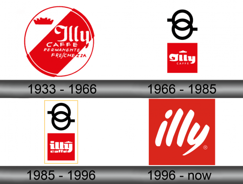
1933 – 1966
The first logo displayed a white circular shape pierced diagonally by a thick red bar and confined by the ring of the same color. On the left remaining white space they depicted a red crown; while the center was occupied by white (mostly) words ‘Illy Caffee Permanente Freschezza’. The last two translate to ‘Permanent Freshness’.
Parts of this writing: the last three letters of ‘freschezza’ and a tip of the last letter in ‘Illy’ were cut off and so had to be colored red for contrast. This genuinely reduced comprehensiveness but the logo still was in use until 1966.
1966 – 1985
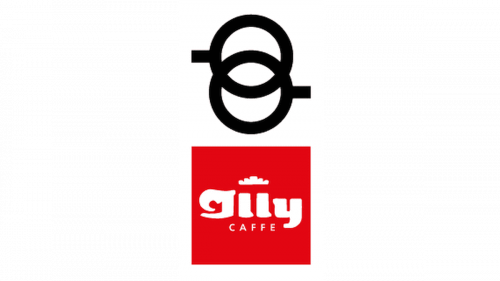
In 1966, they switched over to a more comprehensive design that consisted of two parts: a red square and a monochrome emblem above.
The square held the company’s name of ‘Illy Caffe’ written in white letters (the first much larger and with a more sophisticated font) and a white crown taken from the previous design. The black emblem above, meanwhile, depicted two rings locked into one another, each with a handle on its side. These are likely espresso caps.
1985 – 1996
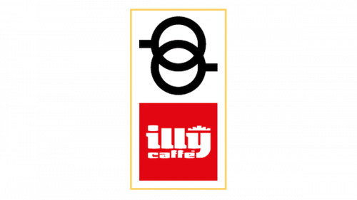
The 1985 logo saw few changes. Mainly, they surrounded the entire thing with a thin yellow rectangle. Also, they slightly repositioned the innards of square. Both writing parts obtained a new blocky look, and the crown shifted to the right.
1996 – today
That’s the logo most people are familiar with. It’s a red square, darker and less saturated than its counterparts from before. The only thing inside is the word ‘Illy’ written in white strokes, all letters lowercase.
Emblem and Symbol
Unlike the previous design, the 1996 logo is featured on almost everything that Illy produces or owns – from packages to cups to exteriors of buildings. It’s a universal logo that can be easily read regardless of the surroundings. The previous logotypes were mostly just used to decorate the cafes and exteriors of other buildings.


