Iron Man Logo
Iron Man is an American media franchise created by Stan Lee, Larry Lieber, Don Heck, and Jack Kirby. It describes the tale of a billionaire Tony Stark, who devised a high-tech armor suit equipped with rocket engines, weapons, and various devices. Using this costume, Iron Man guards the world, beating evildoers. The franchise has toys, comic books, animated movies, series, and blockbusters that found numerous fans across the world.
Meaning and history
![]()
Iron Man was brought to the public in 1963 when Marvel Comics released Tales of Suspense #39. The personage appeared thanks to four professionals at the issue production board: author and editor Stan Lee, scripter Larry Lieber, and artists Don Heck and Jack Kirby. In 1968, the character was materialized in a separate storyline which started with Iron Man #1 comic book. This book reveals the character, telling the readers more about his past.
Tony Stark is a rich businessman-scientist who develops various high-tech gadgets. During a kidnap, he gets heavily injured in the chest. When his antagonists try to force him to create a weapon, able to bring massive suffering and destruction, Stark instead constructs a defensive suit to rescue himself and flee from the captors. Afterward, he improves the suit, adding missiles, guns, and additional appliances, and uses it to crash bad guys across the world.
Iron Man’s image changed throughout the following books. The authors designed new armor and put Stark in new situations that revealed his personality. Probably, this led the comic franchise to worldwide popularity and commercial success.
What is Iron Man?
Iron Man is a superheroic franchise, performed in comic books, movies, animations, and toys. It was launched in 1968 with a comic book, named Iron Man #1. It describes the story of Tony Stark, a moneyed entrepreneur who built a defensive armor suit that has a full arsenal of weapons, rockets, and apparatuses. Stark, bearing the nickname Iron Man, utilizes his invention to defend people and battle against evil.
1968 – 1969
![]()
The first issue of Iron Man comics showed the capitalized nameplate on its poster. It was written in heavy red letters, each having a black outline. Above the lettering, there was the caption ‘the invincible’, also in all capitals.
1969 – 1984
![]()
Later, they changed the logo style completely a tradition that continues down to the latter logotypes. In this redesign, the nameplate has a 3D style with a red front part, while all other sides were blue. The font of the inscription ‘the invincible’ remained untouched, but it was repainted blue.
1984 – 1985
![]()
The 1984 redesign shows the white nameplate with dots on every letter. Each character is also contoured black, which adds a shadow to the whole inscription. They put it on the background with many yellow and orange strokes. To the left of the name caption, they drew a white rectangle with the red and yellow Iron Man, flying up somewhere and keeping a closed fist over his head. Above the silhouette, there was the ‘Marvel’ word shown in all capitals.
1985 – 1987
![]()
Then, they changed the inscription style again. This time, its font was renewed. All symbols were volumetric capitals, and they were shown from a slope. The letterforms were narrower and wider than in the previous logotypes. Their background was a black rectangle with some strokes.
1987 – 1996
![]()
The next redesign showed the 3D letters with a metallic style. All letters looked like smelted parts due to their angular forms and bolts on them. The front sides of the letters were bright yellow, and they were contoured silver. All other sectors were painted blue. This color scheme contrasted brightly with the black background.
1996 – 1997
![]()
The 1996 logotype depicts the letters reminding the metal parts. Every character was drawn in a new gradient gray and white coloring and contoured bold black.
1997 – 2002
![]()
The lettering ‘the invincible’ was returned in the 1997 logotype. It was a specific insignia showing the name in bright yellow capitals with rounded angles. The symbols of the word ‘man’ were joined together. Moreover, there were red bars, connected by dots, on every character. Finally, the nameplate had a dark blue shadow, cast on the gradient green and white background.
2002 – 2009
![]()
The following logo showed bold beige letters with multiple lines on them. Due to this, they looked like micro schemes with a slim red outline having a shining effect. The letterforms had a custom typeface with a futuristic incline.
2009 – 2012
![]()
For three years, they utilized black lettering with a simpler capitalized sans-serif typeface, used both for the lettering ‘the invisible’ and the name of the franchise.
2012 – 2014
![]()
The solid-painted logotype was followed by a multicolored version in 2012. As always, it showed bold uppercase characters placed close to one another. This one had a smooth cartoonish appearance with angular forms. The inscription used a blue rectangle as a background.
2014 – today
![]()
The latter logotype depicts the wordmark, redesigned once more. Every letter is a bold capital of a custom typeface. The character ‘o’ looks like an octagon with something like a growing fire inside it. The symbol ‘m’ has tilted diagonal bars and a sharpened central bit, so the lower tip of the letter comes beyond the inscription’s limits.
Font
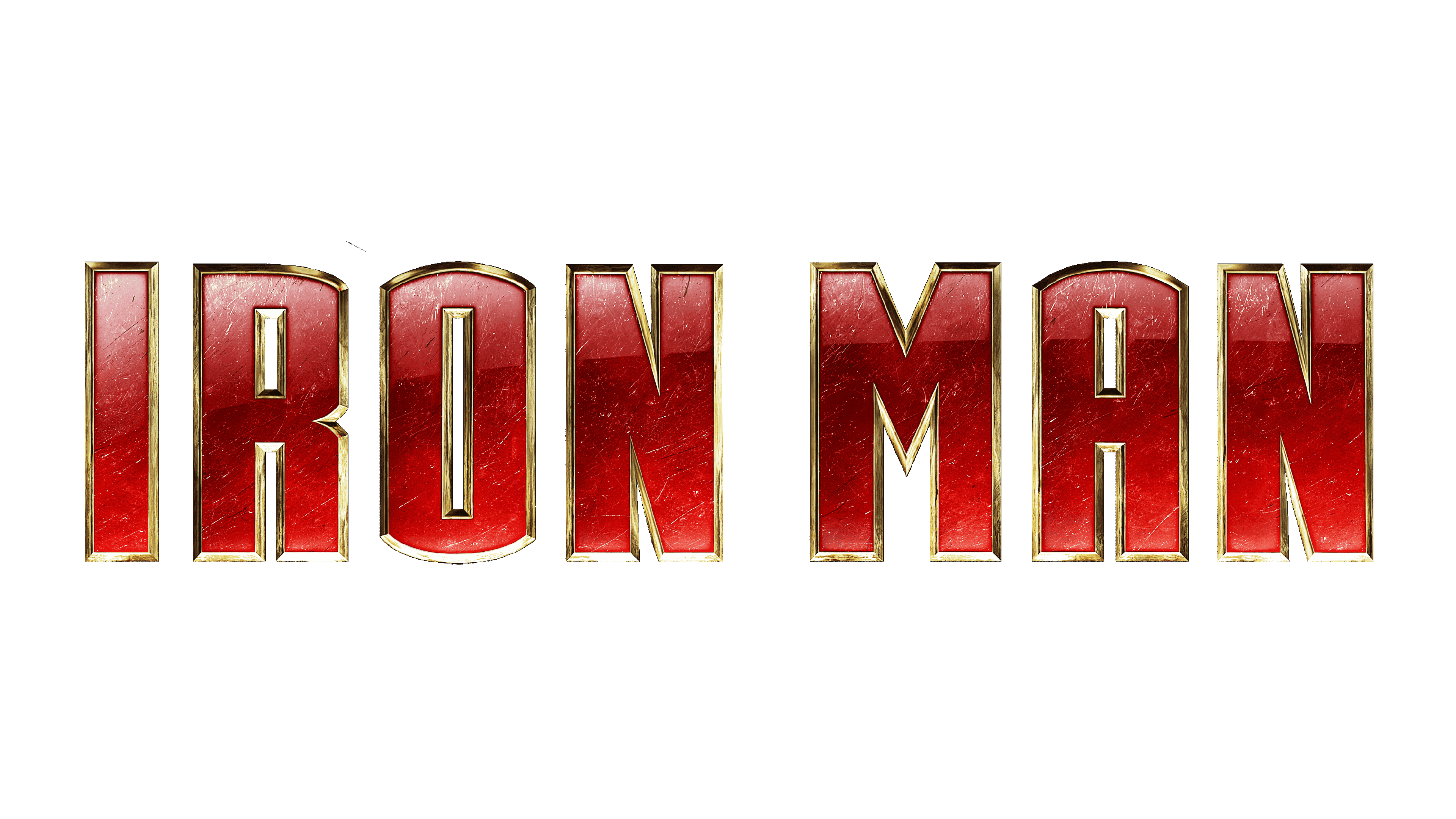
The latest wordmark shows the bold capitals in a futuristic script, designed especially for the Iron Man brand. It has many sharpened or angular forms. Most of the characters are placed very close or even stand over one another.
Color
The latest color code of Iron Man contains two colors, used to draw a bigger part of the Stark’s armor suits during the last several decades – yellow and red. Red stands for the lettering, adding more power to the logo, while yellow is used to represent the contour of the letters. The flame inside the ‘o’ shines yellow. Finally, the whole inscription is bordered by a very slim black contour.


