Los Angeles Angels Logo
The Los Angeles Angels, often referred to simply as the Angels, are a professional baseball team based in Anaheim, California. Competing in Major League Baseball (MLB) as a member of the American League (AL) West division, the Angels have made their mark in the sport since their inception in 1961. Their home games unfold at the Angel Stadium, a site echoing with the echoes of numerous iconic plays and legendary athletes. Over the years, the team has showcased formidable talent and demonstrated a tenacious spirit, earning accolades and loyal fan support. With a rich history and an unwavering commitment to excellence, the Angels remain a crucial fixture in the MLB landscape.
Meaning and history
The Los Angeles Angels, an esteemed Major League Baseball (MLB) team, have their roots set in 1961, marking their entrance as an expansion team. Initially named “Los Angeles Angels,” they’ve undergone several name changes, including the “California Angels” and “Anaheim Angels,” before settling on “Los Angeles Angels of Anaheim” in 2005.
The early decades saw fluctuating performances, with the team often falling short of playoff successes. However, their fortunes started shifting in the late ’70s and ’80s, leading to several playoff appearances. The ’90s, though challenging, set the stage for one of the club’s most significant moments.
In 2002, under the stewardship of manager Mike Scioscia, the Angels clinched their first and only World Series title, defeating the San Francisco Giants in a gripping seven-game series. This victory cemented their place in baseball lore.
Angel Stadium, their home since 1966, has witnessed the rise of several Angels’ legends, including Nolan Ryan, Rod Carew, and Mike Trout. Trout, in particular, has been a modern-day icon for the Angels, accumulating multiple MVP awards and setting numerous records.
Over the years, the Angels have experienced highs and lows, marked by iconic plays, standout athletes, and memorable moments. Their relentless pursuit of excellence and resilience in the face of challenges has endeared them to fans and cemented their legacy in MLB history.
1961 – 1964
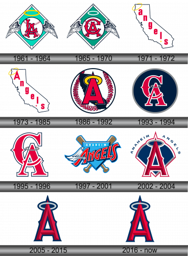
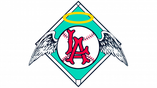
Established in 1961, the Los Angeles Angels quickly unveiled their distinctive emblem. Featuring a teal diamond backdrop, bordered in pristine white, the logo centers around a crimson and white winged baseball. Atop this ball hovers a radiant golden halo, symbolizing divinity and excellence. Encased within the ball, the initials “LA” stand prominently, paying homage to the vibrant city of Los Angeles from which the team hails. This blend of elements is not just a symbol; it’s an ode to the city’s passion and the sport’s timeless spirit. The design effortlessly marries tradition with modernity, making it a lasting representation of the club’s identity.
1965 – 1970
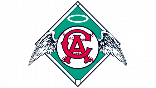
Under the new moniker “California Angels”, the club introduced a slightly modified emblem, drawing inspiration from its earlier design. The formerly turquoise diamond subtly transformed into a shade of green, adding a fresh twist. The radiant halo, previously golden, transitioned to a pure white hue, symbolizing clarity and purity. Naturally, the initials showcased within the emblem shifted from “LA” to “CA”, reflecting their new identity. These deliberate changes, while retaining the essence of the original design, represent the team’s evolution and dedication to staying current, all while acknowledging and preserving their rich heritage and connection to the state of California.
1971 – 1972
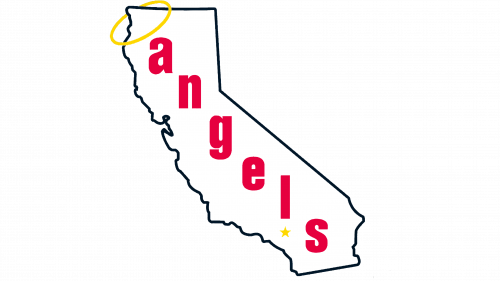
In 1971, the club underwent a significant transformation of its emblem. The contemporary design now features California’s silhouette in a prominent white shade. Across this state outline, the term “angels” is inscribed in a vibrant red hue, positioned at an angle. Hovering over the lowercase “a,” a shimmering golden halo can be seen, appearing as if it’s anchored to California’s border. Beneath the character “l,” a tiny yellow star shines, pinpointing Anaheim’s exact position. This reimagined logo not only emphasizes the team’s connection to their home state but also subtly integrates elements that symbolize their identity, heritage, and regional pride. The golden halo and the star serve as symbolic markers, emphasizing the club’s name and its geographic roots, making the emblem a true reflection of its essence.
1973 – 1985
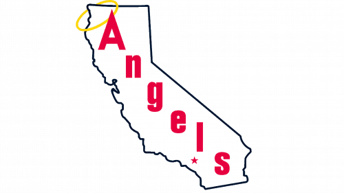
In 1973, the club embarked on a journey to reinvent their emblem, introducing various modifications to refresh its visual appeal. The previously diminutive “a” underwent a transformation, evolving into a more pronounced and dominant character. Additionally, the once yellow star, which proudly stood as a representation of Anaheim, was given a new vibrant red hue, enhancing its significance. This was not just a simple design alteration; it was a bold statement of evolution, indicating the club’s adaptability and desire to resonate more profoundly with its audience. By adjusting even minor elements, such as the color of a star or the size of a letter, they showcased their attention to detail and their commitment to creating an emblem that truly encapsulated the spirit and essence of the club and the city it represents. Such thoughtful changes underscore the dynamic relationship between a team and its brand identity, reflecting growth and progression over time.
1986 – 1992
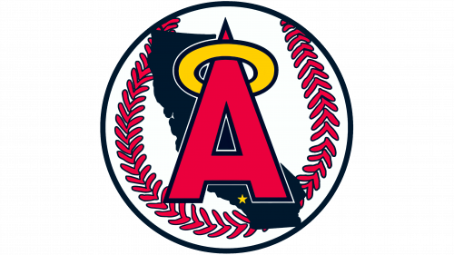
The club’s quintessential emblem showcased a bold combination of colors and symbols. Dominating its core was a striking baseball painted in vivid shades of red and white. Centered within this sphere, a prominent red “A” stood tall, demanding attention. Hovering just above this letter, a luminescent yellow halo added a touch of sanctity. In a subtle yet poignant manner, the backdrop featured a soft black silhouette of California, grounding the design in its geographical roots. Almost hidden, yet essential to the narrative, a faint yellow star nestled beneath the “A” quietly shone, paying homage to the team’s home — the vibrant city of Anaheim. This design, with its intricate details and thoughtful placements, was more than just a logo; it narrated a story of pride, location, and heritage, weaving the club’s identity with that of its beloved hometown.
1993 – 1994
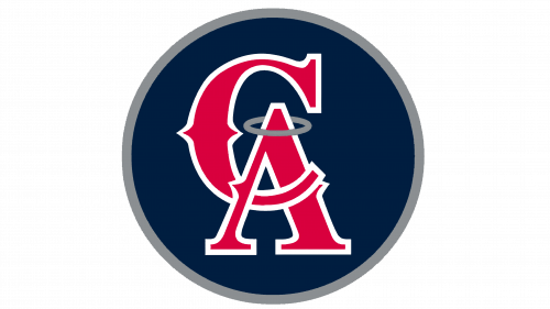
In 1993, drawing inspiration from yesteryears, the club made a conscious choice to revisit the design philosophy of the 1965 emblem where the abbreviation “SA” had once been prominent. Central to this renewed logo was a classic, deep blue circle, framed exquisitely by a gleaming silver border. Dominating this circular space were two bold red characters, “CA”, meticulously outlined in pristine white, signifying the club’s identity. Hovering above the “A”, a subtle gray halo was artfully sketched, adding an ethereal touch. This reimagined design was more than a mere nod to the past; it intertwined legacy with modernity. Every element, from the choice of colors to the placement of letters, was a deliberate decision, aiming to encapsulate the club’s rich history while catering to contemporary aesthetics. It stood as a testament to the club’s journey and its commitment to embracing both its roots and the ever-evolving world of design.
1995 – 1996
In the latest emblematic transformation, the club chose to streamline their design, letting go of certain elements. The familiar blue circle, previously adorned with a shimmering silver border, was notably absent in this iteration. What remained as the centerpiece were the striking red letters, “CA.” These characters, previously standing boldly on their own, were now accentuated with a delicate dark blue contour. This minimalistic approach showcased the club’s penchant for evolving aesthetics and embracing change. By focusing solely on the “CA” and refining its edges, the logo took on a modern, crisp look. Such adjustments, though seemingly subtle, highlighted the club’s adaptability and vision, as they effortlessly fused tradition with contemporary design, making a clear statement about the direction in which the club’s branding journey was headed.
1997 – 2001
With a revamped primary emblem, the team also heralded a shift in their identity, adopting the name Anaheim Angels. The centerpiece of this fresh design was a deep blue triangular backdrop, which subtly showcased a pair of intersecting brown baseball bats. Elegantly superimposed on this triangle was the word “Angels,” rendered in vibrant red letters. Enhancing its visual allure, a pristine white wing gracefully extended from the side of the letter “A,” symbolizing the celestial nature of the team’s moniker. Additionally, paying homage to the team’s home, the city’s name was thoughtfully incorporated. It was delicately inscribed in petite white characters, harmoniously resting against the blue triangular canvas. This reinvented emblem was a synthesis of tradition and innovation, adeptly capturing the spirit of the team and its deep-rooted connection to Anaheim. It was a visual testament to the club’s evolution and their commitment to representing their city with pride.
2002 – 2004
The emblem’s design has undergone a transformation, reflecting a blend of contemporary elegance and defined precision. Set against a backdrop of a deep blue diamond, a bold red “A” stands out, acting as a tribute to the city of Anaheim. Crowning this character, a nuanced shade of black-gray forms a halo, adding a touch of mystique. Framing the entire composition, a slender red border accentuates its distinctive shape. Arching gracefully above the design is the inscription “Anaheim Angels,” encapsulating the team’s identity in a semicircular arrangement. This renewed visual representation not only captures the essence of the team’s roots but also resonates with the modern aesthetics of design, emphasizing clarity, minimalism, and a keen attention to detail. It’s a testament to how the club effortlessly weaves its rich heritage with the evolving trends of the design world.
2005 – 2015
In 2005, the club made a pivotal decision to revert to the name “Los Angeles Angels,” accompanied by a deliberate shift in their logo’s concept. The transformation was marked by the removal of the diamond backdrop, leaving behind the substantial red letter “A” as the focal point. This emblem was meticulously crafted using the Bruce Double Pica font, lending it an air of sophistication and timelessness. Notably, the letter “A” was given newfound depth and dimension through the addition of dark shadows and a dark blue outline, enhancing its visual impact.
Consistent with the prior design, a gray halo adorned the letter’s peak, elegantly encircled by a dark blue outline. This refined logo exuded an understated yet powerful aesthetic, aligning with the club’s heritage while embracing a more contemporary and streamlined approach to branding. The deliberate choices in font, shading, and outlining showcased the club’s commitment to striking a balance between tradition and modernity, making a strong statement about their identity within the evolving landscape of logo design.
2016 – Today
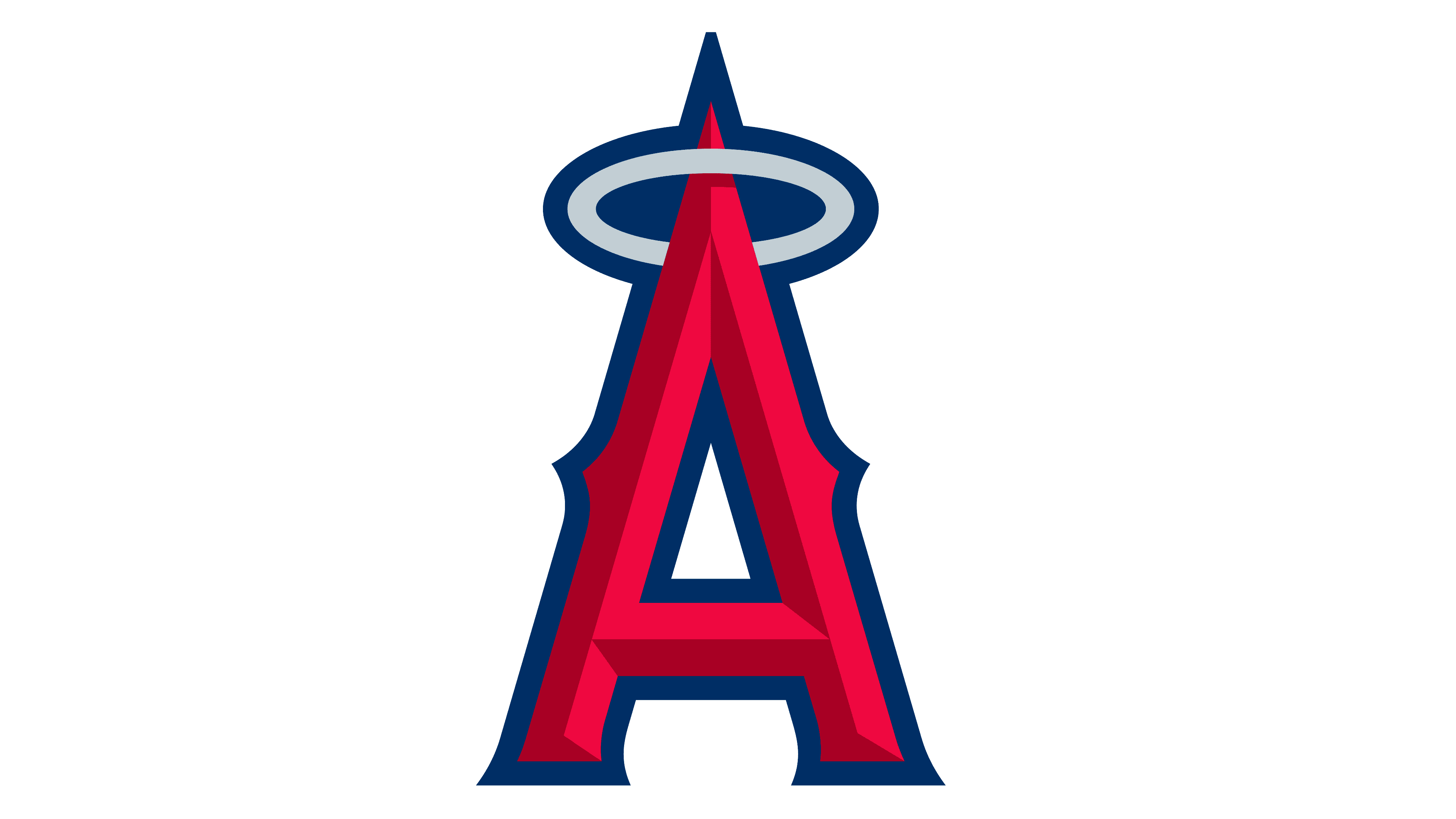
The current rendition of the emblem remains a faithful iteration of its predecessor, originating from the period between 2005 and 2015. This particular design emerged in tandem with the adoption of a more concise team name. Remarkably, it has remained unchanged since its inception, owing to its exceptional adherence to key principles: contemporaneity, simplicity, and communicative efficacy. Despite its minimalist approach, it masterfully conveys a wealth of information.
At its core, the emblem features a prominent and imposing “A.” Crowned atop this substantial character is a halo, serving as a subtle nod to the team’s angelic association. In the central segment of the symbol, one can discern sharp accents reminiscent of Old English typography, adding a touch of historical flair. Delicate notches grace the lower portion. To define the “A” and accentuate its contours, a dark blue border envelops the entire letter in a cohesive embrace. This enduring logo exemplifies the club’s ability to communicate its identity with precision, balance, and a harmonious blend of elements, standing as a testament to its heritage and dedication to timeless design principles.
