Minute Maid Logo
Minute Maid is an international conglomerate of brands that sell juices and juice concentrates. The company originally started in United States, although later it became selling brands to virtually all the countries in the world, often under different brands. The company is owned by Coca Cola.
Meaning and History
The brand was originally supposed to be a juice powder that could be rehydrated at anytime to provide American soldiers with a ready source of juice within a minute (hence the name). It happened in 1945, and the war was over before they could sell anything to the army, which is why they refocused on the civilians.
1945 – 1993
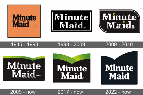
The original logo was a dark orange square with a thin black outline and the brand name written in black letters in the middle. The orange was certainly meant to represent the orange juice, which was their original focus. The letters font was a simple serif typeface with thick lines.
1993 – 2009
In 1993, the square was supplanted with a black rectangle. The middle area was sectioned off with a thin silver line, and inside there was the brand name itself. It was largely the same approach: serif letters written in two lines, but this time they were silver and rather wider than before.
2009 – 2010
In 2009, the rectangle changed form to a leaf-like figure. It was still black and had a white line alongside its edges. The text was still there; almost exactly as we left it, with the exception of two green leaves which now replaced the dots over ‘I’s.
2009 – today
Another 2009 variation instead depicted two black hills with foliage on them. Basically just two curves with green lines along the edges. The hills then extended into a tall black space where. The text nestled there like on the previous designs. The font changed very little.
2017 – today
In 2017, they basically extended the black space even further down and made the hills even curvier, and that’s about it.
2022 – now

The logo was redrawn to have a modern and more timeless appearance. The unique element of the logo, though, was preserved. The designers kept the curves at the top of the base, slightly changing their shape and removing the green color. The name is printed using a very similar font but with rounded serifs. The letters looked taller and the closest similar typeface would be Boardwalk Condensed or Appetite Pro Rounded Medium.


