Myspace Logo
Myspace is a social networking platform. Tom Anderson, Chris DeWolfe, and Jon Hart founded it. They created this platform in Beverly Hills, California. It aimed to connect people through personal profiles, blogs, groups, photos, and music.
Meaning and history
Myspace emerged as a digital haven for social interaction and music sharing. Conceived by Tom Anderson and Chris DeWolfe, it began its virtual life in 2003. Initially, it attracted a wave of individuals, eager for online expression and connectivity. Its layout allowed personalized profiles, fostering a sense of ownership among users. Bands and artists found a podium in Myspace, propelling the platform to a cult status within the music scene. The site’s zenith came swiftly, as it overtook other networks in user numbers. However, the winds shifted with the arrival of competitors like Facebook, leading to Myspace’s gradual decline in popularity. Efforts to reinvent it took shape through redesigns, emphasizing music and creative content. Despite eclipsed by giants, Myspace endures, a nostalgic echo of the early social web.
What is Myspace?
Myspace is a social media site that facilitates interaction through personal and musician profiles. Users can post blogs, join groups, share music, and explore new content. It primarily serves as a platform for emerging musicians.
2003 – 2004
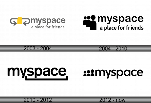
The logo presents a minimalist design, featuring a gray color scheme. Two elongated, horizontal ovals intersect, suggesting connectivity. A central, bright yellow rectangle symbolizes a shared space. The brand name “myspace” sits alongside, with a tagline “a place for friends” in a simple, sans-serif font. The overall look evokes ideas of linkage and community, resonating with the platform’s social networking essence.
2004 – 2010
The updated logo showcases three figures with round heads and a shared body, connoting unity and community. This iconography precedes the brand name “myspace” in a casual, rounded font, emphasizing approachability. Below, “a place for friends” is written, reaffirming its purpose as a social network. The entire logo uses a stark black color, imparting a classic and straightforward aesthetic.
2010 – 2012
The iteration of the logo simplifies to just the brand name, “myspace”, in a robust, sans-serif font. Below it is a thick line emphasizing the word “space”. Stripped of any graphic elements or taglines, the design opts for boldness and simplicity, reflecting a modernized approach to the brand’s identity. The black color remains, ensuring visual continuity and a timeless feel.
2012 – Today
In this evolution, the logo reintroduces a graphic element of three figures with circular heads. This symbolizes a network of individuals, a return to the community focus of the platform. The figures are positioned to the left of the “myspace” text, suggesting integration and social connection. The font remains sans-serif, maintaining the modern vibe. The underline has been removed, indicating a shift from a place to a collective of people. The color is consistently black, signifying strength and clarity.


