Oakley Logo
Oakley, currently a subsidiary of Luxottica Group, specializes in the design and manufacturing of sports performance equipment and lifestyle pieces, most notably sunglasses, goggles, and apparel. The brand is recognized globally and continues to be a favored choice among athletes and lifestyle users alike. It primarily operates in the sport and lifestyle market segments, catering to a diverse consumer base seeking high-performance and innovative products. Oakley remains at the forefront of technology and design innovation in the eyewear industry, maintaining a significant presence in international markets.
Meaning and history
Oakley, founded in 1975 by James Jannard, started with a $300 investment, initially focusing on selling motorcycle grips at motocross events. The company’s name originates from Jim’s dog, an English Setter named Oakley Anne. Oakley transitioned to eyewear in 1980, launching its first pair of sports goggles, and quickly gained prominence for its innovative design and technology.
The pivotal moment came in 2007 when Luxottica, the world’s largest eyewear company, acquired Oakley for $2.1 billion, marking a significant transition in Oakley’s ownership and operational structure. Under Luxottica’s guidance, Oakley enhanced its global reach, fortifying its status in the eyewear and sports accessories industry.
Throughout its journey, Oakley has been synonymous with innovation and high-quality products, creating state-of-the-art eyewear, including sunglasses and goggles, with athletes and sports enthusiasts as its core audience. The brand has consistently focused on delivering performance-oriented and technologically advanced products, maintaining its reputation in design innovation and quality, even amid changes in ownership and market evolution.
Even with alterations in production methods and ownership, Oakley’s commitment to quality and innovation remains its guiding principle, ensuring its continued relevance and success in the competitive eyewear market. The company, now part of the vast Luxottica portfolio, continues to be a leading player in the industry, evolving its products to meet the dynamic needs of consumers worldwide.
1975 – 1993
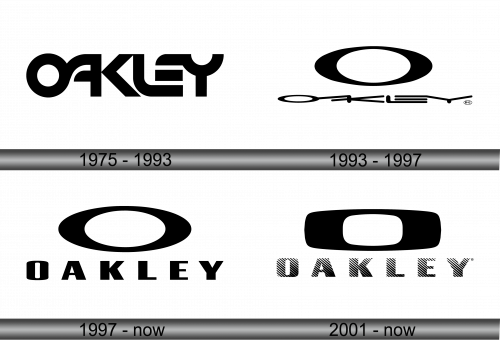
In the initial logo conception, the creative minds centered their attention on the interplay of characters and their inherent meanings, opting to incorporate solely the word “Oakley.” The design was conceived with a novel approach, intertwining neighboring elements. The end product is a symbol bifurcated into two components: “oak” and “ley,” separated by a delineating boundary. Meanwhile, the remaining characters are amalgamated into three segments. The letter “O” seamlessly transitions into “A,” whose right boundary also forms the base for “K.” A comparable approach is observed with the subsequent characters: “L” acts as the base for “E,” which is conjoined at its top with “Y.”
This inaugural design is reflective of a thoughtful and innovative approach to visual branding, emphasizing the fluidity and connectivity of characters, each serving a dual purpose in the formation of others, illustrating a sense of unity and coherence in the brand identity. The clever integration and overlapping of letters depict the brand’s commitment to originality and uniqueness, laying the foundation for its distinctive presence in the market. The meticulous arrangement of letters not only reflects the brand’s attention to detail but also its pursuit to convey its essence through innovative design strategies, symbolizing a harmonious blend of aesthetics and meaning.
1993 – 1997
On this occasion, the creators elected to isolate the letter “O”, augmenting its dimensions and positioning it atop the word “Oakley”. While the foundational writing style remained untouched, alterations in form were manifest. Consequently, the enterprise’s moniker appears to be compressed beneath the imposing presence of a sizable oval “O”, exemplifying a condition of extremity. The modifications in design elements portray a delicate balance between maintaining original stylistic integrity and introducing transformative features to emphasize distinctiveness. This approach highlights the dynamism and adaptability of the brand, reflecting a versatile design philosophy intent on innovating while respecting foundational elements, thus navigating the complexities of visual representation with finesse and strategic insight. The evolved configuration serves as a testament to the brand’s unyielding pursuit of excellence and its commitment to a distinctive visual identity, seamlessly blending tradition and innovation in its continual journey of brand evolution.
1997 – Today
The management decided to discard the erstwhile obscure typography and endorsed a rendition prominently featuring “Oakley”. Substantial spacing has been introduced between the letters, rendering them reminiscent of the symbols found on an eye examination chart utilized for assessing visual sharpness, alternatively known as the Golovin-Sivtsev Table. This transition underscores a commitment to clarity and recognizability, illustrating a conscientious approach to brand presentation and audience engagement. By adopting such meticulous alterations, the organization emphasizes its dedication to both aesthetic appeal and functional legibility, striving to harmonize innovative design with user-centered considerations, ensuring optimal visibility and comprehension in diverse contexts. The revamped design reflects a nuanced understanding of visual communication principles, reinforcing the brand’s identity in a sophisticated yet accessible manner, catering to a broad spectrum of preferences and expectations within the consumer landscape.
2001 – Today
A concurrent logo emerged shortly after the preceding one, showcasing a stylized “O,” symbolizing a pair of sports glasses, with expanded sides and a condensed top and bottom, reminiscent of the brand’s core product. Beneath, “Oakley” is rendered in dash-like characters, achieving a lighter appearance due to alternating black and white stripes, maintaining a chromatic uniformity. This version exemplifies Oakley’s diversification and adaptability, offering a refined aesthetic while accentuating the brand’s foundational identity and its enduring influence in the sport optics realm.
Each design transition encapsulates Oakley’s unwavering dedication to innovation and refinement, reflecting its enduring ethos of merging superior design with unparalleled functionality. The evolution of the Oakley logo mirrors the brand’s journey, adapting its visual identity to embody its progressive spirit and its relentless pursuit to redefine optical excellence.


