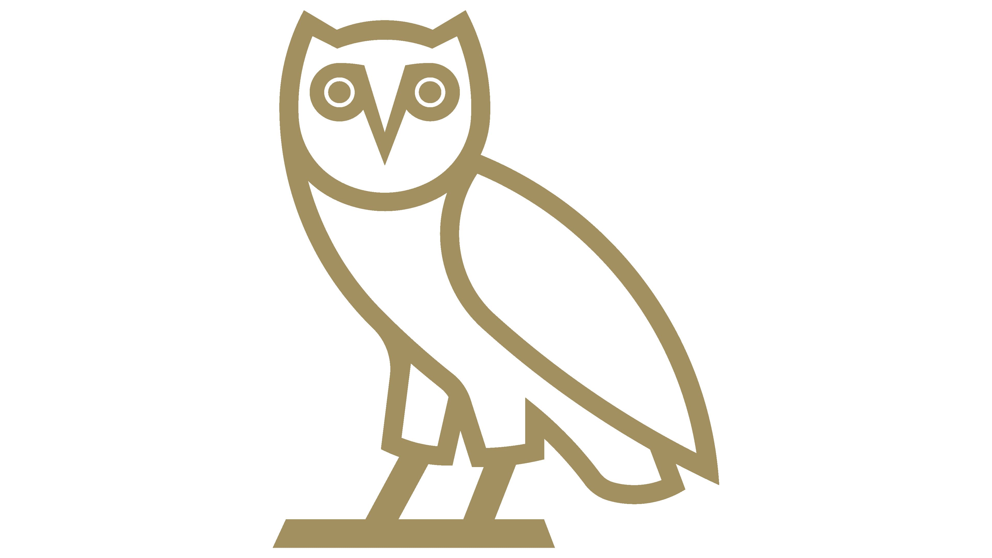
OVO (October’s Very Own) Logo
October’s Very Own (OVO), co-founded by the artist Drake, operates as a contemporary lifestyle brand and music label. Diversifying in both apparel and music sectors, it has its imprints in fashion with unique collections resonating with urban culture. It’s also renowned in the music sphere with OVO Sound. Focused primarily on the global market, it aligns itself with exclusivity and sophistication. It’s recognized for intertwining music and fashion, thus attracting a diverse demographic. Drake’s influence aids in maintaining its relevance and appeal in the dynamic industries it navigates, reflecting modern aesthetics and sound.
Meaning and history
October’s Very Own (OVO) originated as the brainchild of acclaimed artist Drake, Oliver El-Khatib, and Noel Bronson, emerging as a revolutionary lifestyle brand and music label. It delves into the fusion of music and fashion, reflecting urban culture and modern aesthetics. The brand’s journey was marked by a symbiotic relationship with Drake’s rising musical career, propelling OVO into the global spotlight.
OVO’s evolution involved the establishment of OVO Sound, its music division, becoming a home to illustrious artists and epitomizing a distinctive sound. The brand also delved into fashion, presenting exclusive apparel collections characterized by refined designs and high-quality materials.
OVO has sustained its commitment to exclusivity and sophistication, maintaining a meticulous approach to both its music and fashion endeavors. It’s continually innovated, adapting to industry shifts and consumer preferences, fortifying its imprint in the contemporary culture landscape.
Drake’s prominence and influence have been pivotal in OVO’s journey, shaping its essence and maintaining its resonance in the dynamic and evolving sectors it encompasses. Despite the industry’s fluctuations and shifting trends, OVO stands as a testament to the seamless amalgamation of music and style, retaining its allure and relevance amidst the contemporary cultural tapestry.
2012 – Today
The emblem of October’s Very Own distinctly portrays an owl through a schematic depiction, composed of white geometric elements encircled by lines of a deep golden hue. Each component of the logo symbolizes a part of the owl; a piece for the wing, another for the head exhibiting triangular ears, one signifying the body, and the smallest segment representing the top of the leg. The owl is oriented to the left yet maintains a forward gaze. The eyes and beak of the owl are cleverly fashioned to represent the letters “OVO”, with the two “O”s, containing round pupils, positioned at the extremities, and interlinked with the central “V”, which extends downward sharply, illustrating the beak. The ingenious creator of this illustrative design is Nate Willis.
In the primary rendition of the OVO emblem, other than the stylized eyes and beak serving as letters, no additional inscriptions are present. The avian outlines are executed in a rich golden shade, contrasting the white interior, the visual effectiveness of which is also reliant on the background color where the logo finds its placement. The logo’s minimalist and symbolic approach allows it to maintain a modern and distinctive identity, emphasizing the brand’s uniqueness and its nuanced approach to blending simplicity with depth in design. This distinctive logo is instrumental in conveying OVO’s brand ethos and its commitment to sophistication and exclusivity in the realms it navigates.


