Pan Am Logo
Pan American Airways was one of the largest airlines in America. They were founded specifically with the purpose of international travel in mind, and that’s what they did throughout their existence. Most of their destinations included cities in Latin America, but there also points all across the world.
Meaning and History
The company was created in 1927 by two former American pilots specifically to facilitate international travel, which is why they called the firm ‘Pan American Airways’. Since, the 50s, it was officially changed to just ‘Pan Am’, and it stayed one of the America’s biggest airlines until its dissolution in 1991. Until 2004, the name was used by other airlines.
What is Pan Am?
It’s a big American airline. They are considered an international airline and provide services to the whole world.
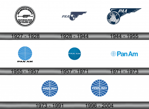
1927 – 1928
The original logo was white circle with black visual elements all over it. Notably, the very center was occupied by a gem shape with the letters ‘PAA’ inside it. It also had a few feathers sticking out of its right, as well as an arrow running all across the logo’s midline.
There were also several written parts: the full name curved alongside the top section and three key destinations written horizontally in the bottom (including Palm Beach-Miami, Key West, and Havana).
1928 – 1944
In 1928, they introduced globe imagery for the first time in their history. It was a purple-with-white view on Americas with a big wing silhouette sticking out of its right and top sections. Furthermore, they’ve placed the ‘PAA’ letters immediately to its left written in a strange purple serif script.
1944 – 1955
In 1944, the globe design inverted (the continents were blue now), the view shifted to Atlantic and there was also a new latitude-longitude grid all over it. ‘PAA’ moved onto the wing, which became more narrow and squat now.
1955 – 1957
The 1955 redesign saw made globe the central piece of the logo, although it looked different now: a turquoise circle with a single vertical white line and multiple curved ones sprouting sideways from it. Right below, they’ve placed the ‘Pam Am’ writing in a similar font, but black and wider.
1957 – 1971
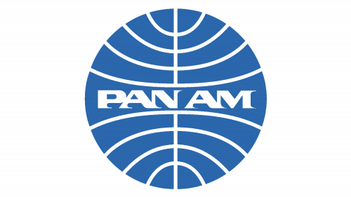
There were two changes in 1957. Firstly, the globe color changed to a darker blue. Secondly, the company name turned white and moved to the middle of the planet.
1971 – 1973
In 1971, the globe emblem was returned to the turquoise coloring and got inverted – the lines became blue, and the rest became white. Moreover, it was now a much smaller figure on the left of the new central piece, the name text. It sported a new, tall sans-serif typeface and occupied about ¾ of the space.
1973 – 1991
Afterwards, they mostly returned to the 1957 design, although there was now a darker, more saturated color blue, as well as thicker white lines all over it.
1996 – 2004
In 1996, the brand was resurrected and used by two independent companies until 2004. It was largely the same image, except the color turned a slightly darker shade.
Emblem and Symbol
Where does Pan Am fly?
Their biggest client is America, obviously. Apart from that, they fly too all corners of the Earth, while Germany is their second-biggest customer.
The logo is usually present on their vessels’ tails (on the stabilizers, to be exact). The livery was also spiced up by the company name written in large letters like on the logo closer to the cabin of the airplane. It differed from ‘Pan Am’ to ‘Pan American’ and other variations, and the colors were also not particularly uniform.

