Qantas Logo
Qantas Airways is the main airline company from Australia. They dominate this market and have the largest fleet out of all the other similar providers in this country. Most of their destinations are scattered across the Pacific – from China to the United States to the island nations between.
Meaning and History
Qantas is one of the oldest still living airlines in the world. It’s been put together in the year 1920 on the rise of the commercial flying. Back then, they were something of a governing agency for Queensland and Northern Territory (the North of the country, basically) – and that actually reflected in the name, which is actually an acronym.
1920 – 1930
The initial Qantas logo featured just the company acronym, QANTAS (Queensland and Northern Territory Aerial Services) in big grey letters separated by the dots – to signify that it is an acronym. They also added the ‘Ltd’ attachment to the right in the similar style. Everything on the logo was rather blocky.
1930 – 1944
By 1930, the company became the Australia’s main supplier of commercial flights. The name stayed, but it soon became just a word, not an acronym. In 1930, however, they still styled it as one.
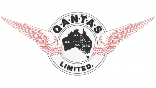
The new logo was a white circle with white outline. It had an outer layer where they put the company name. It wasn’t too different from the previous design. Most of it was put on the top part of the ring, while below they kept the word ‘limited’. Everything was black, including the segmented map of Australia in the middle of the circle.
The only two colored elements were the realistic wings that sprouted from the sides of the Australian map.
1944 – 1947
In 1944, they started using their now-iconic Kangaroo design as a logo. It’s unclear why they decided to use a Kangaroo as a symbol for a flight company, but they’ve been doing it ever since.
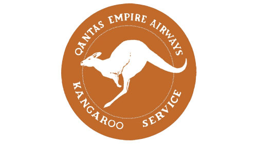
That design, however, looked a bit different. It was a white realistic depiction of an animal, with many features highlighted in ochre (sometimes burgundy) color. The rest of the logo had the same color, for unclear reasons.
The ocher circle surrounding the mascot also bore the words ‘Qantas Empire Airways’ (name then) & ‘Kangaroo Service’ (something of a moniker).
1947 – 1968
The 1947 logo featured instead a much less distinct blue silhouette of the Kangaroo with white wings. In its legs, it held a globe (also blue) where the only visible place is Australia, while largely everything else is blue except for the latitudes and longitudes and the arrows that point from the continent.
1968 – 1984
In 1968, they reused the ‘winged Kangaroo’ image, but put it in a different environment. It was mirrored, colored red and put in the middle of a thin ring of the same color. Below it was the word ‘Qantas’, written in black capital letters.
1984 – 2007
The 1984 logotype was mostly the rearrangement of the previous design. They put the brand name on the same level with the emblem, but made the letters bolder. The emblem was immediately to the left of this lettering structure, and it was this time a red triangle with a white Kangaroo inside. It was the same one as before, but without wings.
2007 – 2016
The 2007 saw just minor changes in regards to the logo. They bleached the letters slightly and tilted them to the right, and that’s about it.
2016 – today
In 2016, they returned the letters to their normal, untilted state and made them slimmer. The emblem also suffered in that they turned the triangular shape into a sort of tall tilted trapezoid. Everything else largely stayed the same.
Emblem and Symbol
The trapezoid shape used in the 2016 emblem is actually conveniently suited for the vertical stabilizer that the planes usually have on their tails. Incidentally, that’s also where they put this emblem to decorate their planes. This makes for a very distinctive mark people recognize from afar.
