Quatro Logo
A distinctive feature of this drink, which is shown in the Quatro’s name and logo, is the taste of four fruits: pineapple, orange, passion fruit, and grapefruit. This feature remained with the brand until today, with very few changes. These drinks are mostly spread in the UK and South America, where much of the Quatro products are manufactured by the Coca-Cola Company. Quatro is advertised as a non-alcoholic beverage that has no artificial coloring and is low in sodium.
Meaning and History
Quatro is a soft fruit-tasted soda, manufactured and put up for sale by Coca-Cola Company from 1982 to 1989 in the UK. The soda had quite interesting advertising back in the 1980s where a man approached a vending machine, which looked like something from the far future at that time, and a can of Quatro beverage flies out after he inserts a Quatro card. It was accompanied by the slogan “It’s a miracle, but we’ve made it“. Unfortunately, the drink was not as successful and was discontinued for several years. The company resumed its production in 1996. However, the drink is now sold in countries in South America, including Chile, Venezuela, Argentina, and Colombia Uruguay.
What is Quatro?
This is a refreshing fizzy drink that had its best years back when it was just launched in the UK. The drink was a green color and, according to the advertisement, had a mix of four different fruits. Coca-Cola, which is the manufacturer of this beverage, brought back the drink in the 1990s, but it is only sold in South America.
1982 – Today
![]()
The logo can be split into two parts: four multicolored squares in the center and on the corners, and multicolored variants of the brand name on all sides. The multicolored squares have a green-colored square at the top left corner, followed by orange, red and yellow going clockwise. They are separated by a thin white line. The colors of the name also follow this pattern, with a green being at the top. All the letters are uppercase and have minimal spacing between the letters. A white symbol, similar to the letter ‘Q’ is placed over the squares in the center.
Font and Color
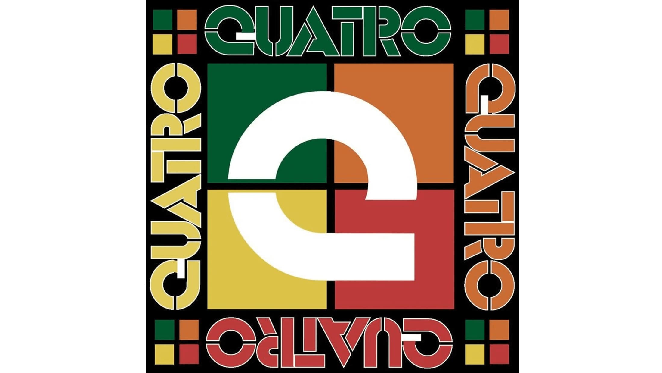
A lot can be said about the style of the Quatro emblem. The brand’s font has a modern and technological sans-serif style. The letters feature vertical and horizontal slits, similar to the ones seen in the Overspray typeface by Tension Type. The color scheme depicts all colors of the fruits used in the drink’s production. These are green, orange, red, and yellow. The company chose to go for muted variations of these colors, which gives an impression that the drinks are natural rather than artificial coloring and taste. At the same time, the logo is bright and colorful enough to capture one’s attention and looks quite appetizing.


