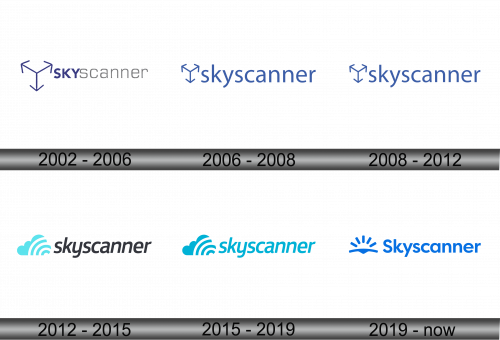
Skyscanner Logo
Skyscanner serves as a global search engine, primarily for travel. Three technology innovators founded it. They started their operations in Edinburgh, Scotland. Their main goal was to simplify the process of finding flights. Users can compare prices across different airlines quickly. It’s a tool for planning trips more efficiently. Skyscanner helps travelers make informed decisions.
Meaning and history
Skyscanner’s journey began in 2003. Its creation filled the gap in the travel industry for a comprehensive flight search engine. By 2011, it had already expanded its services globally. Significant milestones include its acquisition in 2016. This move further cemented its status in the travel tech world. Skyscanner continuously evolves, adapting to new travel trends and technologies. Its history reflects a commitment to making travel search as seamless as possible.
What is Skyscanner?
Skyscanner is a travel search engine. It helps users find flights, hotels, and car rentals. The platform offers price comparisons. This makes planning trips easier and more efficient.
2002 – 2006
The logo prominently features an artistic representation resembling the corner of a cube, oriented with one vertex pointing downward, conveying dimensionality and a nod to navigational cues in space. Its lines converge in a way that suggests both structure and an intersection of paths, fitting for a travel aggregator. The design is executed in a gradient of blues, evoking the vastness of the sky and the depth of the oceans – territories traversed by travelers. This geometric figure rests above the brand’s name, “Skyscanner”, rendered in a clean, sans-serif font that communicates the brand’s modern and accessible approach to travel.
2006 – 2008
The logo portrays a minimalist, geometric figure resembling a three-dimensional cube corner, pointing towards the ground. It suggests navigation, decision-making, and the convergence of different routes or choices. This emblem, placed above the cleanly typed “skyscanner” name in a calm blue hue, evokes the brand’s essence of clear direction in travel planning. The overall design is crisp, with a sophisticated simplicity that reflects the company’s focus on providing streamlined travel solutions.
2008 – 2012
The logo is consistent in its fundamental elements; however, the emblem’s lines are slightly refined and sharper, suggesting precision and clarity. The typography of “skyscanner” remains unchanged, maintaining its straightforward and accessible demeanor. The blue color palette continues to suggest trust and depth, key attributes for a brand associated with travel. This version of the logo subtly refines its predecessor’s design, emphasizing a sharper, more defined approach to navigating travel choices.
2012 – 2015
This logo iteration introduces a new element: stylized clouds paired with signal waves, symbolizing clarity and reach. The “skyscanner” typography is now bold and lowercased, exuding accessibility and modernity. The color scheme is lighter, suggesting freshness and innovation. This design reflects a shift towards broader horizons in travel tech, emphasizing connection and discovery in the skies.
2015 – 2019
In this logo, the color shifts to a more vibrant shade of blue, symbolizing vitality and trust. The clouds and signal motif remain, emphasizing connectivity and reach. The text “skyscanner” now adopts a uniform, cyan hue, enhancing brand recognition. This evolution of the logo reflects Skyscanner’s commitment to a clear, connected travel experience, and the updated color injects a more energetic and modern vibe to the brand’s identity.
2019 – Today
The newest logo design highlights a bold sunburst above a stylized horizon, symbolizing optimism and possibilities. The intense blue remains, reinforcing trust and depth. “Skyscanner” text is capitalized, conveying strength and presence. This redesign embraces a theme of new beginnings and broadened perspectives, mirroring Skyscanner’s expansive view of travel.


