Spirit Airlines Logo
Spirit Airlines is an American airline company that mostly provides ultra-cheap flights across the Americas, including many cities inside the US. As a highly affordable candidate, Spirit has eventually become one of the most successful airlines in the United States.
Meaning and History
Spirit has been launched in 1983, although it was initially known as Charter One. A bit later, they changed it to Spirit Airlines, which is the reference of their goal of facilitating free travel without having to stress about prices. Their motto of ‘Free Spirit’ also reflects this fact.
What is Spirit Airlines?
It’s an extremely affordable airline from America. Owing to that fact, they were able to become very successful in a relatively short notice.
1983 – 2002
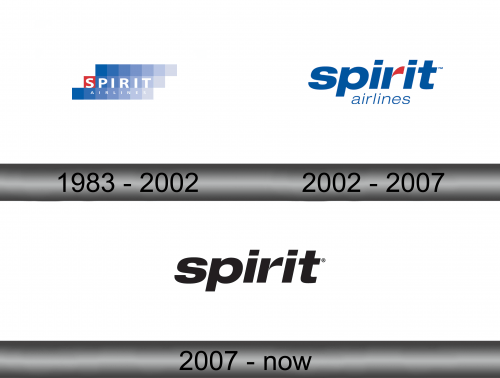
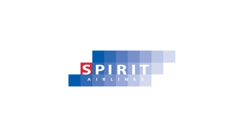
Initially, the logo was a collection of blue squares arranged in three lines, where each line was slightly to the left from the previous one. Progressively to the right, the squares became paler until fading away. The designers also replaced blue with red on the first square in the middle level and put the word ‘Spirit’ there written in capital white letters.
The ‘Airlines’ (in smaller characters) was put directly below the previous word, which meant making them unaligned with the squares.
2002 – 2007
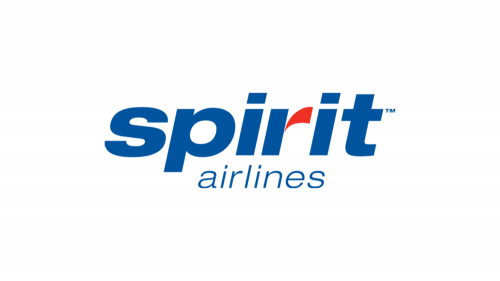
In 2002, the company opted to simply use the name inscription as the logo. They wrote ‘Spirit Airlines’ in two lines, except this time both of them were lowercase (the word above simply had bigger, bolder letters). The usually color was blue, with the exception of a little claw-like mark that came out of the ‘r’ above. This one was red.
What’s good about Spirit Airlines?
Their primary shtick is low prices. They really are one of the cheapest flying candidates in America.
2007 – today
In 2007, they decided to take the ‘Spirit’ word and color it completely black. Everything else from the previous logo was scrapped.
Emblem and Symbol
Where does Spirit Airlines fly?
They mostly operate within the States. Other than that, their favorite locations are all in Latin America.
The post-2007 plane hulls are completely yellow with two logos precisely as they are presented officially. However, the company also had an additional emblem they used before 2007. It was a letter ‘S’ that looked like an entanglement of four differently colored (red, green, yellow and blue ribbons). Usually, it was used in the read.
