Tropicana Products Logo
Tropicana Products is a major American producer of fruit drinks, primarily juices. Big in the USA as it is, Tropicana can also boast major operations even outside of this country. The bulk of their customers is still located in America, however – there, they mostly sell orange juice, alongside other products.
Meaning and History
Launched in 1947, Tropicana Products soon became amongst the most celebrated producers of juice in the country. By the 90s, they’ve become one of the leaders in beverage production in general, which prompted Pepsi towards buying Tropicana. The name simply signifies that they make juices out of mostly tropical fruits.
1989 – 1992
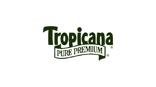
Starting in 1989, the company began introducing proper logotypes. The first was the brand name – Tropicana – written in dark green letters, as well as a white ribbon that said ‘pure premium’ in the same color right below. The font used here was pretty much used ever since in these logos.
1992 – 1998

In 1992, they decided to change the main color to orange, and only two parts remained colored something else: the dot above ‘i’ was now a green leaf, and they also added a black dot on the end of the name for some reason.
1998 – 2003

The 1998 logo was the same concept as 1989, but with the look from 1992. The color changed to a paler, more saturated shade of green. They also added some volume in the form of white inlays and some shading. Lastly, the ribbon was now green with white inside, not the other way around.
2003 – 2007
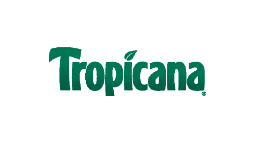
The 2003 logo was just a 1998 emblem sans the ribbon below, and not much else.
2007 – 2017

This time, they decided to take the previous logo and bend it upwards, thus making it into a shape of a semicircle. They also added more glint and gradient to it.
2009 – 2010
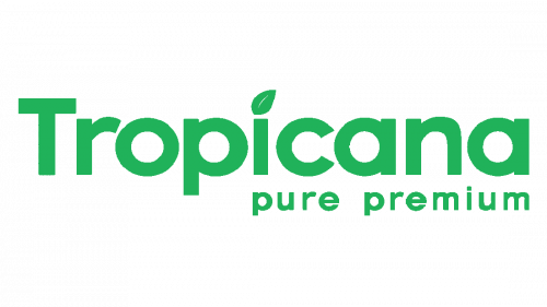
The 2009 logo was a secondary and mostly experimental attempt. They took the usual concept, widened the letters, made them very plain and, lastly, colored them pale green. The ‘pure premium’ part was now just text, no ribbons or other imagery.
2010

Mostly, they took this one out of the very first iteration, except they repainted the brand name white and put it inside a light green rectangle (without the ‘pure premium’ part).
2017 – present
Tropicana logo features a word ‘Tropicana’ written in thick, uneven letters colored in green. Notably, many of these letters are bent and squished slightly, no doubt to resemble plants. The design is overall supposed to remind you of the tropics, hence they put a leaf instead of the usual dot on ‘i’.
Emblem and Symbol
Seeing how most of their products are orange juices of many variations, their usual ‘skewered orange’ image is a popular symbol for the brand. Their orange juice bottles all have an image of an orange pierced by a straw as if for drinking depicted on a label – the background there is mostly white.
