Warka Logo
Warka Brewery is located in the Mazowia region of Poland. This brand is one of the leading in Poland, annually receiving many international awards. It is included in the top ten beer producers in Eastern Europe. As modern producers assure their customers, they strictly follow the old recipes, which give the beer a golden color and a pleasant taste with a slight bitterness. Polish beer Warka Classik, for instance, is truly a classic light amber drink. The brand is controlled by Heineken Group.
Meaning and History
![]()
The history of the brewery goes back to the Middle Ages. In 1478, the residents of Warka city began to brew and supply beer for the Royal Court in Warsaw, which earned them special privileges. Although being first founded as early as 1478, the modern brewery started operations only in the 70s, while being transformed into its modern form in the 90s. Warka Brewery is named after the city of its location. The town itself was called this for its rich brewing traditions. It was home to many brewers even before it obtained its name. At the end of the last century, several international groups invested in the industry, and in 1999, the company was acquired by Grupa Zywiec S.A. Right now, they are a popular beer brand in Poland and surrounding countries.
What is Warka?
Warka Brewery is a Polish beer-making brand located in a town with the same name. The brand itself started in 1478, being thus one of the oldest breweries in Eastern Europe. The Warka Brewery in Warsaw is the oldest in Poland, and the beer brand of the same name is the second most popular beer in Europe. The beer is sold in glass bottles and cans.
2004 – 201?
![]()
The first contemporary logo was created in 2004. It featured a wide dark-red hexagon-shaped banner with protruding angles. The shape has a thin triple-line border, with white being followed by light gray and then dark blue. The key detail is the brand’s own name written in white capital letters in an archaic serif style. It also has a light gray and dark blue outline on one side that looks like a shadow and gives the wordmark a 3D feel. They also added an image of General Pulaski, who is a notable military commander native to Warka, above the main emblem. It is dark blue with light gray ornaments and the name on both sides. However, they rarely use it on the beer labels. The general also doesn’t have much to do with the brewery itself and the connection is simply patriotic. There are also some floral ornaments under the banner done in light gray along with the foundation year.
201? – now
![]()
Font and Color
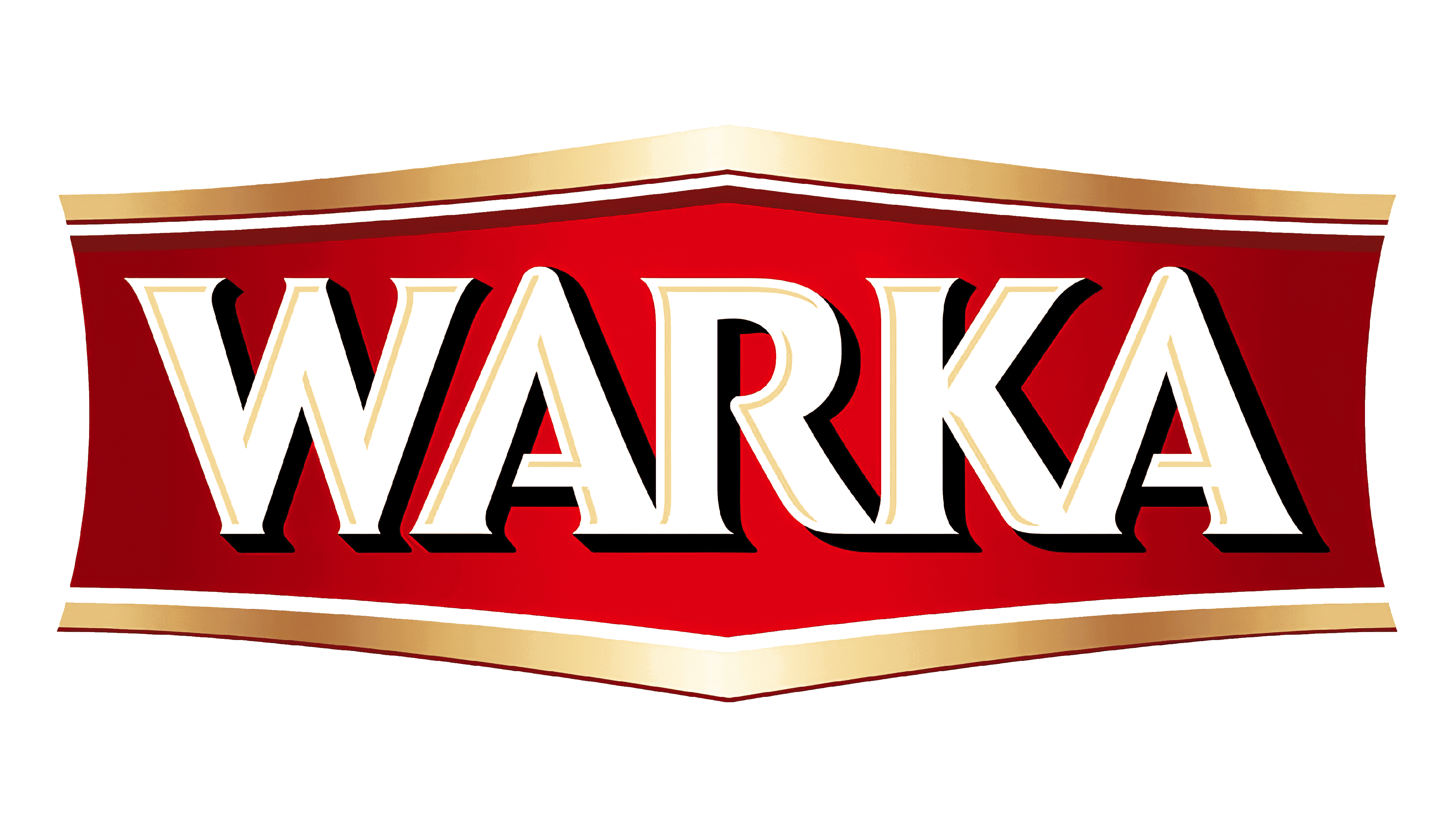
The logo is very recognizable, as the design mainly contains only red and white colors, the national Polish style. There is also some light gray and dark blue, but they are not the dominant colors. The font features sharp serifs and all uppercase letters. They have a shadow for a more impressive look and are placed very closely together so much that in some spots the letters are touching.


