Adria Airways Logo
Slovenian airline Adria Airways provided passenger services from 1961 to 2019. The services were very popular thanks to the loyalty program, which gives access to discounts and special offers. In the last years of its activity, the company constantly experienced serious financial difficulties. In 2019, she was forced to declare bankruptcy.
Meaning and history
The first logo appeared along with the emergence of the company in 1961. It was an abstract form, the right and left sides of which were mirrored to each other. In 1988, a simpler and easier to understand logo was published, representing the name of the company, written in a typeface that was specially designed for this task.
1961 – 1988
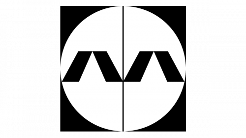
The first company logo was made in black and white. The logo was black and square, with a white circle bisected by a black line from top to bottom. On either side of the line was the letter A without a middle dash. The letters A in the logo symbolized the first and last letters in the name.
1988 – 2019
In 1988, a font was developed by order of the company, which was then used to write the last logo of the company. It had characteristic rounded features that contrasted sharply with the abundance of sharp corners in the previous logo.
Color and font
A characteristic feature of the typeface used in the logo is the inclination to the right. The standard logo is the name of the company, it was used from 1988 until bankruptcy. The color chosen is navy blue, popular with airlines.
One of the logo options is one letter, from which a shadow is cast in the form of a blue A. There is also a modification of this option, the background changes from white to blue, the letter A becomes white, and the shadow is painted in light blue, the reflection is divided into parts by horizontal stripes of color background.
From 2004 to 2019, a variant of the logo was actively used, where, under the name of the company, a postscript Star Alliance Member was made in a different font (more square). In 2011, a version of the Adria with you 50 logo (Adria with you for 50 years) was created in the same vein. The number 50 was to the right of the company name, an airplane flew around it, leaving a characteristic train.


