British Airways Logo
British Airways is a national airline of Great Britain, and one of the biggest such firms in this country. They chiefly operate across Europe (and United Kingdom in particular), although there is also plenty of intercontinental destinations – primarily, in the United States and Commonwealth countries.
Meaning and History
British Airways appeared in its current form in 1974, although there also were many predecessors. The talks of creating a flag carrier for Britain out of many smaller airlines led them to unifying into British Airways. As such, the company has soon become one of the biggest flight providers in Europe.
Who owns British Airways?
They are subsidiary to International Airlines Group. This is basically just them and Iberia, a major Spanish airline.
1974 – 1984
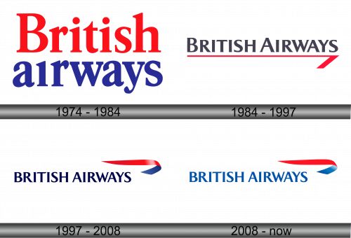
The 1974 logo was simply a company name written piecemeal on two levels. The colors are red and blue, taken from the flag of Great Britain. The font of the letters is notably an old-fashioned serif typeface, although it’s interesting that the letters in the lower one have a slightly different appearance.
1984 – 1997
The second variation instead placed both words onto the same level, colored them both grey and got rid of most of the serifs. Not to mention that all of these letters are stylistically uppercase. The other element was a thin red underline with a wider diagonal appendage at the right tip.
Where does British Airways fly?
They are obviously rather fond of Britain. Apart from their homeland, they travel very frequently to America, Germany, Italy, France and other European countries. Moreover, they provide services to a wide range of nations.
1997 – 2008
The 1997 was mostly the same design, except the text is now colored blue and has a twisted ribbon image on its right (the front side is red, and the reverse is blue).
2008 – Today
In 1997, the creative firm Newell & Sorrell reinvented British Airways’ corporate image, believing the previous design resonated too strongly with British characteristics. The airline, aiming to emphasize its global reach and commitment to worldwide flight operations, chose to adopt a design that reflected the era’s spirit of internationalism. This new emblem, mirroring the appearance of a fluttering ribbon in shades of red and blue, was a testament to their vision. Positioned beneath this iconography, the company’s title was etched in consistently sized blue uppercase characters, leaning towards the left.
Emblem and Symbol
What is British Airways?
It’s the British flag carrier. It means that the biggest portion of travel out and into the country is done through them.
In addition to the official logo, the British Airways vessels also decorate their tails with the patriotic imagery of the Union Jack, or at least a section of it. What they usually put there are two diagonal red lines and a blue triangle separated by the blank white space, all in the colors taken from the British flag proper.
