Alaska Airlines Logo
Alaska Airlines, based in the Pacific Northwest, stands out for its exemplary customer service and environmentally conscious operations. With a fleet of over 330 aircraft, it connects over 115 destinations, prioritizing punctuality and safety. Renowned for its innovation, Alaska Airlines offers passengers a seamless and comfortable travel experience, enriched by its commitment to community engagement and sustainability initiatives. Emphasizing a genuine care for customers and the environment alike, it continues to set the standard in the aviation industry.
Meaning and history
Alaska Airlines, established in 1932 as McGee Airways, has grown from a small regional airline to a major carrier, connecting over 115 destinations. Initially, it only flew from Anchorage to Bristol Bay, with a single three-passenger Stinson. In 1944, after numerous acquisitions and mergers, it became Alaska Star Airlines, later changing to its current name.
The 1980s marked significant growth with the acquisition of Jet America and the expansion of routes. The ’90s brought the introduction of online booking, enhancing customer convenience. In 2016, Alaska Airlines solidified its presence by acquiring Virgin America, becoming the fifth-largest airline in the U.S. This expanded its reach and added valuable assets.
Throughout its history, Alaska Airlines has been at the forefront of innovation. It was one of the first to offer satellite-based GPS for more efficient routes. Sustainability has also been a core value, with the airline investing in fuel-efficient aircraft and carbon offset programs.
Today, Alaska Airlines, under the parent company Alaska Air Group, remains committed to providing excellent service and innovating for a more sustainable future. Its story is a testament to its resilience, adaptability, and dedication to its customers, communities, and the planet.
1966 – 1972
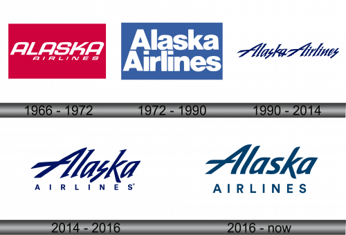
In the mid-1960s, Alaska Airlines unveiled a distinctive logo, featuring its name emblazoned in slanted uppercase letters. The design was notable for its rounded “A”s, which lacked upper corners, set against a red rectangle. While the primary design featured the word “ALASKA” in white on a red background, the reality was slightly different, with the red “ALASKA” standing out against the aircraft’s white fuselage.
This fresh design was integral to a pioneering advertising campaign that catapulted Alaska Airlines to global recognition. As part of this marketing initiative, the airplane’s interior was adorned with rich red-orange velvet wallpaper, creating a luxurious and inviting atmosphere. ASA staff donned traditional Cossack attire, embracing a unique theme that set the airline apart from its competitors.
Passengers were treated to an immersive cultural experience, with the offering of traditional Russian dishes, elevating the in-flight dining to new heights. Caviar was elegantly presented on gleaming silver trays, while vodka and tea were served in exquisite gold samovars. This attention to detail and commitment to offering a unique and memorable experience underscored Alaska Airlines’ dedication to excellence and innovation, solidifying its position as a leading player in the aviation industry.
The innovative approach to branding and customer experience showcased Alaska Airlines’ willingness to think outside the box and take risks to establish a strong brand identity. This willingness to embrace the unconventional has been a defining characteristic of Alaska Airlines throughout its history, contributing to its ongoing success and reputation as a trailblazer in the world of aviation.
1972 – 1990
In 1972, with the transition of leadership from Charlie Willis to Ron Cosgrave, a pivotal advertising initiative was launched. Its primary aim was to alleviate financial strain by broadening the customer base. As part of this strategy, a new emblem was introduced, featuring “ALASKA AIRLINES” split across two lines, rendered in a straight sans-serif typeface with only the initial “A” capitalized. The logo’s background was a vibrant blue, providing a striking contrast to the white lettering.
A harmonious synergy was established between the logo and the aircraft’s livery. The fuselage was predominantly white, adorned with elegant stripes in shades of turquoise and blue. Artists were commissioned to embellish the tail sections of the planes with unique designs, each representing a facet of Alaska’s rich cultural tapestry. Among these were a totem pole, a symbolic representation of native Alaskan culture; the portrait of an Eskimo clad in a traditional kulittak; a depiction of a gold miner; and lastly, the intricate domes of Russian churches, a nod to the historical heritage shared by Alaska and the 49 other US states.
This strategic rebranding and the addition of culturally significant imagery were not merely aesthetic decisions; they were a calculated move to forge a deeper connection with the airline’s roots, while also appealing to a broader demographic. The result was a visually stunning fleet that was not only a testament to the airline’s proud heritage but also a mobile advertisement, turning heads and captivating hearts wherever it flew.
1990 – 2014
In the year 1990, a pivotal transformation unfolded, significantly altering the essence of the ASA brand. The wording “ALASKA AIRLINES” was seamlessly integrated into a singular line, resting upon a pristine white canvas devoid of any rectangular encasement. The creators of the emblem opted for an italicized serif font, bestowing upon the text a semblance of handwritten elegance, albeit achieved through meticulous stylization.
This alteration wasn’t merely aesthetic; it was symbolic of the airline’s evolution and its pursuit of modernity while maintaining its foundational principles. The fluidity of the handwritten-like font mirrored the airline’s commitment to providing a seamless, customer-centric experience, and the removal of the rectangle symbolized the breaking down of barriers to connect more intimately with its clientele. The choice of an icy blue hue was not just a nod to the airline’s Alaskan roots but also represented the refreshing and invigorating experience the airline aimed to offer. This reinvention of the logo marked a significant milestone in the airline’s history, encapsulating its essence while propelling it into a new era.
2014 – 2016
In an innovative move aimed at enticing new patrons, the company’s executives mandated a logo overhaul. The revamped design elevated “ALASKA” to prominence, with the designers magnifying its scale and situating it at the center stage of the visual hierarchy. Subsequently, the latter portion of the brand name was demoted to the bottom tier, where it was presented in diminutive block letters, rendered in a contemporary sans-serif typeface.
This strategic reconfiguration wasn’t merely superficial; it was a calculated endeavor to underscore the brand’s core identity, with “ALASKA” serving as a symbolic beacon of the airline’s heritage and values. This central positioning also served to create an immediate visual impact, ensuring the brand name was indelibly etched in the minds of potential customers. The use of a sans-serif font for the remaining text was a nod to modernity, aligning the airline’s image with the contemporary aesthetic that resonates with today’s consumer. This clever amalgamation of heritage and modernity was a testament to the brand’s adaptability and its unwavering commitment to evolution and excellence.
2016 – Today
Feedback from pilot focus groups described the original design as having a “cool” and “corporate” aesthetic, precipitating the decision to revamp the font. CEO Brad Tilden and the executive team at Alaska Airlines placed their faith in the expert hands of the Hornall Anderson branding firm to breathe new life into the logo. The fruits of their labor were first unveiled on a freshly painted Boeing 737-800, proudly displaying the updated emblem. In addition, the modernized logo has been seamlessly integrated across various platforms, gracing the airline’s signage, official website, and a plethora of promotional materials.
This logo transformation wasn’t merely cosmetic; it was part of a larger strategic initiative to modernize the brand while maintaining its core identity. Every touchpoint, from the aircraft to the website, was an opportunity to communicate the airline’s commitment to innovation and excellence. The new logo serves as a visual testament to the airline’s evolution, encapsulating its rich history and forward-looking ethos. It stands as a symbol of the airline’s dedication to delivering exceptional experiences, staying true to its roots while soaring confidently into the future.


