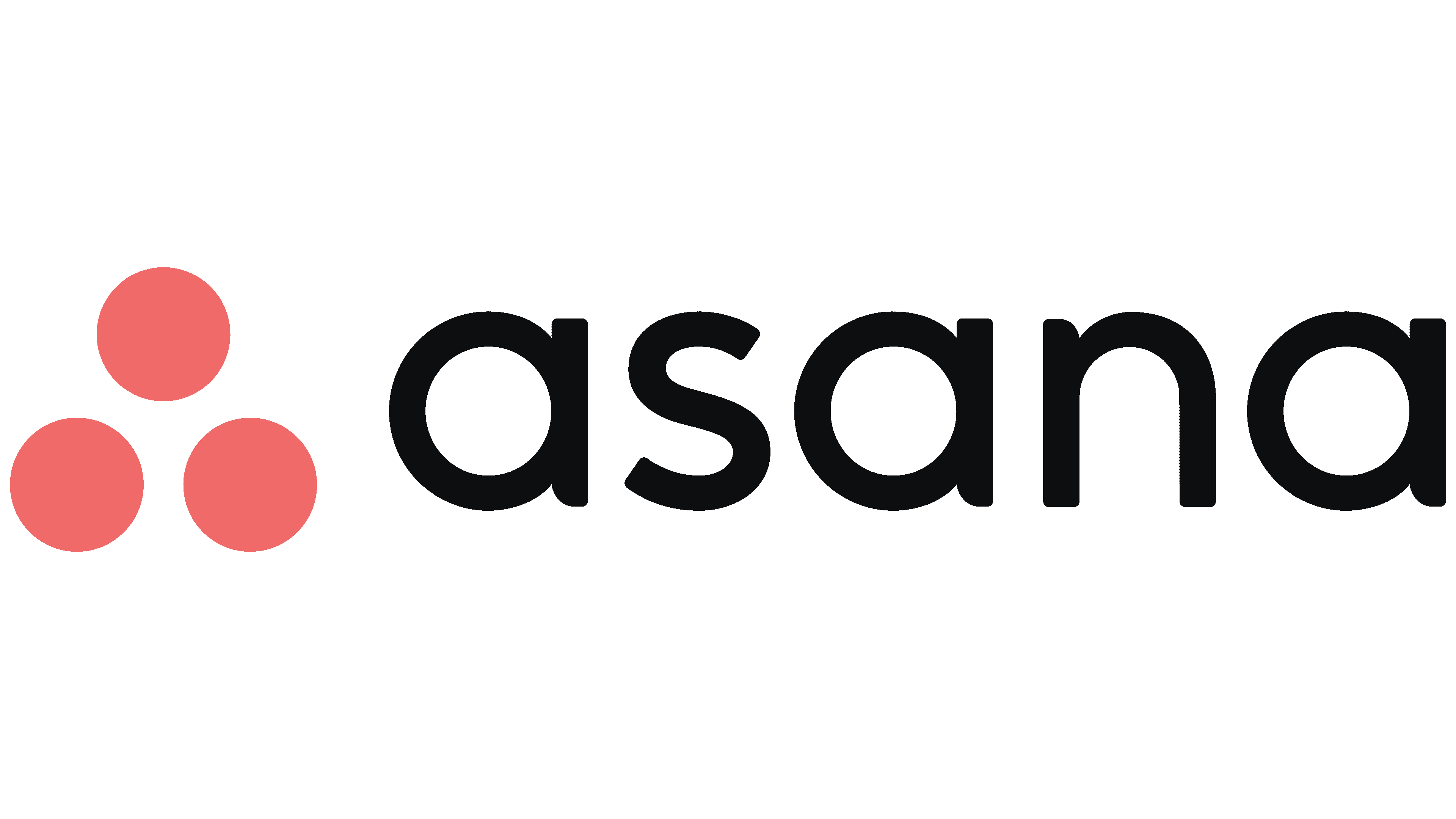
Asana Logo
Asana is a renowned software platform focusing on work management, enabling teams to coordinate and manage their tasks and projects seamlessly. It’s a tool that facilitates efficient work organization and collaboration, making it easier for teams to track their work progress and achieve goals. It offers features like task assignments, project timelines, workspaces, and real-time updates. Founded by Facebook co-founder Dustin Moskovitz and ex-engineer Justin Rosenstein in 2008, Asana has become indispensable for numerous organizations seeking enhanced productivity and streamlined workflows.
Meaning and history
The development of Asana was motivated by a desire to eliminate work about work—those mundane and time-consuming tasks such as email chains and status meetings, which detract from meaningful work. Asana was constructed to act as a centralized location for task assignments, project timelines, and real-time updates, thus fostering a cohesive work environment.
Since its inception, Asana has undergone continual refinement, introducing a variety of features aimed at meeting the evolving needs of teams and organizations. The platform’s user-friendly interface and versatile functionality have been instrumental in consolidating its standing in the work management sector. Asana’s impact has reached a global scale, assisting numerous organizations in different industries in optimizing their workflows and achieving their objectives more efficiently.
Asana has distinguished itself by focusing on enhancing team collaboration and organizing work in a way that’s accessible and clear, thus empowering teams to spend more time on accomplishing their goals and less on coordinating their efforts. The sustained growth and widespread acclaim of Asana underscore its commitment to refining work management and helping teams realize their full potential.
2008 – 2015
The logo of Asana encompasses two distinct elements: textual and illustrative. Foremost is the brand name, commanding the lion’s share of the emblem due to its robust, pronounced letters. These characters boast rounded edges, seamless curves, and sleek lateral aspects, all presented in lowercase and rendered in a shade of aquamarine.
Additionally, the character “n” deviates from the norm, mirroring an inverted parenthesis or an elevated arc, owing to the absence of a lateral line. Adjacent to the textual component, one observes a trio of green dots aligned vertically. These dots, meticulously positioned, do not surpass the textual boundary of “asana” and maintain a subtle position slightly beneath the brand name.
Furthermore, these integral components of the logo, with their unique structure and harmonious color palette, reflect a meticulous attention to detail and a profound understanding of design aesthetics. The emblem, with its innovative depiction of elements, embodies the essence of the brand, representing simplicity, clarity, and a modern approach to design. The positioning of the dots and the unique representation of the letter “n” signify a departure from the conventional, highlighting Asana’s commitment to providing innovative solutions in the realm of work management and team collaboration. The interplay of color and form within the logo subtly echoes the dynamic and harmonious synergy that Asana aims to foster within organizational workflows.
2015 – Today
Following a conceptual transformation, the corporation embraced a revamped logo. Every facet experienced a metamorphosis, encompassing both the typographical and the pictorial elements. Consequently, an altered typeface emerged, maintaining its lowercase and rounded demeanor, but now incorporating a consistent lateral element across all letters, fostering visual cohesiveness within the inscription. A trio of dots now precedes the brand’s moniker, presenting themselves larger, colored in a shade of pink, and configured triangularly. Envisioned by the creative minds at Moving Brands studio, these dots are illustrative of an ascending arrow, symbolizing the brand’s escalating potentials.
Additionally, the newly adopted aesthetic elements and color schemes articulate a subtle yet profound representation of the brand’s evolving identity and its continual pursuit of innovation and expansion. The alterations in the logo, while seemingly minimal, reflect a strategic intention to align the brand’s visual identity with its evolving mission and values. The reimagined typeface and the repositioned, re-colored dots, all serve to convey a sense of upward mobility and limitless possibilities, reiterating the brand’s commitment to fostering growth and exploring new frontiers. This refined visual representation serves as a beacon, emphasizing the brand’s dedication to progress and its ability to adapt to the ever-evolving landscape of its industry. The innovative design choices illustrate the brand’s forward-thinking approach, subtly communicating its unwavering aspiration to elevate and expand.


