Busch Logo
Busch Beer, a prominent name in the brewing sector, currently offers a range of beers, with Busch Light and Busch Ice being among its popular variants. Targeting chiefly the North American audience, the brand also possesses a global footprint. Busch Beer has consistently prioritized quality while embracing innovations to resonate with modern beer enthusiasts. A subsidiary of Anheuser-Busch InBev, the world’s largest beer conglomerate, Busch Beer upholds its longstanding tradition, blending it seamlessly with today’s evolving beverage landscape.
Meaning and history
Busch Beer’s saga dates back to the mid-20th century, emerging as a subsidiary under the vast umbrella of Anheuser-Busch. This brewing giant, founded by Adolphus Busch and Eberhard Anheuser, transformed the beer industry by introducing novel brewing techniques and setting the gold standard for lager production.
Over the decades, Busch Beer carved its niche, focusing on quality, affordability, and consistency. Its brand offerings expanded, introducing variants like Busch Light and Busch Ice, targeting different segments of beer enthusiasts.
Ownership remained within the Busch family for generations, but the late 20th century witnessed a shift. Anheuser-Busch faced numerous acquisition attempts, culminating in its 2008 merger with InBev. This merger formed Anheuser-Busch InBev, the world’s largest beer conglomerate.
Through ownership changes and market evolutions, Busch Beer remained steadfast in its commitment to quality, constantly reinventing itself. Modern brewing techniques fused with time-honored traditions ensure Busch Beer’s relevance and appeal in the ever-evolving world of beer.
1995 – 2013
Busch Bavarian Beer’s initial moniker reflected the German heritage of the Busch lineage and paid homage to Bavarian monks – pioneers of lager. Bavaria, after mastering the art of bottom fermentation, emerged as a brewing powerhouse. The brand wanted consumers to connect their beer with those age-old Bavarian brewing techniques. Their crafted taglines, “as crisp as mountain breezes” and “journey to the peaks,” hinted at this legacy.
The logo prominently showcased the founder Adolf’s last name, ascending diagonally, symbolizing a climb to greatness. A vibrant red underscore and shadow beneath the letters conveyed passion, vigor, and Adolf’s unwavering dedication, which was pivotal to the brand’s meteoric rise. The cerulean-hued letters edged in white resonated with the Bavarian skies and pristine snow-capped peaks. This color scheme subtly hinted at the innovative mechanical refrigeration technique introduced by Busch.
By 1979, the brew adopted its modern name, Busch Beer. However, the emblem’s transformation took place much later, under Joao Nevis’s leadership, steering the brand’s visual identity into a new era.
2013 – 2016
During this era, the logo boasted a distinct handwritten style. The characters forming “BUSCH” appeared as if penned hastily, showcasing uneven, shaky borders and irregular curves. The “U” was notably unique, eschewing the typical symmetrical appearance. Positioned beneath was the term “BEER,” rendered in uppercase letters but notably smaller in size. This straightforward sans-serif typeface bore a close resemblance to S-Core’s Core Sans N 83 Ex Heavy. Both text segments donned a muted black shade. Moreover, the upper tier of characters was accentuated with a slender outline in a deep beige hue, adding a touch of finesse to the overall design.
2016 – Today
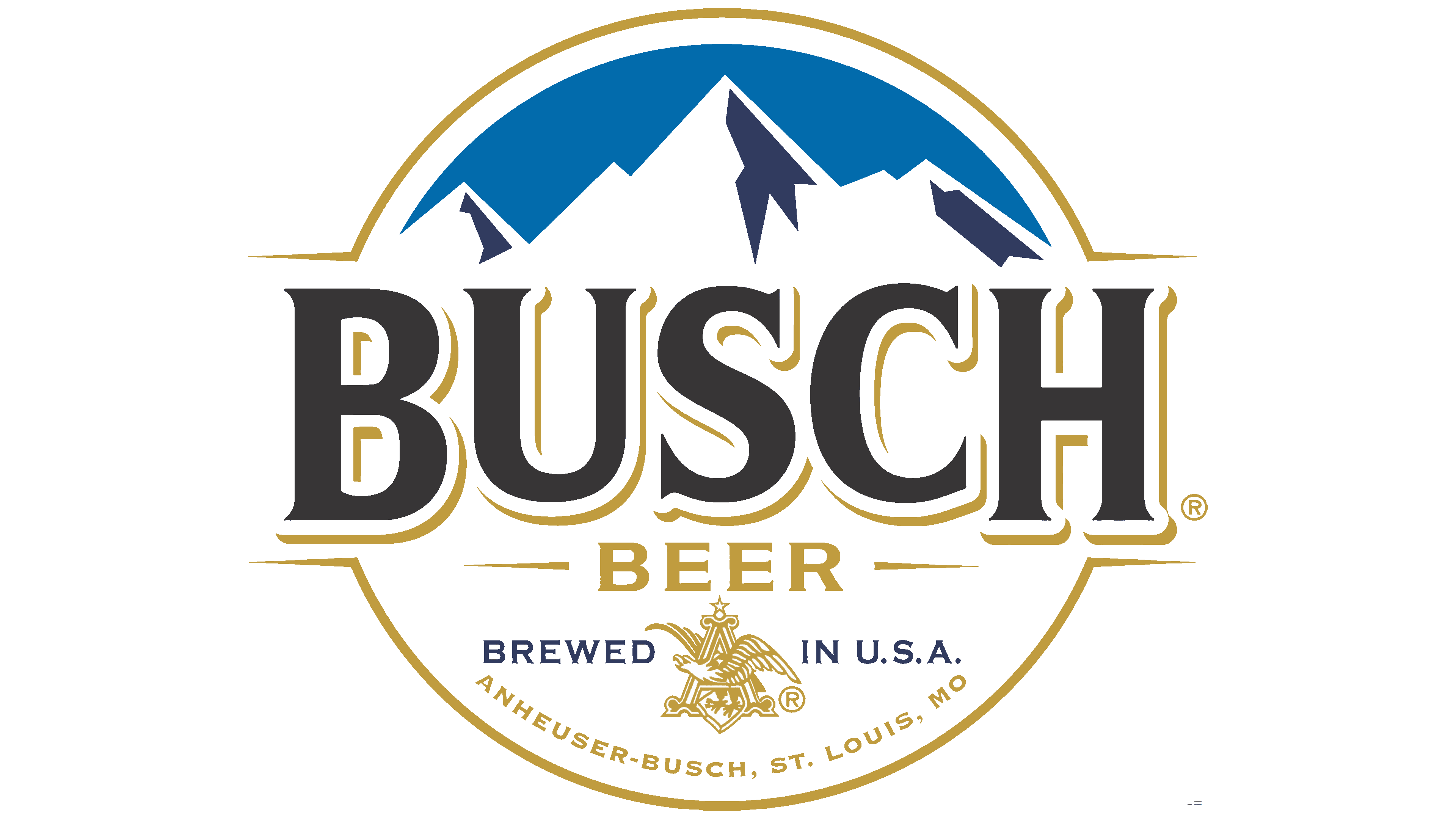
After 2017, the logo underwent a significant transformation. The emblem now showcased a circular design, punctuated by two divergent stripes reminiscent of a champion boxer’s belt, symbolizing the brand’s leadership and dominance over rivals.
Beyond just the textual elements, the emblem incorporated an imagery of snow-tipped mountain ranges, nodding to Bavaria’s majestic Alps and paying homage to the original Busch Bavarian Beer. These peaks resonate with the beer’s crisp taste, enticing aroma, and its lighter brew variant.
Dominating the logo’s center are the bold, three-dimensional letters spelling ‘Busch’. Rendered in black with a contrasting white outline, the previous red undertone was replaced with a lustrous golden shade. The word ‘beer’ is gracefully scripted below in a gleaming gold. Adjustments in alignment and shadowing underline the brew’s six-decade legacy, reinforcing the brand’s adherence to age-old brewing methodologies and recipes.
This respect for legacy is further exemplified in the emblem by integrating symbols characteristic of Anheuser-Busch. Notably, the eagle nested within the letter ‘A’ (a hallmark of the company) and the inscription ‘St. Louis’ stand out. After all, it was in St. Louis where Anheuser’s inaugural brewery was birthed and its primary production facility was stationed.


