Cargill Logo
Cargill is an American food corporation that mostly just works with agriculture, raw food materials and other similar products. In US, it’s responsible for a big portion of all food manufactured in that country, although they also export abroad. They are amongst the biggest companies in their homeland.
Meaning and History
The company was founded in 1865 by the man called William Cargill, hence the name. Back then, they basically just stored grains and other agricultural products for their future processing into food. That makes them one of the oldest food-oriented companies in USA.
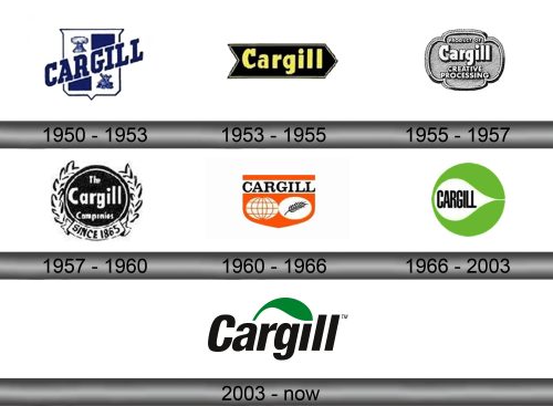
1950 – 1953
The first logo was introduced in 1950. Prior to that, the company didn’t really have emblems or need for them.
It was a sort of coat of arms with two trapezoids and two bundles of wheat set in opposing corners. Across the middle, they’ve written the word ‘Cargill’ in big letters with slab-like serifs. They positioned it diagonally, so it actually cut what was supposed to be squares into trapezoids. Everything here was dark blue.
1953 – 1955
The 1953 replacement was just the company name written in yellow over the black arrow that pointed right. The font changed little, except the letters were mostly lowercase (with the exception of the first capital one, naturally).
1955 – 1957
For several years since 1955, they simply used this label for their emblem. It looks like a metal seal with two petal-like extensions. Inside, they wrote: ‘Product of Cargill Creating Processing’, where everything except ‘Cargill’ was a smaller size. The font pretty much stayed the same.
1957 – 1960
This emblem was instead a black circle surrounded by the monochrome ears of wheat and with the little ribbon that said ‘since 1865’ below the central piece. The circle also held inscription – ‘the Cargill Companies’. The sizing principle was the same here, and the font didn’t change either.
1960 – 1966
In 1960, they instead introduced a sort of wide orange shield with several white and black additions. The white inlays included two circles – the grid on the left one makes it look like a globe, and the black ear of wheat of the right one signifies their purpose of being an agricultural company.
They also left the strip of white closer to the top of the ‘shield’. Inside, there was a word that simply said ‘Cargill’ in a new, official-looking serif script.
1966 – 2003
1966 saw the creation of the first long-time emblem – a green (for agriculture) circle with a pear-like white space carved out horizontally along its middle. In this blank space, they left the company name – the black word written with the tall, capital letters.
2003 – today
For this logo, they actually took the upper green half from the previous logo but made it darker. And it was just a small visual element over the main part, which was the company name written in a basic sans-serif type.
Emblem and Symbol
For a long time before the first logo was adopted in 1950, Cargill didn’t use imagery for branding. Most of their premises and property had some sort of ‘Cargill’ written over them, but there was no system, really. It was just a collection of differently styled brand names for many different objects.


