Coors Light Logo
Coors Light is a brand of light beer (in both senses). It’s a pale lager with a small caloric value and also a smaller alcohol dose – just above 4%. It’s brewed by the American beer-making company called Coors, and their main location is in the town of Golden, in Colorado, USA.
Meaning and History
![]()
Coors Light was introduced in 1978 as a much lighter version of the usual beers Coors made – several years prior to Bud Light. That’s basically where the name came from: the name of the parent brewery combined with ‘light’. It tells you both that it’s a light beer and that it’s not heavy in calories.
1978 – 1980
![]()
The initial logo was simply meant for labels. They took the usual ‘Coors’ logotype used back then – a combination of red cursive letters – followed by an even more pronounced cursive in the word ‘Light’. This one was black. Commonly, they placed these onto a beige background.
1980 – 1994
![]()
This time, they decided to take the good old ‘Coors’ word and give ‘Light’ a different style. This time it was entirely capital letters with slab serifs on the tips. Both words were black.
1994 – 1999
![]()
In 1994, they painted it. The first word was given a bright red color with a slight white outline, while the second one is white with some black frame.
1999 – 2005
![]()
They pretty much did the same thing, except the letters are also much deeper now and enjoy more volume. They are rotated and turned away slightly, which made them expose some of their black ‘undersides’. Notably, the logo is also curved upwards just a tad.
2005 – 2012
![]()
In 2005, they added the mountains for the first time – a grey & white peak above the logo proper. That’s a reference to the Rocky Mountains, which you could clearly see from the company’s hometown.
As for the previous elements, they decided to scale back on the black outline for ‘Light’, as well as remove the serif elements and generally tilt the letters to the right.
2012 – 2015
![]()
All they did for this is put both words on the same level and increase the number of peaks on the logo: there are now 4.
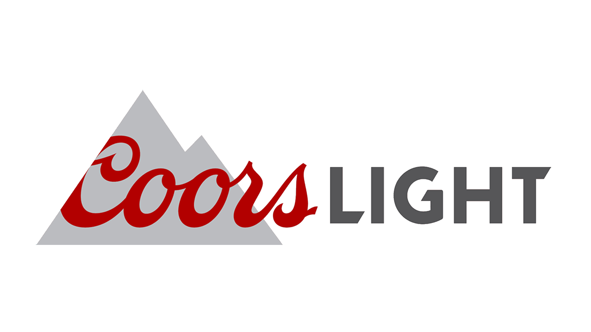
2015 – today
Several things happened in 2015. Firstly, they removed all the volume, shading and other colors from ‘Coors’. Secondly, they turned the second word into a slightly different, jagged style and colored these letters grey (after the mountains, probably). Lastly, the mountains themselves moved to behind ‘Coors’.
These new mountains are also just two overlapping grey triangles at this point – unlike the previous realistic designs.
Emblem and Symbol
Apparently, whenever the bottle or a can of Light is cold enough to be drunk at an optimal comfort (near 0 °C) the mountains depicted on the exterior turn blue. This feature is unique and fascinating, but also entirely pointless, because you can feel the temperature by simply touching the thing.


