Gatorade Logo
Gatorade is a sports drink with a balanced content of water, salt, and sugar produced in the USA by PepsiCo. The main purpose of this product is to restore fluid in the body after exhausting workouts. Sugar calories from Gatorade are included to provide consumers rapid energy when doing workouts. It has also been designed to replace electrolytes lost through sweat. Gatorade comes in different flavors and each one has a different color.
Meaning and History
![]()
The drink was invented back in 1965. Dr. Robert Cade invents an isotonic drink. In 1966, the UF officially published about a new sports drink to prevent dehydration in football players and other active people. In 1967, Stokely-Van Camp, a food manufacturing company, became interested in the invention. In 1983, Quaker Oats acquired Stokely-Van Camp and until 2001 held all rights to the Gatorade sports drink. In the same period, there was a change of ownership, and Gatorade got bought out by PepsiCo. This sports drink takes the name Gatorade, which combines the name of the football club “Gators” and “lemonade”.
What is Gatorade?
Isotonic drinks from Gatorade are non-alcoholic non-carbonated drinks. In addition to the liquid form, the company produces isotonic in powder form. This option is ideal for people involved in active sports. It is convenient to use and store. Also, the athlete can choose from several different tastes.
1965 – 1970
![]()
The original logo featured only a black wordmark, but thanks to the use of different font styles, it looked quite interesting. At the very top, it stated “Stokely” in large, bold, serif letters. The second line featured “Van Camp’s” done in a similar style, only smaller and all uppercase letters. The word “Finest” on the next line featured delicate cursive writing to support the meaning of the word. Finally, “Gatorade” was done using the second largest sans-serif letters. The whole emblem looked handwritten as it featured uneven lines of different thicknesses.
1970 – 1986
![]()
This is when an iconic emblem was introduced. It featured the name in sans-serif font of grassy green and a thin black outline. It was accompanied by the tagline “Thirst Quencher” done in blue, all uppercase letters without serifs. In the background, there was large lightning bold of a bright orange color, which was used to draw a thin, rectangular frame around the name.
1986 – 1991
![]()
The lightning bold looked bolder as it got wider and had fewer zigzags. In addition, the company changed the black outline around the name to blue, keeping the name otherwise unchanged. The last change made was the usage of a different sans-serif font for the tagline, which made it appear larger and more important.
1991 – 1994
![]()
The designers kept the lightning bold unchanged but decided to place the rectangle with the name at an angle. It also got two opposite corners that look even rounder, while the other two had pointed ends. Such a move gave some dynamics to a familiar logo. The tagline was written using the font seen in the 1970s.
1994 – 1998
![]()
An addition of a green shadow to the lightning bolt and the frame gave the logo a 3D appearance. The frame also had a thinner line, while the lightning bolt now featured an orange and yellow gradient. In addition, the designers decided to place the tagline outside the frame to make more accent on the name itself.
1998 – 2004
![]()
The lightning bolt looked different once again. However, it was just the addition of a yellow line on one side and a thin black one all around. The blackline was also used to frame the name, replacing the familiar orange one. The name was still written using the same font, only a lighter green and without an outline.
2004 – 2009
![]()
This version looks even more striking as the lightning bolt is done in more saturated orange with an addition of red. The black border around it is thicker and creates a 3D appearance. The name now filled the whole parallelogram, which had the top line follow the shape of the letters. It also acquired a thicker border and shadow.
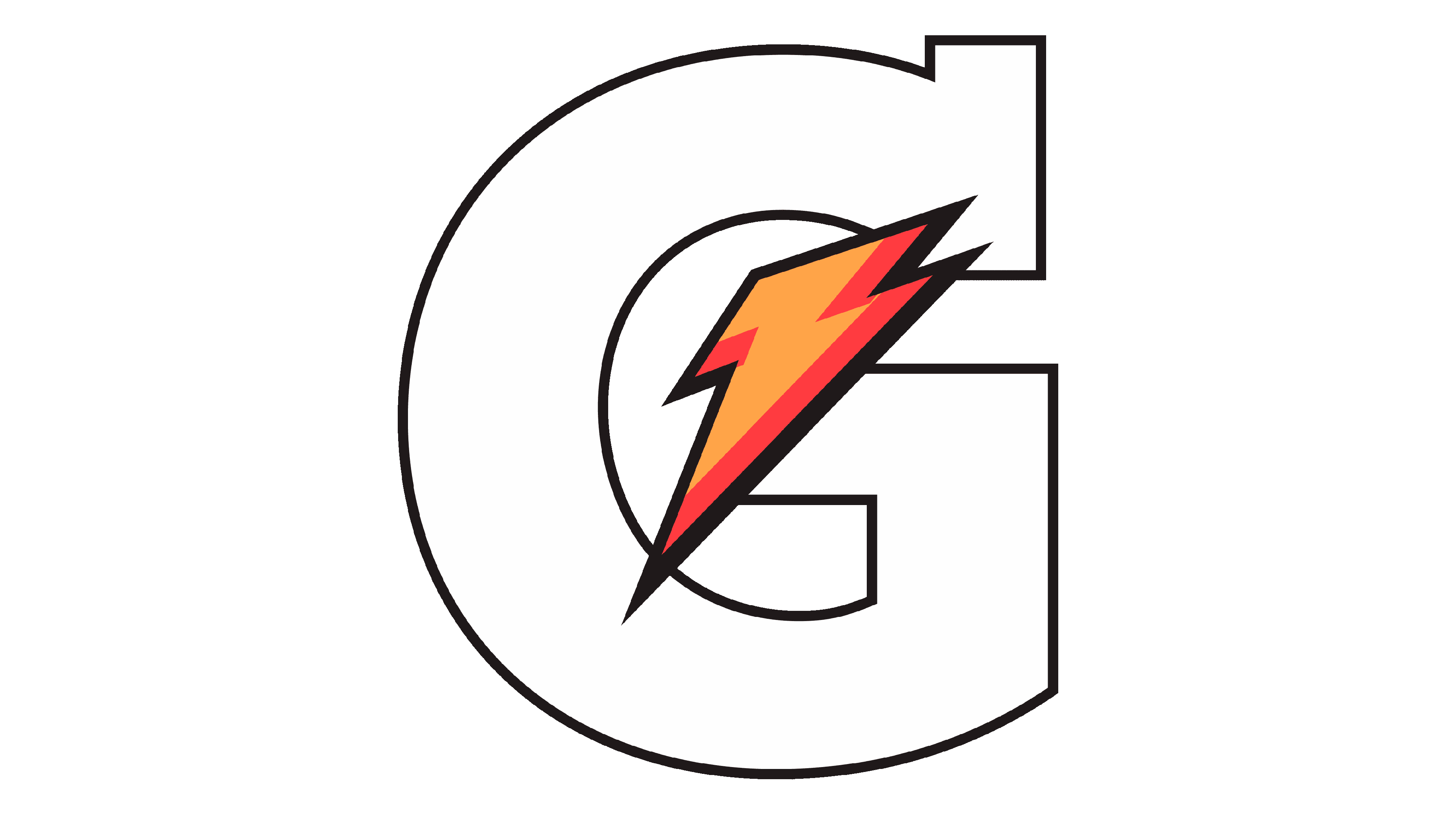
2009 – Today
![]()
This was something new after almost 40 years of different variations of one logo. This version looks masculine and powerful. It features a large letter “G” with slab serifs done in black. There is a familiar lightning bold, only now it is brought forward and looks much smaller.
Font and Color
The brand used bold and bright colors, which are meant to represent the strength and energy of those who drink their beverage. This was primarily an orange color, with some yellow and red. Different shades of green were used for the name itself. There were also black and blue accents for some contrast and volume. With an exception of the first and last logo, the brand used the same font for its name which was slightly altered in each version of the logo.


