Grolsch Logo
Grolsch is a major Dutch brand of beer, and one of the biggest breweries in the Netherlands. Simultaneously, their history is one of the longest in this part of the continent. They mostly produce lagers with a relatively light alcohol dosage. At the moment, the brand is owned by Asahi – a large Japanese alcohol company.
Meaning and History
The brewery was launched in 1615 in the Dutch city of Groenlo (then Grolle), which is where the name comes from: ‘Grolsch’ is an adjective to ‘Grolle’. It was launched by the entrepreneur Willen Neerfeldt, and for several centuries the resulting business was run by his family.
What is Grolsch?
Grolsch is a Dutch beer company known for its distinctive green bottles and traditional brewing methods. Established in 1615, Grolsch is recognized for its high-quality, premium beers and has become a well-regarded brand both in the Netherlands and internationally.
1980 – today
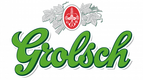
The main part of their logo is the wordmark itself – it says Grolsch in a handwritten sort of writing. These cursive letters generally look soft, pleasant and fluid. As for the coloring, it has commonly been green for the longest time (after hops, obviously), but there were many red variations in the past.
The other important visual element (at least for now) is a vertical red oval above the wordmark. Inside, it contains a white illustration of a crown, with two letters: ‘G’ (‘Grolsch’) and ‘B’ (‘Bier’) on either side.
Emblem and Symbol
The positioning of two elements on the label can vary. Usually, they are both located on a white circle for labeling, with many additional elements all around them – notably, the description of the exact beer variation you’re holding, and more. On rare occasions, they like to change colors of get rid of the oval badge above, but just occasionally.


