Jim Beam Logo
Jim Beam is the top brand of American whiskey produced in Kentucky. Recipe-wise, it’s technically corn bourbon with a 40% share of alcohol, although there are also various versions that slightly alter the recipe, mostly by adding flavors, such as honey, apple or vanilla. The brand is owned by Suntory.
Meaning and History
![]()
The first batches of what is now Jim Beam Whiskey date back to 1795. These were brewed by one Jacob ‘Jake’ Beam – a German emigrant who came to Kentucky to brew liquor. Initially, the brew was known as ‘Old Jake Beam Sour Mash’, changing it to ‘Old Tub’ in the 1880’s and then to ‘Jim Beam’ in 1943.
1795 – 1880
![]()
The original logo was a brochure used both as a marketing tool and as labeling for bottles. There were several noteworthy details on it, including the picture of Mr. Beam, his full name and title ‘Colonel James B. Beam’ (the name written in red slab-serif), the product name ‘Kentucky Straight Bourbon Whiskey’ (in cursive) and distillery location.
There were also several American symbols, added to promote drink among patriots. For instance, there were two stars on the sides of the Beam’s likeness and a blue-white-red ribbon below it.
1880 – 1943
![]()
In 1880, the brand changed name to ‘Old Tub’. The logo now depicted both words in a grand red style, followed beneath by a pencil image of a barrel with some bottles on it, as well as two flags that say ‘sour’ and ‘mash’, one word at a time. Then, naturally, they followed it up with a ‘Kentucky Straight Bourbon Whiskey’ in a similar style as ‘Hot Tub’.
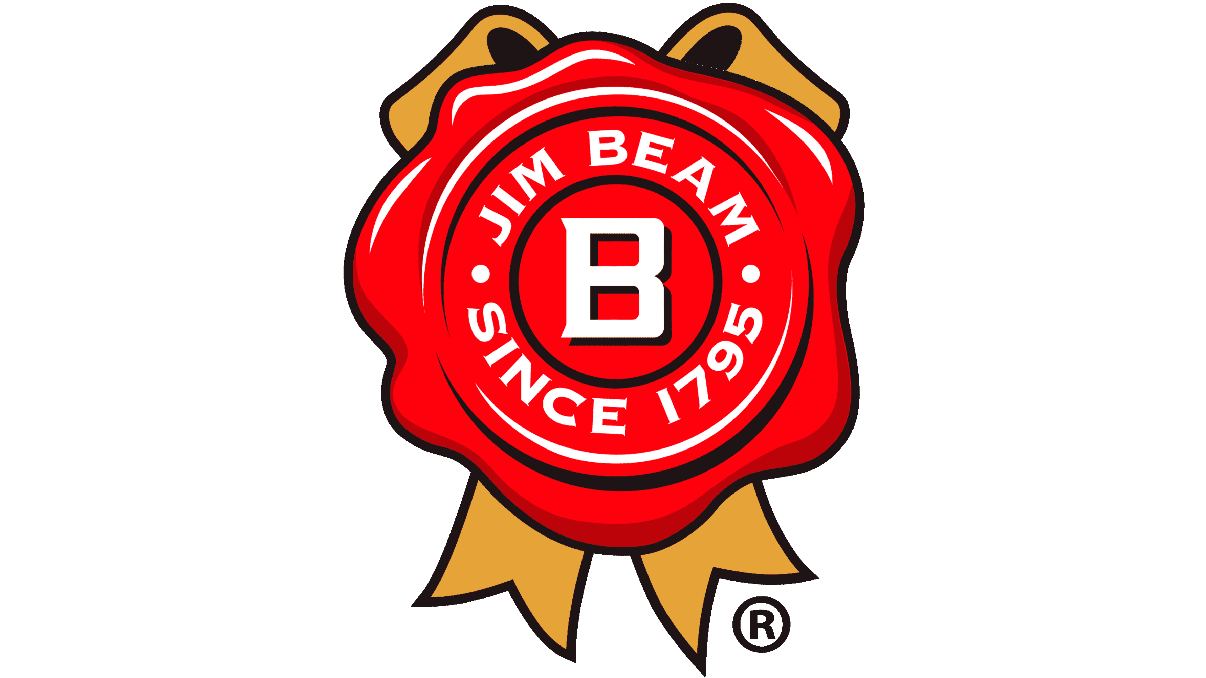
1943 – today
![]()
In 1943, the name changed to ‘Jim Beam’. This part of the logo was written in red, with some yellow shadows. The main word’s positioning, interestingly, didn’t change from the previous logotype. Beneath, they’ve added an emblem that was just a red wax stamp with the white letter ‘B’ on it, as well as an inception year.
Emblem and Symbol
The logo doesn’t change particularly when it becomes a label. The word coloring does change if the surroundings don’t fit. For instance, black becomes white if the label is also black. The label coloring itself depends on the variety of whiskey – as such, it can change to mostly green or mostly yellow after the flavor.


