Lavazza Logo
Lavazza is a major Italian coffee company. Most of their products are packages of whole roasted beans imported from South and North America. It’s considered one of the biggest and most successful Italian companies, because most coffee-drinkers in this country prefer Lavazza coffee to others.
Meaning and History
The brand was established in 1895 by the coffee-seller Luigi Lavazza. Like with most Italian companies, the name of the family that runs the business is also the name of the business itself. Right now, the Lavazza family still runs this company from their headquarters in Turin.
1895 – 1927
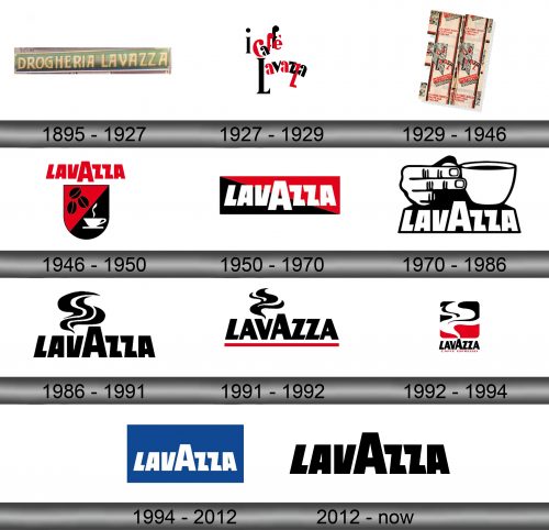
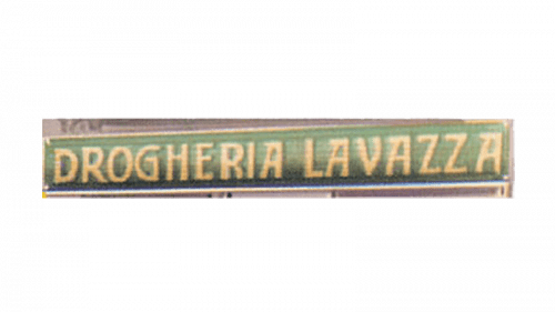
The original logo was just the words ‘Drogheria Lavazza’ written in plain beige letters over the brown-and-green background. ‘Drogheria’ here means ‘grocery store’, which is what the company was originally.
1927 – 1929
In the 1920s, Lavazza change their logo to this: ‘i caffé Lavazza’ (‘Lavazza coffee’) written in a collection of mismatched words, colored red and black without a system. Moreover, the article here is almost completely blocked by the second one. It was likely inspired by numerous modernist philosophies that surfaced in this time period.
1929 – 1946
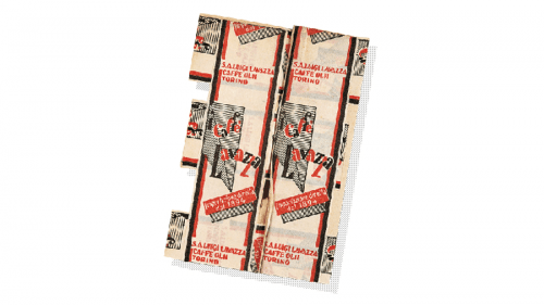
The 1929 uses the same design, except it also places a pair of previous emblems onto the vertical strips of paper that contain little else other than the company name, the location and some pictures.
1946 – 1950
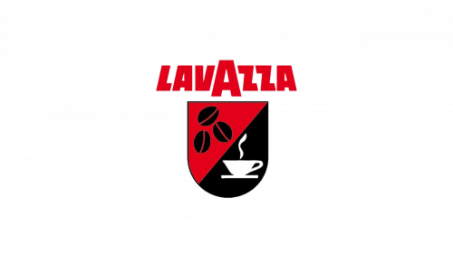
In 1946, they introduced a design that was destined to stick with the company for many years to come. They took the word ‘Lavazza’ and wrote it in tall uppercase letters, except the middle ‘A’ was also enlarged, while the others leaned in towards it, creating a sense of symmetry.
The other part was a coat of arms design that featured a red and a black space separated diagonally. The red one contained a few black coffee beans, while the other held a white cup of coffee with smoke coming out of it.
1950 – 1970
In 1950, the same lettering design was colored white and put over a rectangular plaque. They colored it in a similar manner as the previous emblem – putting red and black over it and separating the two areas diagonally.
1970 – 1986
In 1970, they opted for a black-and-white design. The letters were once more white and heavily outlined in black. Right above, they’ve included a cup of coffee held in the hand by two fingers. Most of the space between this imagery and the lettering was also pitch black.
1986 – 1991
The ‘Lavazza’ lettering made it intact again, although this time in black. At the same time, the letter ‘V’ here acted as a sort of coffee vessel, seeing how the wisps of smoke come out of its top.
1991 – 1992
This time, they decided to underline the logo with a single red line, as well as slightly alter the appearance of letters.
1992 – 1994
The red line was scrapped in 1992. In its stead, they wrote ‘caffe espresso’ (‘coffee espresso’) in thin red letters. The smoke is now much larger; they incorporated it into a red and white square shape, where it occupies most of the space. This new emblem also occupies most of the logo: the source of the smoke is positioned right above ‘A’ now.
1994 – 2012
The 1994 is simply the wordmark before it was slightly altered in 1991. Here, it’s put inside a blue rectangle that acts as the background.
2012 – today
The 2012 logo is even simpler – it’s just the black wordmark on its own.
Emblem and Symbol
The smoke image from the 90s is still present on the packages of Lavazza coffee. Although they use the modern style of the wordmark to label their products, the background is usually occupied by the smoke as seen on the 1991 or 1992 logotypes, except transparent and bigger.

