LinkedIn Logo
LinkedIn is one of the major social networks. This one, in particular, is focused on providing businessmen, entrepreneurs and activists a place to share opinions, takes and news. The website has been active since 2003 (so, longer than most other social networks), so it might be considered one of the pioneers.
Meaning and History
![]()
LinkedIn’s image surprisingly didn’t change much over the years. They’ve introduced their name and a logo back in 2003, and the latter only suffered a couple of changes over the years. The choice itself was due to the opportunity to ‘get linked into the preferred community’ this website provides.
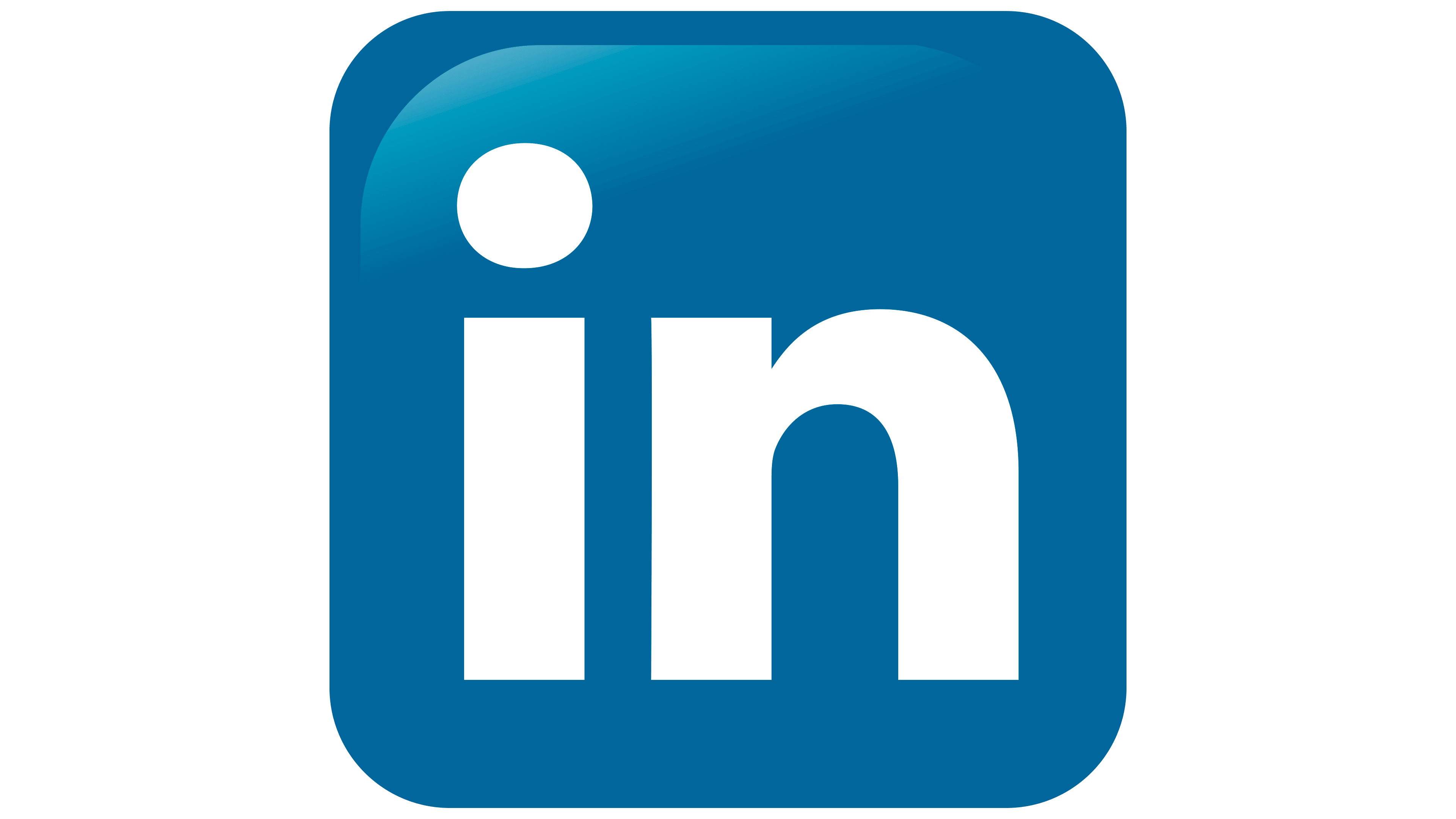
2003 – 2011
![]()
LinkedIn prefers a very smooth yet straightforward text style. The writing is blocky, although it also feels smooth and soft. Divided into two parts – ‘Linked’ and ‘in’, the text is painted to different colors: black and white, respectively.
The second part and the shape that surrounds it is actually an iconic symbol of this network. The shape is a rounded square colored in azure. It’s also very quickly become a major brand color for LI.
2011 – 2019
![]()
The only part that changed on this stage was the coloring of the ‘Linked’ section. Instead of the jet black, it’s now paler black or dark grey. Essentially, nothing else changed.
2019 – 2021
![]()
In 2019, LinkedIn decided to fully embrace their iconic azure color. Not only is the square shape colored azure now, but the previously grayish writing also switched to this color.
2021 – Today
![]()
Similar to its predecessor, the updated LinkedIn logo adopts a monochromatic approach, discarding the previous three-color scheme. However, the new shade of blue is notably brighter, leaning towards a captivating cobalt hue. The company name is now presented in a distinctive custom typeface called “Community,” adding a unique touch to the logo’s design.
Emblem and Symbol
The ‘in’ part is used in many places besides as a part of bigger logotype. It’s a standalone symbol – for instance, you can see it throughout the pages on the actual website. Interestingly, although the correct spelling is ‘LinkedIn’, the emblem starts with a lowercase ‘I’, as if it’s just a regular preposition.


