Maxwell House Logo
Maxwell House was for a long time the biggest supplier of coffee in America. Their brand has been responsible for the biggest portion of coffee sales in this country until being overtaken by the likes of Starbucks. But even now, Maxwell blend is regarded is one of the better coffee options.
Meaning and History
Maxwell House was created in 1892 in Nashville, Tennessee. It was named after the local grand hotel, the Maxwell House Hotel that commonly admitted high-class visitors, including several presidents. After his first big sale there, he decided to thank the establishment in this way.
1927 – 1986
![]()
The initial logo was a blue rectangle. The left side was occupied by a picture of overturned cup of coffee with a red rim. The central and right contained the brand name, written in the similar red color in two lines, as well as the word ‘coffee’ in smaller size down below.
1986 – 2005
![]()
In 1986, they decided to rearrange the logo slightly. The cup was given a new blue rim, lowered and made smaller, but otherwise stayed the same. The brand name now partially occupied the vacant place. The written parts changed color to white and adopted a new serif look.
Additionally, the designers decided to incorporate the company slogan this time: ‘Good to the last drop!’ – between the name part and the ‘coffee’.
2005 – 2009
![]()
Another rearrangement followed in 2005. The written parts now occupied much of the space, while the coffee cup moved to the very top, where designers made a little special nook for it. The slogan was also written alongside the top line this time. The ‘coffee’ disappeared altogether.
2009 – 2014
![]()
In 2009, they changed the figure behind into a sort of bloated rectangle with arches across its both horizontal lines. The name stayed where it was, although with a slightly different style. Everything else was gone. Visibly, this version had a lot more 3D elements, including gradients, shading and more.
2014 – 2021
![]()
The 2014 logo was simply the old 1986 design, but they removed everything apart from the cup and the name (which was now outlined with blue).
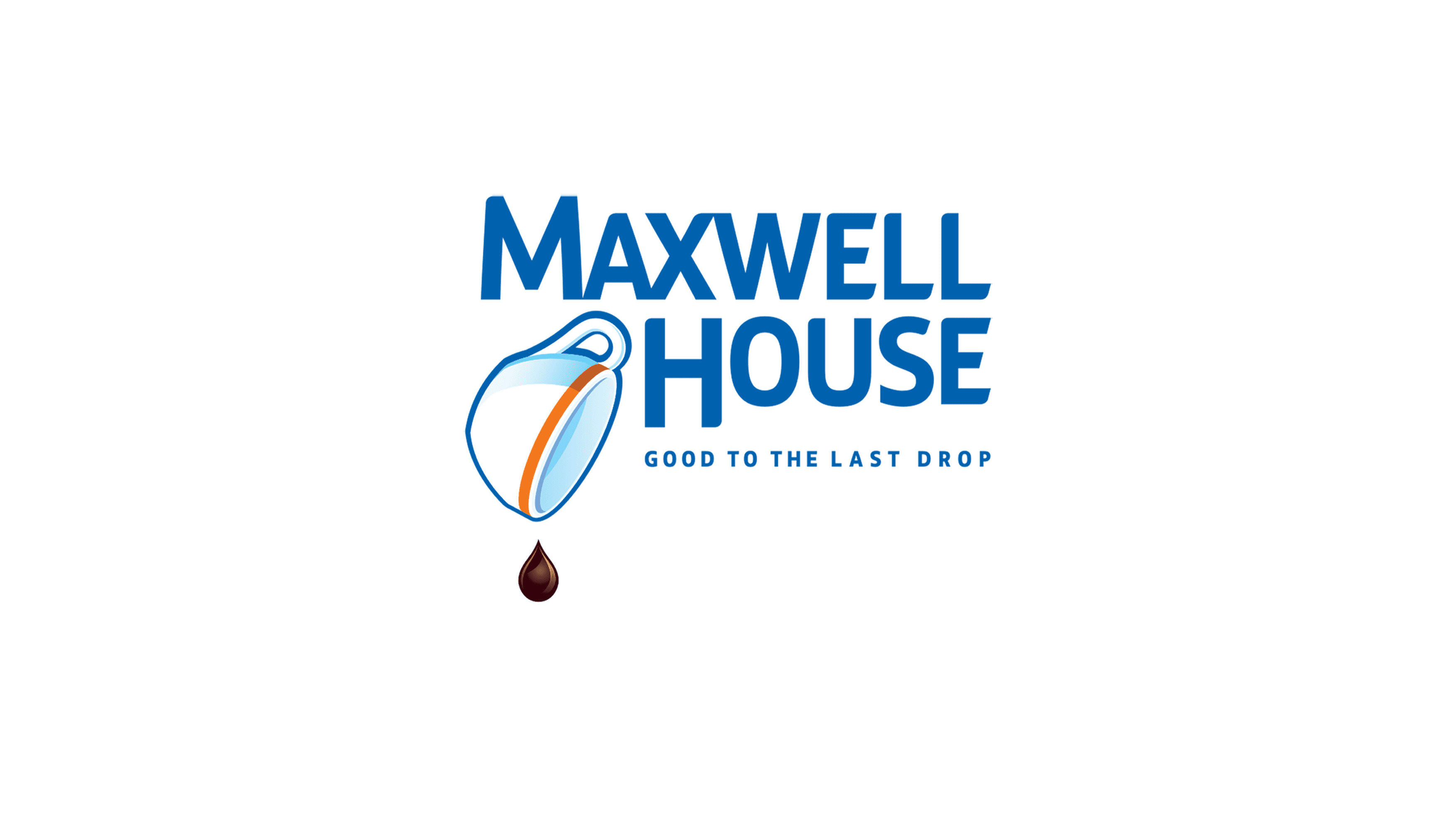
2021 – today
In 2021, they changed the text to a more streamlined style and changed the coloring to blue, while the coffee cup received a new orange rim and a dark brown drop of coffee flying from it.
Emblem and Symbol
Many packages of Maxwell House coffee actually use their own emblem variants. They aren’t particularly different from the original stuff – they simply rearrange the elements on the label. For instance, the Original Roast Instant Coffee is a combination of the 2009 logo with a cup of coffee to its right (which wasn’t there).


