Nestea Logo
Nestea is a brand of ice tea in many forms including liquid and powdered tea, bottles and the tea in vendor machines. It goes in several flavors depending on the region: apple, strawberry, lemon, lime and others. Nestea is produced and sold by Nestlé and Coca-Cola in collaboration.
Meaning and History
![]()
The brand was launched in 1948, when bosses of the huge in that time company Nestlé caught a thought that it would be great to establish the brand of mass-accepted tea. The name they made up was neat but gaudy – Nestea. With the name, they brought the brand logo as well.
1948 – 1960
![]()
The first Nestea logotype depicted the black-colored sans-serif inscription with the space between letters. The distinctive part of the lettering was in the elongated character ‘N’, from which came both the upper line and underline of the entire word.
1960 – 1979
![]()
The following logotype featured generally the same things, but in the simplified mood. The inscription narrowed, and the lines were removed.
1979 – 1987
![]()
In the year 1979, the brand designers introduced the prototype of the modern font for the brand name. It was not that hard and serious as the previous one, but it had all the successful elements of the predecessor, such as simplicity and minimalism.
1987 – 1989
![]()
The next logo appeared in 1987 and was an experimental one. That time, the brand designers turned the black inscription a bit diagonally and put in under the cover of three leaves of the black color as well.
1989 – 1997
![]()
That experimental logo was generally successful, but it needed some mods. The new version arrived in 1989 and depicted the bold black inscription ‘Nestea’ with the leaves in the middle of the word.
1997 – 2003
![]()
Eight years after, the brand designers put this logo in the ice and changed the color to the blue. The three-leaf figure became green as well.
2003 – 2009
![]()
In the year 2003, the brand decided to return to the old 1997 logo, but with some changes. Due to them, the brand name became dark blue, while the ice gained almost pure white color.
2003 – Today
![]()
One of the current logotypes represents the gradient blue word and the leaves above. Simple, but clear.
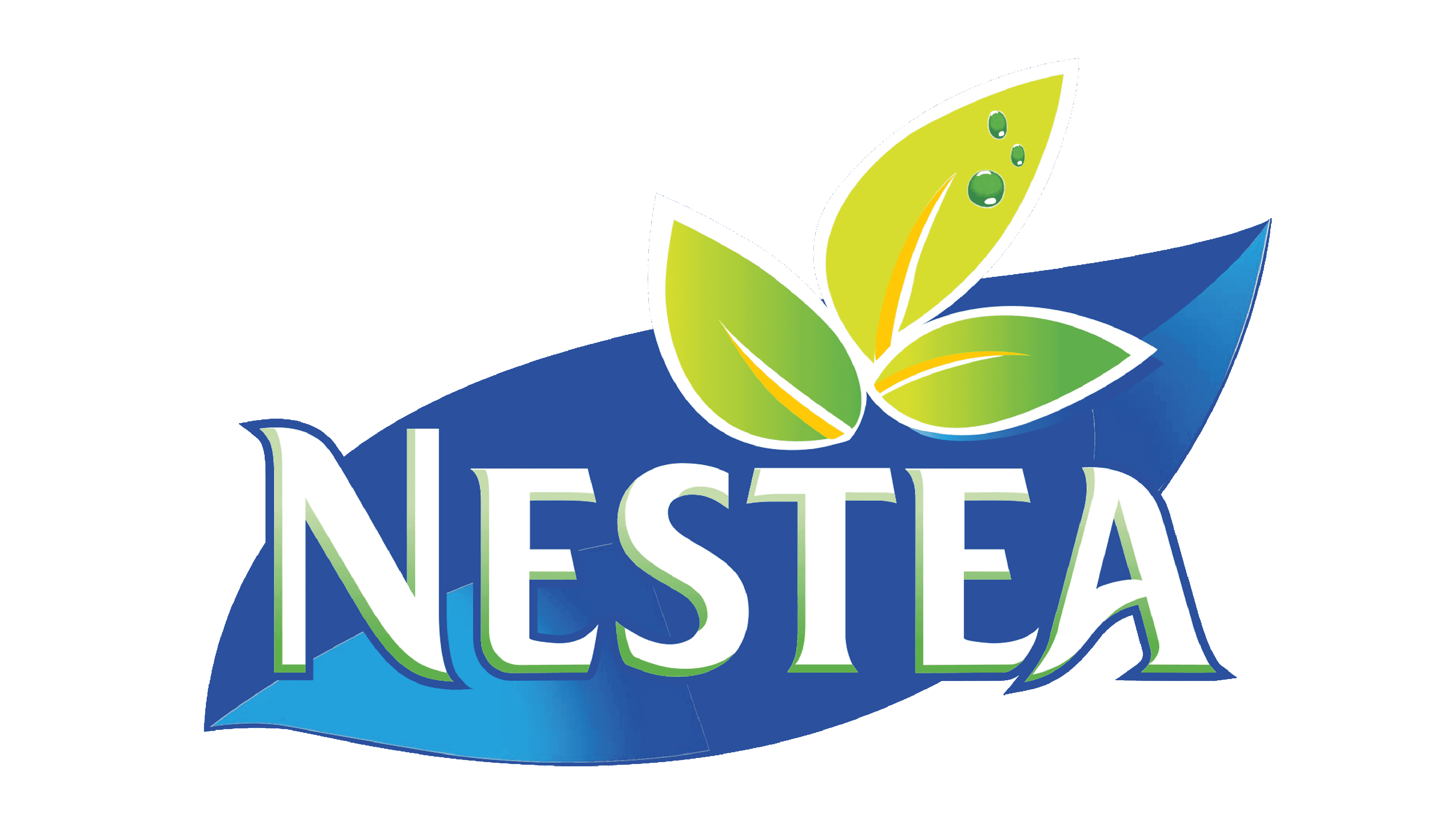
2009 – Today
The latest logo of all existing represents the well-known ‘Nestea’, put on the big ice-colored leaf that stands as the background. That three-leaf figure we mentioned didn’t disappear — it was put above, and became bigger.
Emblem and Symbol
Nestea often used third versions of the logo for the adverts, while the main corporate logotype was in use on the bottles and packs. For example, you can find the 1960s pages in magazines with the curious brown inscription ‘Nestea’, with the image of palm tree coming from the last letter ‘A’.


