Schweppes Logo
Schweppes is the world’s first brand of carbonized soft drink that stands on the origins of the modern soft drink industry. Initially, Schweppes was simple carbon water. But as the time passed, the other tastes with sugar, lime, raspberry and lemon released.
Meaning and History
As well as a large variety of other companies, Schweppes was called after its founder, Johann Jacob Schweppe, the Swiss businessman and scientist. In the late 18th century, he developed the process of carbonizing water. Without a lot of thinking, he decided to make money on it, and founded the company.
1783 – 1918
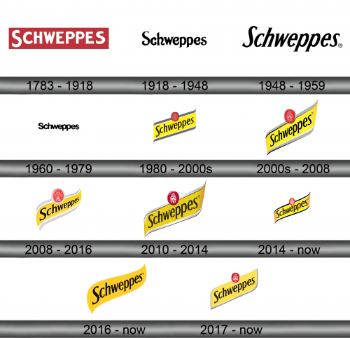
The initial logotype came up with the company foundation in 1783. This one was the simple inscription of optional font.
1918 – 1948
The following logo depicted the brand name as well, but in that case it used the single font for the ads, though it could change as well.
1948 – 1959
They changed their brand logo again in 1948, and again it was the company name, with another font.
1960 – 1979
The following logotype was the last which had the name only, and it was the last with the font changing. The next ones will use 1948 typeface.
1980 – 2000s
The 1980 logo redesign finally brought something new. Now it was the catchy image with the brand name on the yellow strip, with the iron-color parts above and below. We can also mention the red medallion with the foundation year above.
2000s – 2008
The next logo on the list has mostly the same things as the previous one, but a bit in another shape and color.
2008 – 2016
One more redesign occurred in 2008. The iron lines became snow-colored ones, and the whole logo gained a bit of volume.
2010 – 2014
There was also the transitional logo along with the 2008 version. It had generally the same details, but the lines below and above became silver. The medallion was changed as well.
2014 – today
Once in 2014, the brand designers caught a thought:’Hmm, we’ve already made a million versions of the same logo, but we need one more, so why don’t we just bring some black color to it?’
2016 – today
Another redesign was the removing of all the ‘extra’ details out of the logo, so only the inscription and the yellow fundament remained.
2017 – today
And in 2017 the brand designers decided to simplify the background at maximum, and convert it to the simple flat parallelepiped.
Emblem and Symbol
Until 1980, when the iconic Schweppes logotype arrived, the brand didn’t have a logo in its full meaning. Those inscriptions with different fonts the brand had been using for over 150 years just said ‘Hello, it us, not them’ in adverts and banners. You can find the magazine ad pages referred to 1890 or 1920s, where the company name is written in various fonts.
