Tecate Logo
Tecate is the name of a beer that appeared in 1944 in an eponymous Mexican city in Baja California. There are several types of this beer, including Original, which is a dark beer with 4,5% of alcohol by volume, Alta, having a low amount of calories and carbs, Titanium with 8,5% of alcohol, and Light version, flavored citrus and a slight bitterness. The marque enters a group of brands, owned by Heineken and exported globally.
Meaning and history
Tecate brewery bears the name of the city where it was incorporated in 1944 by Alberto Aldrete, a Mexican entrepreneur, and beer lover.
He believed a brewery could exist in town instead of the countryside and founded the brewhouse inside the city. His idea worked, and the company gave the city fast economic growth, as well as opened the doors to international recognition for the brand.
In 1947, the Tecate product appeared in Asia and the southern states of the USA. The brewery was bought in 1954 by Cuauhtémoc Moctezuma Company, which made it the second-largest brand in Mexico. Under them, the brewhouse started using cans as the vials for the beer, which became a compact and easy-to-open alternative to bottles.
Cuauhtémoc Moctezuma continued their innovations and brewed the new tastes of Tecate beer, starting with Tecate Light in 1994.
Today, Tecate is an internationally recognized beer, spread across Mexico, the United States, Asia, and Europe. It keeps honoring its birth city by pleasing the world with the new tastes of beer – Titanium, and Alta. Since 2010, Tecate has been an integral part of the Heineken family of brands.
What is Tecate?
Tecate is a marque of beer named after the Mexican city where it is brewed. The brewhouse was established in 1943 by businessman Alberto Aldrete. Now, the beer has 4 versions: The Original, Alta, Titanium, and Light. It is owned by Cuauhtémoc Moctezuma, which itself is owned by the Dutch Heineken.
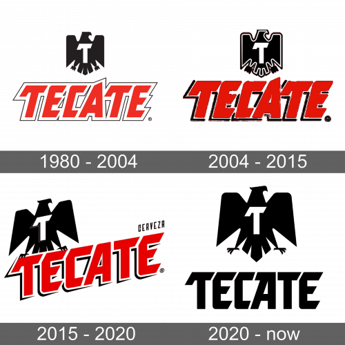
1980 – 2004
During the first 40 years of existence, Tecate put handwritten wordmarks on advertisements, bottles, and cans. The initial logotype had similar features as the following logos: it had the uppercase wordmark in a heavy custom font. Each character had a bold white contour, which itself had a slim red outline. Above it, an emblem featured a minimalistic image of an eagle with short and straight wings and feathers. A large capital ‘t’ stood over it.
2004 – 2015
The following insignia featured the italic version of the inscription with a renewed design of the character ‘a’. The nameplate had also received a new double black and white contour, adding more volume to the word. The eagle became larger and got an outline too.
2015 – 2020
They had removed the italic effect but tilted the whole inscription instead. The black contours got bolder, so the black one looked rather like a shadow than like an outline. Above the last character, there was the capitalized word ‘cerveza’ in all caps. What’s notable, they smoothed the eagle to the right, and it now held on the edges of the first ‘t’ and ‘e’ symbols. The symbol on it got a contour.
2020 – today
Most letterforms in the latter logotype follow the same style as previously, but they have some modifications coming into force smoothly, one logotype after another. The eagle got bigger and returned to its previous place centrally above the inscription.
Font
Initially, the brand designers employed a capitalized sans-serif typeface with all letters looking heavy, bold, and massive. They had sharp tips and angular forms. The letter ‘a’ in this logotype was higher than all other characters.
Then, they italicized the wordmark in the 2004 logo. The ‘a’ design changed, so its upper tip had been pointed right instead of left.
Another milestone in the inscription’s design took place in the 2015 brand insignia, that now displayed the tilted version of the lettering with the lower angles of the ‘c’ and ‘e’ letters rounder, while the upper left portions of the letters are cut where the usual corner would be.
The 2020 logotype depicts the nameplate in a similar uppercase sans-serif font with small intervals between the letters. They are written horizontally in a line and have all the mods from the previous logos.
Color
For most of its history, the logotype utilized a black, white & red color palette, whereas black was typically used for the contours and the eagle, while red stood for the letters. In the latter logotype, they painted the whole inscription black.
